
The Vivid Artists
“VIVID“ draws in on the ephemeral quality of colour and its ability to rejuvenate our conversations and senses. This collection features 8 incredible artists and their artwork that uses the quality of colour to captivate an audience.
Holly Stapleton
Artist Bio
Holly Stapleton is an illustrator and painter based in Toronto. Her work explores the complexities of the human experience, through a lens bathed in golden hour light. She often seeks to evoke themes of selfhood, relationships, and nostalgia. Holly works primarily as an editorial illustrator for clients such as The New York Times and The Washington Post.
Artist Statement
This series aims to explore elements of personification through textiles. That which is shed, layered and hung to dry acts as playful pillars of our identity. Like garments, we carry emotions and memories with us. Some we shed, and others we handle with great care. We hang them on the back of the chair, fold them, or tuck them away in a drawer. We are draped in our own stories.

Can you tell us how you balance the use of colours and harmonize them into your work?
It’s kind of an intuitive thing for me. I usually just try to have a dynamic presence of light contrast and warmth in my work. Sometimes it’s on the monochromatic side of things and other times there’s a lot of different tones in the mix. I think I just have specific hues that I’m drawn to that I’m usually opting for in my work.
You have unique pieces of human experiences, how did you come up with the inspiration to do this?
I try to paint moments that feel peaceful for me, or evoke feelings of peace to the viewer. I’m usually just drawing from my own personal experiences or from things I notice when people-watching or spending time with friends.

Among the may aspects of living, why did you consider the following themes for your artworks: selfhood, relationships, and nostalgia?
I guess I would say that these are concepts that I reflect on everyday in my own personal life, that show up in my work. I try to pull from my own unique experiences in a way that’s accessible and relatable to others.
Would you also say that some of the artworks you create are from self-reflections and own experiences?
They definitely are a form of self-portraiture in a way. I think the best storytelling comes from our own lived experience. I try to share that in my work through a lens that’s a little bit more colourful and dream-like.
Jennifer Trueman

Artist Bio
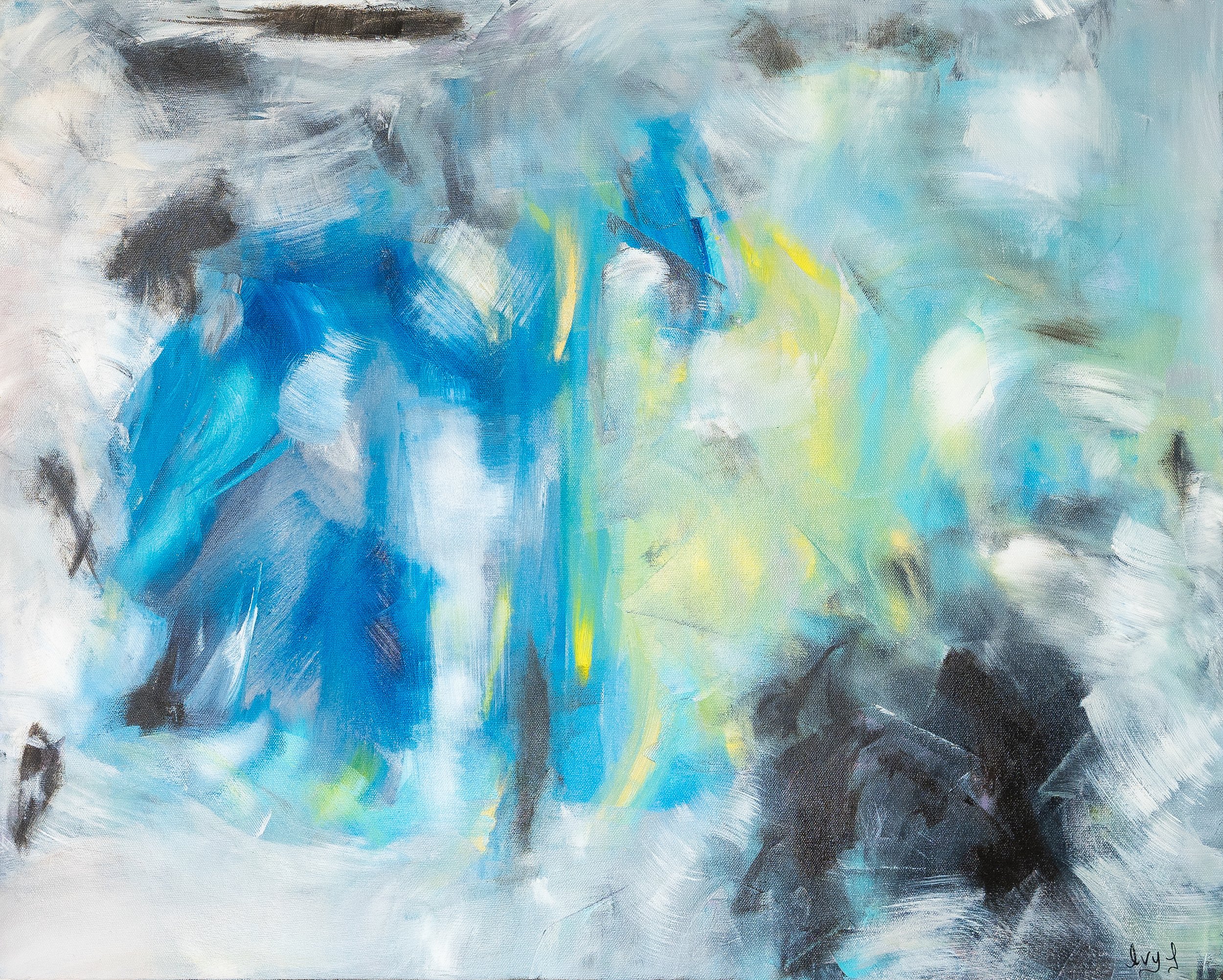
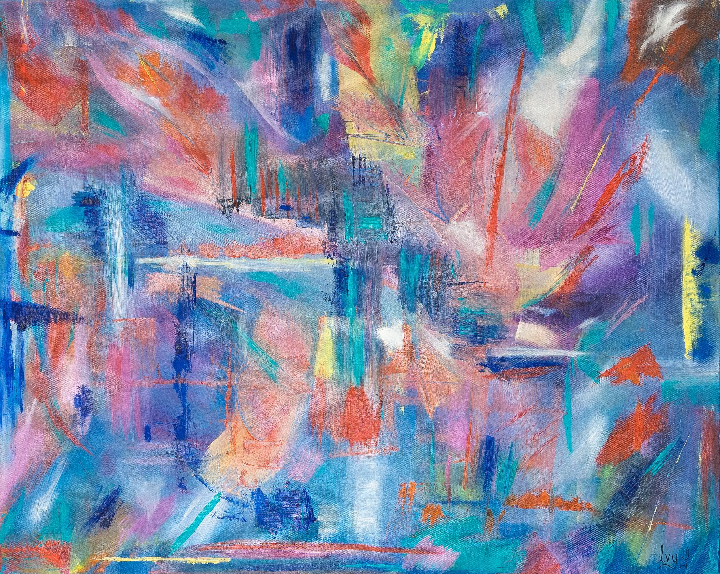
My mantra for creating abstract art has always been “there is no right or wrong way to create any emotional expression“. Personally, creating art has always been about the freedom of feeling and emotion, rather than the production. The beauty of abstract art is being open ended and free. I love creating paintings with no plan other than having a colour scheme and letting go, letting the canvas and brushwork take over. The beauty of art and passion for creating expressive paintings for me is usually in overdrive, I always seek new design ideas and often create and develop multiple canvas’ at a time.
Artist Statement
My compositions are full of artistic freedom and take an “intentional twist on the conventional expression of nature“. I enjoy taking realistic photos of landscapes and putting my own personal abstract twist to embrace my artistic style, and seek to put my emotional journey into the objective of the painting. When I paint, I embrace the emotional freedom and push myself to create without limits. My creative vision consistently include four aspects — bold vivid colour, movement, emotion, and energy.
Can you tell us how you balance the use of colours and harmonize them into your work?
I really try to use bold bright vibrant colours in all my work. I enjoy building up the layers of contrast week after week. Oil paint has a variety of tones to work with so often I find myself using contrasting colours to harmonize the arrangement of my composition. Base coats/underpainting are really where I find the right colour combinations, I start with neutral tones, then build to strong bold pigments of rich brilliant colours.
As an artist, how do you want your artworks to connect with people?
Abstract art for me is really about the emotional response. I hope the arrangement of bold colours brings to light the creative expression in my paintings; and I hope people are able to connect to the joyful and blissful movement of the brushstrokes. I consistently paint with music playing at high volume..... I love hearing different takes and opinions on how people relate to unrecognizable compositions -for me , that is the connection. I enjoy the art journey of not knowing how the painting is going to turn out. I enjoy viewing and creating art that is unfamiliar ; it allows each person to interpret the pieces very differently. Each of my painting compositions are really quite different and unique - each one tells a different story that is open to interpretation through the details and techniques.
Your mentioned emotional freedom and pushing yourself to create without limits in your statement, can you expound on this?
Art for me has always been my escape, my down time, my time to be in my zone without an endless 'to-do' list that never ends. Painting is my calm and refreshing time. I'm elated when I take a risk on a piece and it works. Furthermore -I love creating different art pieces in various styles, I don't like limitations - I crave the artistic freedom to try everything and go with the ideas that come to my mind on that day. I want to maximize my creativity and versatility ...I often have several paintings on the go and find I need variety - always change the canvas size, scale, brush size, colour palette and movement of my brustokes to maximize the impact of new creative ideas.
Aside from brushwork details, what other elements in your painting would you like to emphasize?
Great question - I really like my painting to have multiple layers of colour texture and vibrant movement. Aside from my abstract style, I really try to get my paintings to a point where they have an " identity" of vibrant elegance. Creative and colourful energetic freedom are what you will see in this collection of new paintings!
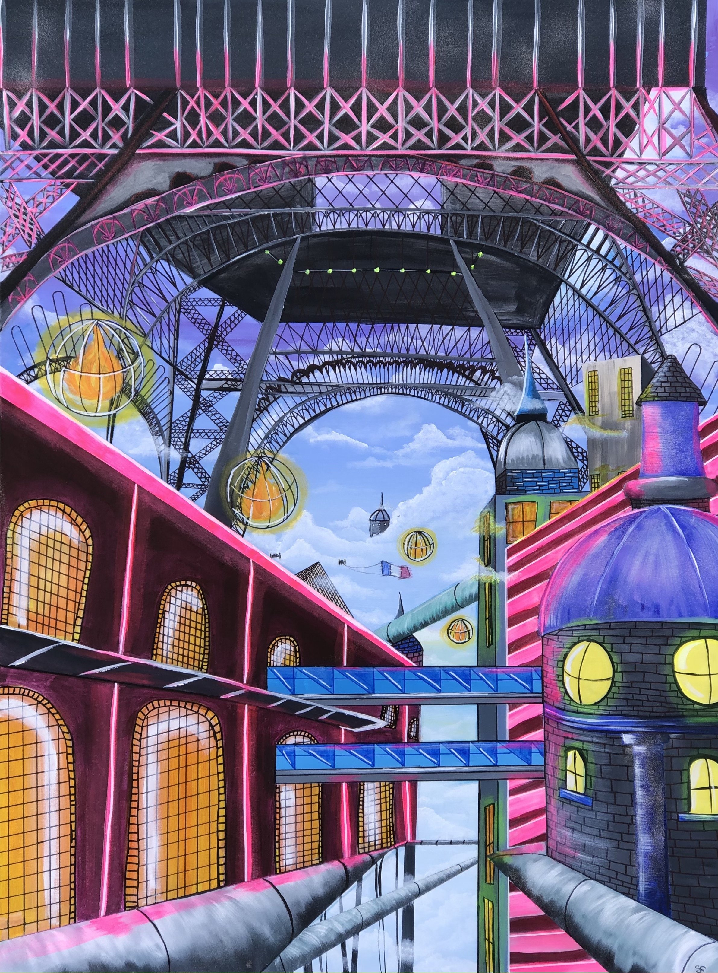
Sasha Sutherland

Artist Bio
Sasha Sutherland is an artist and art teacher. In 2022, she graduated from York University with a BFA and BED. Sasha has received awards for the quality of her paintings; one being the Best of Painting Award in 2022 for participating in TOAF online fair. As an artist and art teacher, Sasha aspires to create an inclusive and welcoming class environment where her students can explore and learn about their creativity and passion in the visual arts.
Artist Statement
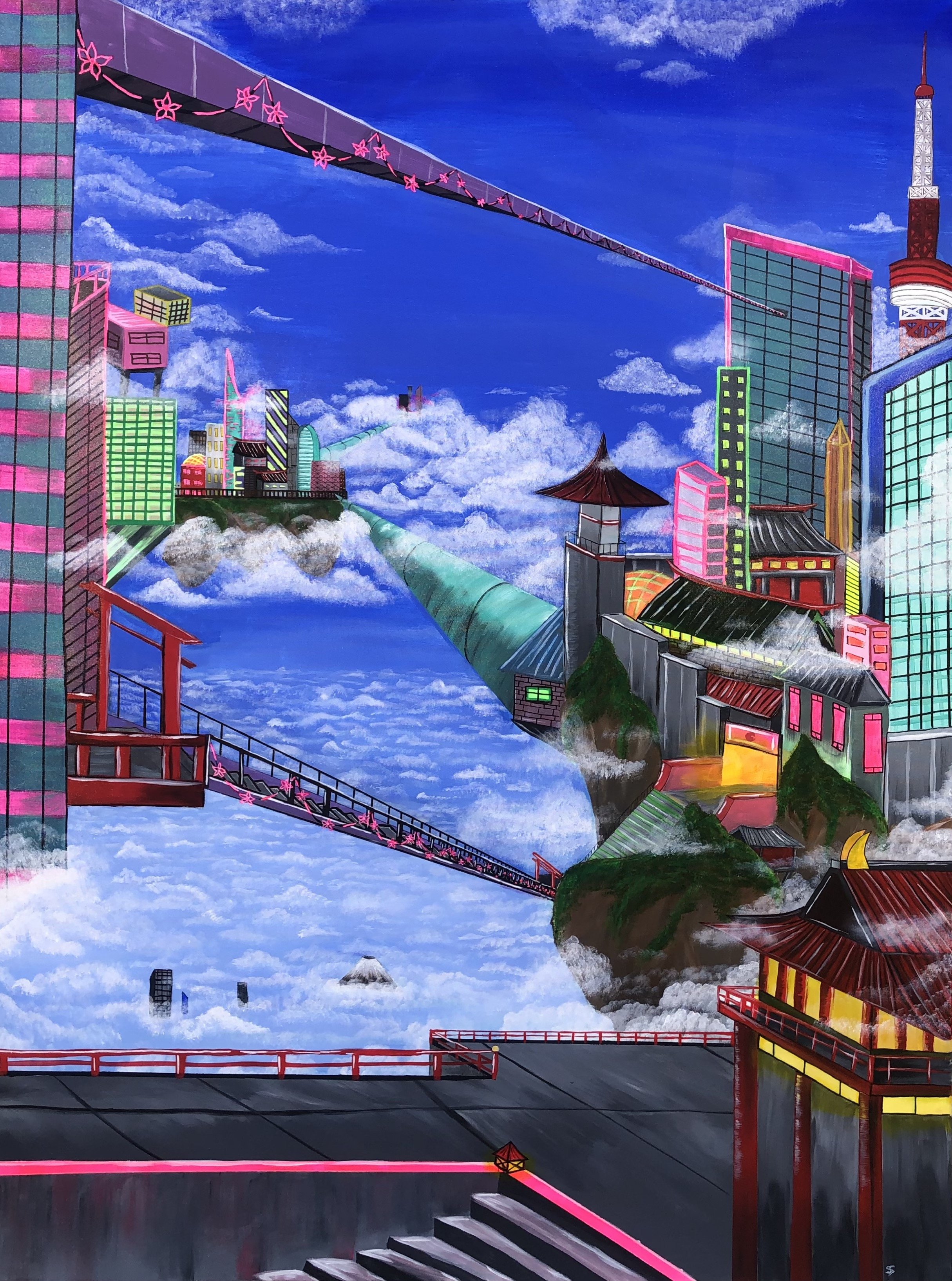
Sasha Sutherland has explored painting well-known cities and located them high within the clouds to suggest what these cities could look like after years of continuous development. Her work in done with acrylic paint, acrylic markers, and glitter spray paint. Within her paintings, she chose to work with vibrant colours in order to lend a utopian dimension to the cities. Sasha’s futuristic paintings of these imagined cities portray various perspectives that all consist of tubes as a means of transportation throughout each place.
Can you tell us how you balance the use of colours and harmonize them into your work?
When painting with numerous colours to create these vibrant places, I always start with a digital sketch to help me figure out where I would like to place each colour. When I paint, I put a neutral colour or dark colour next to a bright colour so it can stand out the most. For example, for some of the buildings in my pieces, the base colour is dark grey, purple, dark green, and dark blue. To make the building look brighter, I create a neon outline or design on top of that base colour to catch the viewer's attention. Another method to harmonize my colour choices is to use a monochromatic colour scheme for some buildings, so using different shades of one colour. I would always have the bright colour on top so it stands out the most.
Sometimes it can be challenging to figure out where I would like to put a specific colour; that is why I create a quick digital sketch on my iPad to test out colours. If I dislike their appearance, I can undo them and try a different colour. My focus for my futuristic city paintings was to make them as colourful and vibrant as possible. I created these imagined cities with the intention of viewers looking at how bright and eye-catching it is that you would want to see more of these places and want to visit them.
However, when I paint with numerous colours, it is only sometimes plan ahead of time as things tend to change while in the middle of painting. This leads to me sometimes painting bright colours next to each other because I liked how they looked side by side.
What made you focus on well-known cities as subjects? Do you have visions of places even before you recreate them?
This city series started with my idea of painting places I have never been to and would like to visit one day eventually. For viewers to figure out what places I have painted in a futuristic way, I have painted known monuments from these places and placed them somewhere in the painting. Looking at my Tokyo 2.0 painting, I have painted Mount Fuji very small near the bottom of the piece, and the Tokyo Tower can also be found on the right side of the work.
As for my vision of each place I paint, I wanted them to be high in the sky with tall skyscrapers where you cannot see their base. I wanted to try different perspectives of the buildings to get a different angle of the cities and push myself to try more difficult perspectives to grow as an artist. A third point I knew before I started painting each city is that I wanted to keep some of the architectural designs you see from each city I painted. That was an important detail for each place; as cities keep developing over time, some original and well-known architectural designs remain for each location instead of completely changing.
How would you describe the places you’ve recreated? Do you have some personal connections with the elements in your painting?
The places I have created are a combination of two things. One is my imagination of how I would see cities in the future as they are continuously being developed and getting taller as the years go by. The second thing is researching my chosen cities, taking parts of them, and adding them to my paintings. When I look up a city I am about to paint, I look at the colours that are mostly seen and what kind of architectural design is present. So it is a combination of my imagination and a bit of research. I also wanted to keep a similar theme within all the works by having these large turquoise tubes seen throughout the cities as a means of transportation. I decided the tubes were the way to get around to places and use them to travel to other cities and countries.
As both an artist and a teacher, how do you encourage your students to explore their creativity and passion?
As an art teacher, I encourage my students to explore their creativity and passion for art by not limiting them to what they can draw for their art projects. By that, I am providing a few expectations, such as using a specific medium and a technique I want to see in the project; but they can choose colours and what they would like to draw. As a class, we explore and use different art mediums and practice with them so they become more comfortable with them, as some practice is needed before jumping right in and starting on their final piece. Having time to practice, sketch, and write/ draw out your thoughts is a necessary process that helps students explore their creative minds.
I provide my students with examples of what they could do with every art project, but I always want them to make it their own and add their own twist to the art projects. I give time as well at the start of class for students to work in their sketchbook, to draw whatever comes to mind, finish up something they were working on outside of class in their sketchbook, and also provide a drawing prompt if they do not know what to draw as sometimes you don't know what you want to create and that is okay.
Elena Pope

Artist Bio
Elena is an abstract expressionist based in Toronto. She describes herself as an intuitive painter who seeks to process and express a constantly changing exterior and interior landscape. As a practicing physician she has always used art as a personal outlet, a way to preserve the humanistic side in counterbalance with the scientific rigors of Medicine. She loves the freedom that abstract art affords, the versatility of acrylics and various media, and constantly explores ways to achieve the truest translation of impressions and expressions into an artistic, coherent language. Her art is very personal, raw, and therefore, she has been reluctant to share it. The pandemic changed that, she realized that “while art making is selfish, art sharing is essential because of its universality, transcending languages, cultures and trends. And today, more than ever, we need art to sustain, to heal, to connect, to escape…"
Artist Statement
Colourful acrylics, charcoal, textiles, paper and oil sticks are some of the tools I use to create vibrant, bold, mixed media paintings that evoke emotion.
Painting has always been a joyful and fulfilling part of my life, but only in the last few years I have felt that I found “my voice”. My best work is when I let the right part of my brain direct the strokes at the beginning and I “respond” layer by layer until the painting becomes the story that needed to be shared…sometimes troubled and messy, occasionally light and bubbly. I see my canvases as abstract projections of a constantly changing inner and outer landscape.
While most of my paintings just happen, this current exhibit is more purposeful in its intent. “Interpreting Muskoka” attempts to interpret the beauty of Muskoka woods. I was inspired and challenged to recreate the colors of the trees and leaves, their shadows and highlights, changing with the time of the day, season and ambient temperature, the discarded birch bark lying on the ground (featuring as media in the current series), adding light and reflecting back the color of the moss, stone and ground, and the knotted tree roots marking their territory... But more importantly I tried to convey the many ways in which a walk in nature nourishes and cleanses the soul, reframing our position in the world.
“I took a walk into the woods and I came out taller than the trees.”- Henry David Thoreau

Can you tell us how you balance the use of colours and harmonize them into your work?
I typically start with a limited palette conveying the mood or the feeling I want to create. In the later stages I may add a different colour to complement or create interest by being different than the rest. Rarely, if I start with multiple colors, I mix small amounts of dominant colour with the rest of them. If completely unhappy with the colour scheme I would use a wash or transparent colour to cover big parts or all of the canvas in this way unifying the color scheme.
How would you describe the shift from being reluctant about sharing your artwork to opening your creative work for everyone to see?
I’ve always being a consumer of art, whether by watching exhibited or online art, searching for pieces that inspired or challenged me, matched my mood or uplifted me. I realized how much I was getting out of the process and that by being reluctant to share my own art, I was maybe not providing support for somebody else who might have needed it. I realized that authentic art always has an audience and somebody may experience or resonate to what I was putting down on the canvas.

What attracted you to abstract paintings? And how do you relate this to your lifestyle?
The switch to abstract happened several years ago. Instead of my painting being about something, they became a mirror of my constantly changing inner landscape. I loved the freedom of expression, starting intuitively and switching back and forth, between intuition and intellect, until the canvases reflected what I wanted to say but did not have words for.
How would you describe your art collection for VIVID?
The art collection for VIVID exhibit is part of a bigger series on the beauty of Muskoka woods. While colors are what most of us see, I was fascinated by interplay between various elements of nature, the way everything is connected, even in decay (e.g. discarded birch tree gave sustenance but also beauty to the ground and stones), the renewal and changes with seasons. In the spirit of sharing, I set myself to be an “interpreter” of Muskoka’s beauty.
Yosvany Marrero
Artist Bio
Originally from Cuba, Yosvany is a mixed media painter who moved to Toronto in 2004. His passion for existence, healing and expression drove him to paint these thoughts down on canvas with different types of materials and medias.
Artist Statement
I began painting as an outlet to express emotions and love. I explore these themes using mixed media on canvas. Art is a passion of mine, but also something I do to connect with my three sons. Through the process of teaching, learning, and discovering the magic of art, we find our way of communication, and growing together with joy.

Can you tell us how you balance the use of colours and harmonize them into your work?
For me, using vibrant colour is essential. It reflects the celebration for life, it is inclusive, full, and welcoming.
What’s the over theme of your work for VIVID? How would you describe it to the public?
The over theme of this series is very simple: spring is coming. With all the colours and shapes to give grace and happiness to all hearts.

You mentioned that art lets you communicate with your family, do you also use this as a personal expression for others to see? And why?
Yes, painting came to my life when I needed it the most. Naturally, it became an important activity shared between myself and my three sons. Spending hours together, having fun, creating, collaborating, bonding, making deeper connections and memories, listening to one another… It gave us tools to be more tightly connected with each other.
How would you describe your creation process? Do you visualize your work or create spontaneously?
Personally, I learn to listen to my heart, my feelings, and my energies. When the process of creating happens, sometimes I know exactly how it will end; other times, I simply create freely. I have learned that it isn’t about what I can create on the canvas, but what the process of creating can provide for me.
Sophie Bastien
Artist Bio
Sophie Bastien was born in Dijon, France in 1984. She currently works and lives in a village north of Montreal in the forest.
Sophie’s passion for portraiture started when she joined Fine Art School at the age of 18, where she was tasked with painting her peers. She instinctively started painting with vibrant strokes but couldn’t achieve the same photo-realistic results she did painting still lives so decided to hone her style and began studying graphic design.
After finishing her studies, Sophie lived and moved around the world for a few years before finally settling down in Montreal, Canada. She then decided to concentrate exclusively on her paintings and become a full-time artist.
Artist Statement
Sophie’s work is influenced by her background in the fashion industry. She paints emotionally charged women’s portraits. Through picking pictures of like-minded, strong willed women that move her by both their strength and fragility - her ‘warriors‘ as she calls them, she pays tribute to all of the strong female figures in her life. She seeks to capture the beauty and complexity of human emotions, exploring the ways in which colour and form can be used to evoke different moods and states of mind.
Sophie’s art is characterized by a playful use of colour and form. She often works with bright, saturated hues and bold, geometric shapes, creating compositions that are both dynamic and engaging. She paints her vision instinctively and spontaneously with daring colours — working freely and organically without any rigid planning on how the final painting will look.
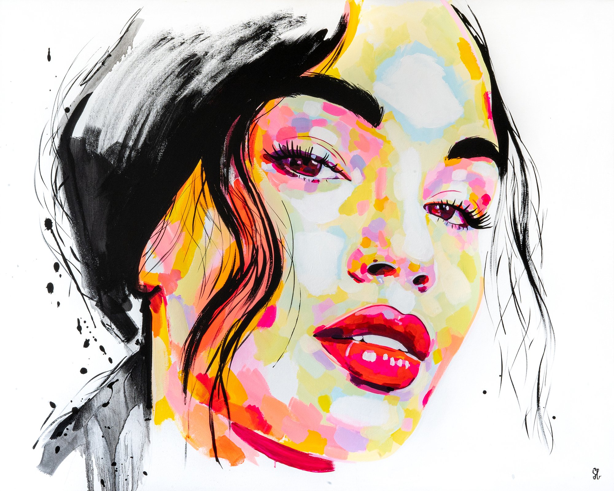
Can you tell us how you balance the use of colours and harmonize them into your work?
I paint really instinctively, the only thing I plan is how I’m going to crop the image. I have no idea what it’s gonna look like in the end. I actually don’t think about the colours I’m using, I just paint what I see, my own reality I guess. I just use primary colours and some fluorescent paint that I mix to represent what I see. I feel like the harmony comes from the black ink I usually apply at the end for the hair and some other details, it brings everything together. That’s the only part of the painting process that is very deliberate.
As an artist, you have a very interesting journey from studying Fine Arts and moving to Montreal and doing painting full-time. What made you decide to concentrate on paintings versus graphic arts?
My dad suddenly passed away in 2018 and I felt like loads of things became irrelevant to me. I wanted to be true to myself. Working as a graphic designer for big companies was not fulfilling anymore. There’s a lot of restrictions in terms of creativity, the bigger the company the more limited you are in terms of creativity. My husband got offered a job in Montreal and we moved to Canada in 2019, I decided to make the switch and work on my paintings full time.

Tell us more about how you choose your subjects (or “warriors“ as you call them) and the development of facial expressions behind the artwork.
Most of the time I use pictures of models, I’m really struggling to paint people I know. I like to have the liberty to depict people’s feelings the way I perceive them. I pick pictures of women that seem to reflect what I’m feeling at a specific time. It’s linked to a song I would listen to on repeat while I’m painting a specific painting, like creating a bubble of a particular feeling. It’s very therapeutic, I focus on a specific emotion, work through it and then I can let go. I don’t ask people to pose for me because I just want to browse images and get struck by a certain expression. I generally start the painting straight away, there’s no overthinking at this stage, it all feels very natural and organic.
How would you describe the difference between your subjects and their journeys through your paintings?
I tend to do closeups because I want to explore the psychology of my models. I remember studying cinema at University and being mesmerized by the psychology of framing. You tell a completely different story from the way you frame a subject. I imagine what they think, what they go through. I think when you paint portraits you always paint yourself in a way. I would say most of my models have subtle emotions. I like to make their hair like they try to stay still in a storm but their hair is the only giveaway of something happening. I believe we can turn negative situations into something beautiful, I like the saying no rain no rainbow.
Amy Fitzgerald

Artist Bio
Amy Fitzgerald is a Toronto-based abstract artist who creates vibrant and whimsical paintings full of colour and joy. She works primarily in acrylic, using a mix of bright colours and bold shapes to create her unique pieces. Her art is a celebration of life, and she hopes to inspire others with her work. She uses her art to explore the relationship between colour and emotions, creating pieces that are both visually stunning and emotionally resonant.
Artist Statement
Colour is a powerful language. From vibrant hues that evoke joy and happiness, to subtle shades that convey a sense of calmness and serenity, colour has the power to capture people’s attention and communicate ideas in an impactful way. As an artist, I love exploring the language of colour through my work — using different hues to create pieces that tell stories of hope, beauty, and joy.
Through my art, I aim to bring more light into the world by conveying uplifting messages of resilience and optimism, evoking a sense of joy though vibrant colours, intricate details, and thought-provoking compositions.

Can you tell us how you balance the use of colours and harmonize them into your work?
My colour work is primarily intuitive, although when intentional I primarily work with triad relationships. I also will at times be inspired by vintage lithograph images and their use of vivid colour combinations.
Aside from colours, you also have incorporated shapes to your works, how does this blend with your vision?
In some of my pieces you can see textured layers. These textures are usually created with found objects from both nature and vintage items. One of my favourite tools is a old biscuit cutter that belonged to my grandmother. The larger shapes tend to be linear and circles. These have personal meanings to me, but with abstract art the feelings they invoke can be unique to each viewer.

Can you tell us more about how you use art to explore the relationship between colour and emotion as mentioned in your bio?
There are cultural associations with many colours. Red can signify love and passion but also anger and rage. But I find that the stories are also told in how the colours work together and the intent behind the piece. My painting - A New View, was created at a time of both transition and strife, but also with great hope for the future. It is painted with the same intense colours as many of my other pieces and yet there is a shadow that I believe comes through in the colour combinations.
Your pieces revolve around stories of hope, beauty, and joy. Can you explain why you choose these concepts among others?
My mother tells a story about when she was a young girl in Texas. She went to visit her grandparents, and it was in the last years of the depression. They lived in a small shack, where the walls were covered in newsprint to keep the sand from blowing through the cracks in the walls. She talks about how grey and sad everything looked, devoid of all colour. And then her grandmother served her strawberry jello. She remembers being taken aback by the intensity of the red in the midst of the dreary. To her it was the most beautiful thing she had ever seen. So when she was grown and had a home of her own she filled it with colour. And that was the world I was raised in. And once again we are living in a world that is filled with uncertainty and darkness. The colour in my work is a manifestation of the joy and love that I believe art can bring into this world.
Jessie Chen

Artist Bio
I am a self-taught artist based in Toronto, Ontario. Growing up in a family of science, I held my first paint brush at a young age of 4 and have been interested in the process of creating art ever since. In recent years, I have re-immersed myself in painting and have been experimenting with different media and techniques. Drawing inspirations from nature, painting mountainous sceneries and treescapes became my means of escape from the uncertainties brought on by the pandemic. Making art helps me rediscover my inner peace, and I hope to convey the calm to my audience. My primary medium is acrylic on various surfaces, but I also work with watercolour, gouache and paper collage.
Artist Statement
As my paintings progress, vivid touches are introduced to the colour palette to bring contrast and life to the neutral and earthy tones. Through my work, I want my audience to experience the still, yet dynamic, landscapes through the use of colours, and to feel the catharsis from within.

Can you tell us how you balance the use of colours and harmonize them into your work?
My earlier works were more "telling it as it is" - the colours used would match closely to what is shown in the reference photo. While I learnt to capture the details of the landscape that way, eventually I found the pieces needed more dimension to really bring the scene to life. With landscapes that contain lots of greenery, I like to have a base layer using red colour, and I would use occasional neon colours- such as pink or bright green, as highlights to balance out the otherwise earthy tone of the painting. For deeper tones, instead of using black paint, I use dark purple or brown so as to not have too much contrast with the bright colours.
How would you describe your experience as a self-taught artist based in Toronto?
I started painting again around the same time when the pandemic first started. The isolation allowed more time for myself to examine the purpose of my art and explore different techniques. At the same time, I was able to connect with other local artists through social media and artist networks and learn through them. Toronto is full of opportunities to showcase your work, and it was a rewarding experience to be able to display your work to the public.

Can you explain the process of drawing inspiration from nature and creating artwork on sceneries and treescapes?
I largely draw my inspiration from landscapes with mountains and a body of water- usually lakes and waterfalls. I examined the contrast of great stillness and the dynamic liveliness through the use of colour. I am attracted to the intricate shadows created by the trees and rocky surface of the mountains. I think such details on a vast natural structure remind me just how minute most of our problems are and in turn bring me a sense of calm, which is what I am inspired to convey to my audience.
Among the different media and techniques you’ve used to create artwork, what would be your personal favourite?
My go-to medium is acrylic paint. It is my personal favourite because of its versatility- it can be as lightweight as watercolour, allows multiple layerings to create endless possibilities and yet also forgiving at the same time. I like to paint on wood panels for a smoother finish.
Also Read: Event Space Toronto, wedding venue Toronto, Wedding Reception Toronto