"FORM & FREEDOM" GET TO KNOW THE ARTISTS!
Form & Freedom will be Twist Gallery’s first 3-month long exhibit running from Oct. 3 to Dec. 16, 2024. Featuring bold abstract works, this collection celebrates the tension between form and fluidity, inviting viewers to experience the beauty of artistic freedom and the power of creative exploration. Twist invites readers to meet the artists and dive into their unique creative processes.
In honour of the theme, Form & Freedom, Twist Gallery is scrapping our usual form of only month long exhibits. Form & Freedom will be Twist’s first 3-month long exhibit running from Oct. 3 to Dec. 16, 2024. This theme explores the dynamic relationship between structure and expression. Featuring bold abstract works, this collection celebrates the tension between form and fluidity, inviting viewers to experience the beauty of artistic freedom and the power of creative exploration.
The vibrant, abstract art exhibit features the dynamic works of eight local artists, showcasing a kaleidoscope of colours, textures, and forms. Each artist brings an unique perspective, blending bold hues and imaginative techniques to create captivating visual experiences. The exhibit celebrates diversity and creativity, offering visitors an immersive journey through contemporary abstract expression, reflecting the rich talent and innovation within the local Toronto art community.
Twist Gallery will be holding the opening reception for the Form & Freedom exhibit on October 24th, 2024 from 6-9pm. Each artist involved in the exhibit has unique perspectives, techniques, and creative processes. Although, they all experience artist intuition in their own ways.
ellee sy lee


As a Korean-Canadian, Ellee SY Lee is influenced by Eastern and Western cultures which helps her to create art shaped by the dual influences. She’s fascinated by how post-impressionists used colour emotionally and expressively, employing basic shapes and distinct brushstrokes.
“I’m intrigued by the philosophical and spiritual notions rooted in Eastern traditional landscapes, which emphasize simplicity, spontaneity, and naturalness, often expressed through simple lines and shapes,” said Lee.
Lee combines these influences in her work to experiment with new visuality through the interplay of bold colours and simplified shapes and lines. After returning from a decade-long break, Lee aimed to create paintings that evoke positive feelings, offering a “temporary respite from a fatiguing and monotonous world.”
“I had realized art is powerful enough to console frail souls and enrich our lives after spending time away from my artistic practice,” Lee said.
In the past, Lee created abstract painting influenced by abstract expressionism and non-representational art, without reference to anything outside of artwork. Now that she has grown an appreciation for nature and its significance, Lee creates semi-abstract paintings where natural motifs recur, and referential images are often used.
“I see the interplay of colours, lines, shapes, and perspectives as a metaphor for mutual interactions occurring in nature and life, making the world interconnected,” said Lee.
Lee hopes viewers feel a sense of connectivity while experiencing positive energy and expanding their imagination through her art.
colleen todd


Each of Colleen Todd’s paintings has a “one of a kind” identity. Ironically, she doesn’t set out to make each of her paintings unique and one of a kind. It simply happens organically.
According to Todd, each piece is influenced by the mood she’s in the day she starts her painting. From the colours and tools she chooses to use, to the mixed media pieces she decides to incorporate, the end result is always unexpected.
Todd says it’s an amazing feeling when one of her pieces creates a connection with someone. When looking at abstract art, it isn’t a recognizable object or scene and yet it can tap into feelings and emotions that are unexplainable, helping create emotions, intrigue and mood.
Todd believes in art “speaking to you” and hopes her pieces evoke that feeling in others. Her pieces decide when they are finished. Sometimes it happens quickly, sometimes months but it happens when it feels like there’s nothing more to add.
douglas robinson


Before Douglas Robinson returned to painting full-time, he had a successful career in advertising. His desire to get back to his creative roots helped him decide to leave the advertising space.
“As a creative person, I believe painting is one of the purest expressions of creation,” said Robinson. “The creation of art is an individual pursuit, a quest for freedom and self-discovery.”
Robinson has always felt he was meant to paint, draw and design. His paintings are visual stories formed by his life experiences, his journey, and his connections.
“These stories through design, colour, texture, mark making, and sheer abandonment create a connection, evoke emotions and reactions,” said Robinson. “Colours help to connect with moods and desires while contrast is used to convey energy and reactions.”
Robinson uses form to create a journey through each piece. Form helps to create a flow, guiding you through each painting. He uses form in his work like a visual beginning and end through a novel.
“My journey is a creative path with no limitations and the courage to follow my heart,” said Robinson.
Freedom is a concept that Robinson uses in his work to express the type of energy he wants. He uses large spontaneous strokes to create more energy and voice, whereas smaller strokes and mark making create quieter conversations. Robinson sees painting as a journey of self-discovery.
“I’m at a point in my return to painting that I’m beginning to follow the spontaneity within me and the more I do that, the freer I paint,” said Robinson.
His work is constantly evolving everyday that he paints. He is pursuing imperfection and not perfection.
Tina ding


Tina Ding often draws inspiration from the countries she has travelled to, transforming real scenery and objective facts into lyrical and contextual images. Her journeys help allow her to see the world not just as it is, but how it feels, “a synthesis of reality and imagination.”
The experience of immersing herself in such places around the world transforms her artistic perspective. This led Ding to focus on the flow of colours and shapes that reflect her emotional connection to the scene.
One of Ding’s goals is to paint the “joy of living” and bring happiness, peace, and delight to her audience. To convey this she focuses on vibrant colours, dynamic movement, and organic shapes that radiate life and energy.
“Colour is a central element for me,” said Ding. “I use bright, bold hues that can uplift and energize, evoking emotions of happiness and warmth.”
Ding also pays close attention to the flow and rhythm of the composition.
“By creating movement through brushstrokes and abstract shapes, I aim to capture a sense of vitality, a pulse that mirrors the experience of being in the moment and feeling connected to life,” said Ding.
Her goal is to offer her audience a moment of peace, joy, and reflection by immersing viewers in an environment where light, colour, and form come together in harmony, drawing them into a space of serenity and delight.
Balancing the lyrical and contextual elements in her art comes from emerging the emotional impact of a scene with its physical presence. While she begins with real-world inspiration — a landscape, a moment in nature — her focus shifts towards translating the feeling the place evokes, rather than reproducing it.
“The contextual aspect grounds the work, often providing recognizable forms or details, while the lyrical dimension emerges through my use of colour, abstraction, and expressive brush work,” said Ding.
Over the years her painting style has evolved from a more representational approach to one that embraces abstraction and emotional expression. She has increasingly become more focused on how to convey the essence of a scene through colour, movement, and composition rather than depicting it exactly as it appears.
“Ultimately it’s about capturing the essence of a moment, not just its appearance,” said Ding. “By blending the concrete with the poetic, I invite viewers to experience both the beauty of the physical and the deeper emotions it stirs with them.”
Recently, Ding has been experimenting with more vibrant, contrasting colours and looser brushstrokes to capture the energy of nature. Her materials have also shifted towards a mix of thicker acrylics and layered textures to achieve a sense of depth and fluidity. This allows Ding to explore how abstract forms can evoke both visual and emotional qualities of the natural world.
Amy Armstrong


Amy Armstrong uses texture to tell a story with her art. Each layer she paints adds depth and intrigue, each layer building on the one before. Armstrong compares this to life — every year, every lesson, every adventure building off the one before. Each experience, whether bad or good, is important for making a fulfilling life.
“Each layer matters and without the layers that make up the texture in art, it wouldn't be the same or have the depth that I long for — in my art and in life,” said Armstrong.
When viewers look at her artwork in person, the various layers and how each builds on the next is clear. There are pops of colour shining through along with markings, patterns and expressive brush strokes.
Acrylics are her favourite medium for achieving depth, and building on each layer. How thick each layer is depends on what she is trying to achieve. Much of Armstrong’s process is an intuitive response.
“There’s part of me that knows when a certain colour or marking should show through the layers or when much of it should be concealed,” said Armstrong. “This is the part that I love about creating abstract art and letting things truly flow when I’m painting without having too many rules and restrictions.”
The first thing Armstrong thinks of when she hears “Form & Freedom” is organized chaos. The collection that’s currently at Twist Gallery represents having a plan but allowing spontaneity to be included too. The first few layers of her collection represent the freedom part of the exhibit with markings, whimsical and expressive brush strokes, unusual patterns, and various layers.
Form comes in when Armstrong uses unique techniques to create lines that cover the layers but still allow certain parts of the underlayer to be visible in different ways. The lines she uses are vertical and horizontal which adhere to the form part of the exhibit.
“More layers, colours, and markings were all needed to create more depth and tell the full story,” said Armstrong.
Some of the pieces in this collection have so many layers because she felt like the pieces weren’t finished yet. It is an intuitive decision for Armstrong, and she knew some of the piece’s stories weren’t done yet.
helena krolak


Helena Krolak was inspired to transition from a long career in the tech industry to becoming a full-time artist after reaching a tipping point. She says she kept receiving signs that she should return to the art industry but would continuously ignore them. This went on until one day she had enough. Krolak decided that she would invest in herself wholeheartedly and try a different path. She took a chance, and started painting again.
She decided she would commit to three months and go from there. After the first three months, she decided to give herself another three months, and so on.
“It wasn’t easy, but by making that initial choice, I gave myself permission to try regardless of the outcome and that was the pivotal factor,” said Krolak.
Krolak often uses themes of healing, harmony, and authenticity in her work. To her, freedom is achieved when people are most themselves.
“It’s not a place you reach, but a state that you embody; to freely express your truth and authenticity,” said Krolak.
Krolak’s journey then became about reaching that embodiment. In order for her to feel truly free, her journey included healing her limiting beliefs and past trauma. Her journey also included radical acceptance, a deeper understanding of herself, and a willingness to be open to larger internal shifts.
As Krolak worked on healing, she evolved and found more harmony and balance within herself. WIth that inner understanding, she could clearly see the balancing and harmonizing outside of herself which led to freely expressing what was previously unexpressed.
“The fluidity and flow of my work in this exhibit captures the feelings of that healing, evolution, and that ultimate expression of that embodiment of freedom,” said Krolak.
Krolak feels like her creative process continues to evolve. This evolution includes more exploration of various levels of play and doing away with any perceived boundaries. Each evolution, Krolak focuses on various elements and combinations. Whether it’s remembering past skills or trying completely new misting or splatter techniques. As Krolak evolves, by extension, her work evolves too.
“Not only do I feel the shifts internally, but I get to experience them through my art and see them in my finished pieces,” said Krolak.
maylin morales


Maylin Morales spent over a decade in the technology field as a programmer and data scientist. She uses painting to escape from her analytical mind and enter a state where she allows herself to be playful and free.
“The ego needs to be removed to allow creativity to flow; stepping away from perfectionism and trusting the process,” said Morales.
She also loves the physicality and movement involved in working on a big canvas for hours. Morales’s Cuban heritage is very present in her artistic process. She loves to listen to Cuban music and dance while she is painting a piece.
“It’s a great ingredient that reflects in the vibrancy of my work and I hope others can feel it too,” said Morales. “I am very proud of my Cuban heritage.”
Although the subject of Morales’ work is not directly related to the broader Latina experience, it’s a big part of who she is. Morales sees the theme of Form & Freedom as a paradox. Her experience managing software development projects has been helpful in managing her own art projects and setting goals as an artist.
“I believe being an artist is a balancing act between both [form and freedom],” said Morales. “Experiencing artistic freedom and the structured aspects and discipline required to maintain an art practice in general.”
In the past, Morales has mentioned her process as a journey “from sounds to emotion, from emotion to colours.” Music is essential to her creative process as it has the power to evoke deep emotions in her.
“I intuitively translate those emotions and sounds into colours, so they can also be experienced visually,” said Morales.
When Morales hears drum beats, they make her feel grounded and connected to the earth. She then associates that feeling with red hues and the element of fire. These personal associations allow Morales to create her own language.
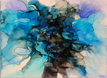
kristen stephen


Kristen Stephen’s use of India inks on canvas is central to her creative process. They offer a fluidity that aligns with Stephen’s desire to create paintings where the canvas itself becomes an integral part of the work, not just a passive surface. She was inspired by Helen Frankenthaler’s technique of allowing pigments to soak into the canvas. Stephen embraces the idea that the material should interact with the medium.
“By dyeing the canvas, I create a base that feels organic, as if the painting is growing from within rather than being applied on top,” said Stephen.
This unique approach allows for harmony and spontaneity as she layers inks in a way that feels instinctual, constantly responding to how the inks absorb and flow. When approaching a blank canvas, Stephen relies entirely on her feelings or experiences, letting her instinct guide her. This process is deeply subconscious for Stephen. There’s no predetermined image or structure for her pieces.
“I allow the painting to unfold naturally through many layers of ink, with each mark feeling like an expression of something deeper,” said Stephen.
Her work embraces Carl Jungian’s ideals and explores the subconscious by using her spontaneous actions to reveal the inner truth of the piece. Blue frequently dominates Stephen’s palette, as it feels most aligned with her emotional state. Love, sadness, and the human spirit are all recurring themes in her work. These themes emerge organically, echoing her emotional landscape.
“Despite differing opinions of my use of glitter and diamond dust, I find them irresistible,” said Stephen. “They add a touch of seduction and allure to the depth of the work.”
While Stephen’s work often reflects her personal insights and emotions, she finds it difficult to openly explain the specific stories behind them. The process of painting allows her to express these feelings without the need for words, creating an emotional connection between the piece and the viewer. Attending art gallery openings is still an important part of Stephen’s practice, as it helps her stay connected to the broader art community and inspires new directions in her own work.
Growing up in her mother’s gallery was a formative experience that profoundly shaped Stephen’s relationship with art. From an early age, she was exposed to a wide variety of artistic techniques and styles, which fueled her curiosity and passion for painting. Being immersed in that environment nurtured her understanding of how artists express themselves and how art connects with people emotionally. This early exposure instilled in Stephen a sense of dedication and discipline towards the craft.
To fully immerse yourself into the exhibit, visit Twist Gallery in person at 1100 Queen Street West, Toronto. The exhibit will run from Oct. 3 to Dec. 16, 2024. All artwork sizing and pricing is available on Twist’s art for sale page.
Twist Gallery will be holding the free opening reception for the Form & Freedom exhibit on Oct. 24, 2024 from 6-9pm. This is where viewers can engage with the artists and fellow art lovers to further explore the stories behind the artwork.

In Depth with The Evergreen Artists
We had the opportunity to chat with the nine artists featured in the Evergreen Exhibition this fall! They opened up to us and allowed us to understand their artistic process and what inspired them to paint. Keep reading to learn more about these amazing artists and gain insights into what drives them to keep creating.
We had the opportunity to chat with the nine artists featured in the Evergreen Exhibition this fall! They opened up to us and allowed us to understand their artistic process and what inspired them to paint. Keep reading to learn more about these amazing artists and gain insights into what drives them to keep creating.

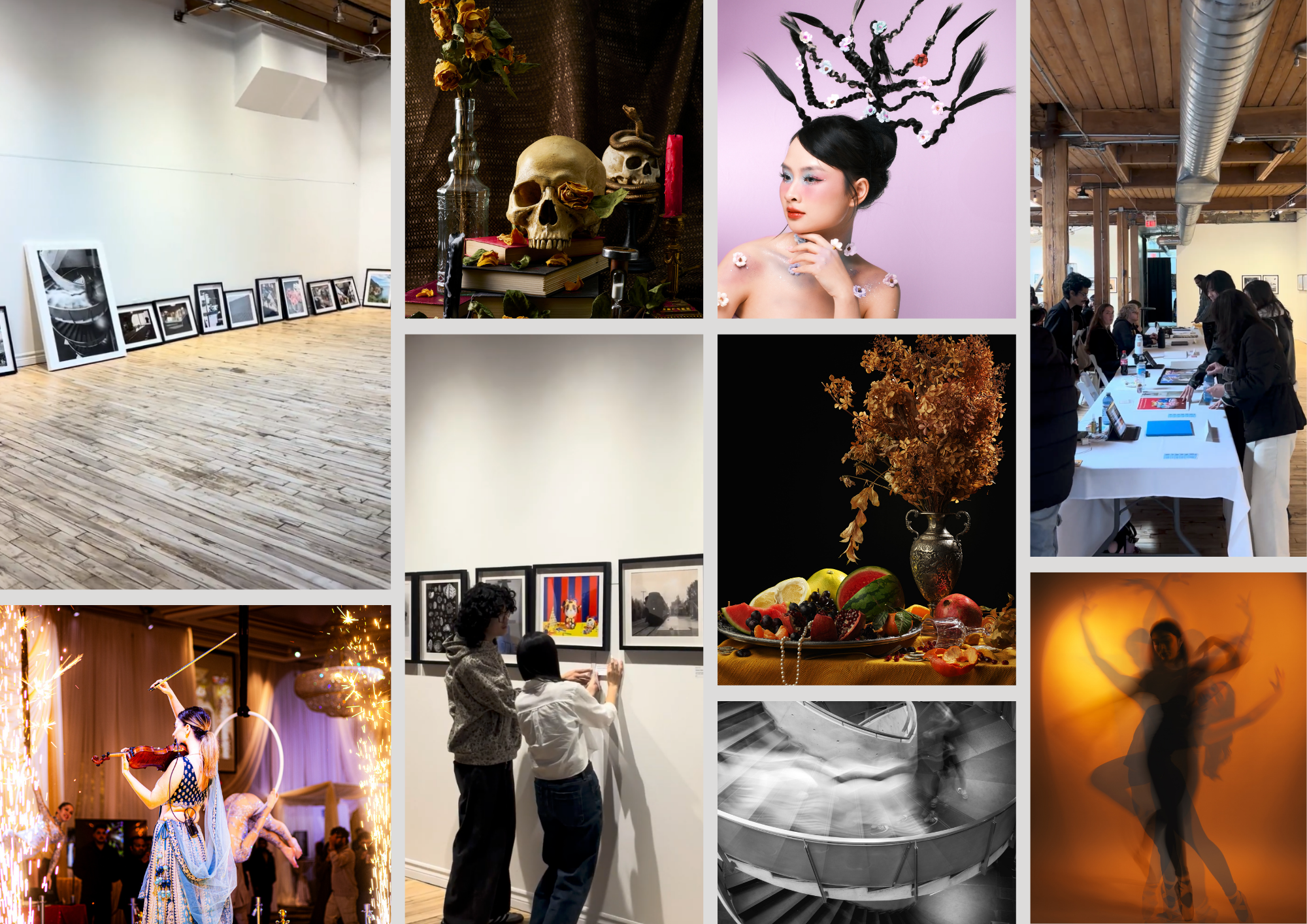
The Evergreen artists at Opening Reception!
Ewa Stryjnik
Ewa Stryjnik is a familiar face here at Twist Gallery, Evergreen is the third exhibition she has participated in. Many of Ewa’s paintings are influenced by the vast and uninhabited regions of Northern Canada. Ewa feels it is a privilege to live in one of the most beautiful countries of the world where one can still experience the pristine, natural territories. With her landscape paintings, Ewa invites the viewer to walk through the lands she’s visited and experience the topography; the natural and physical features of the area, as well as, the moods of the weather.

Labrador 3 (Battle Harbour) | 54" x 48" | $3500 | by Ewa Stryjnik
Over the years, Ewa has adapted her creative practice. For years, she loved to apply multiple layers on the canvas. Allowing for the colours and shapes to peak through, in order to create the complexity of the surface. Lately, she simplifies the layers, opening up bigger fields to bring calmness and clarity to her paintings. Ewa’s paintings project happy and positive energy, which she achieves with bright, saturated colours.
Theo McLaren
Theo McLaren has been drawing and painting for over 40 years. Recently, Theo has adopted monoprinting; she enjoys this technique because it is a more spontaneous and intuitive method of mark-making.
Her favourite piece from the Evergreen is “River Flow.” It is a piece inspired by watching the tide in New Brunswick. She was fascinated by the patterns the water was leaving behind in the sand.

River Flow | 20" x 14" | $400 | by Theo McLaren
Theo’s current artwork is about a memory of a place, traveling through the Canadian landscape. When you are alone in the forest or in the vast hills you think about where you have been or where you are going next. Or sometimes you pass by without really looking - but that image stays in your mind and resurfaces later.
Monique Parlevliet
Monique Parlevliet started working primarily with oil paint in 2021, after painting with acrylic for years prior. She finds the motivation to create in the hopes that those around her will enjoy it. When she finishes a painting, Monique always makes sure to share it with her family because she knows it will put a smile on their faces.
When creating, Monique tries to not spend a load of time on one painting. It is easy for her to get caught up in “small details”, which you can tell from her beautifully detailed work. She likes to keep her paintings on the impressionist side, which she can easily end up overthinking and overworking if she spends too long on it.

Beaver Valley | 16"x 20" | $1100 | by Monique Parlevliet
Monique finds inspiration from seemingly plain but scenic views of trails, fields and lakes in places she travels to. Growing up in a small farm town, she is influenced by her love of fields, which is something that some people might see every day but never fully appreciate. Monique used to think that landscapes had to be beautiful and one of a kind to be worth painting, like giant mountains or a crystal clear lake. She has since come to appreciate the beauty in more common scenes
Nerso
For Nerso, Evergreen is his first group exhibit and that makes it very dear to his heart. It is a new experience, meeting other artists, and gaining new perspectives. Overall, Nerso is very excited to take part in the exhibit.
As an introvert, Nerso is accustomed to painting in the nook of his basement. He still manages to create even when natural lighting is scarce. Out of Nerso’s whole Evergreen collection “Pink Parasol '' is his favourite painting.
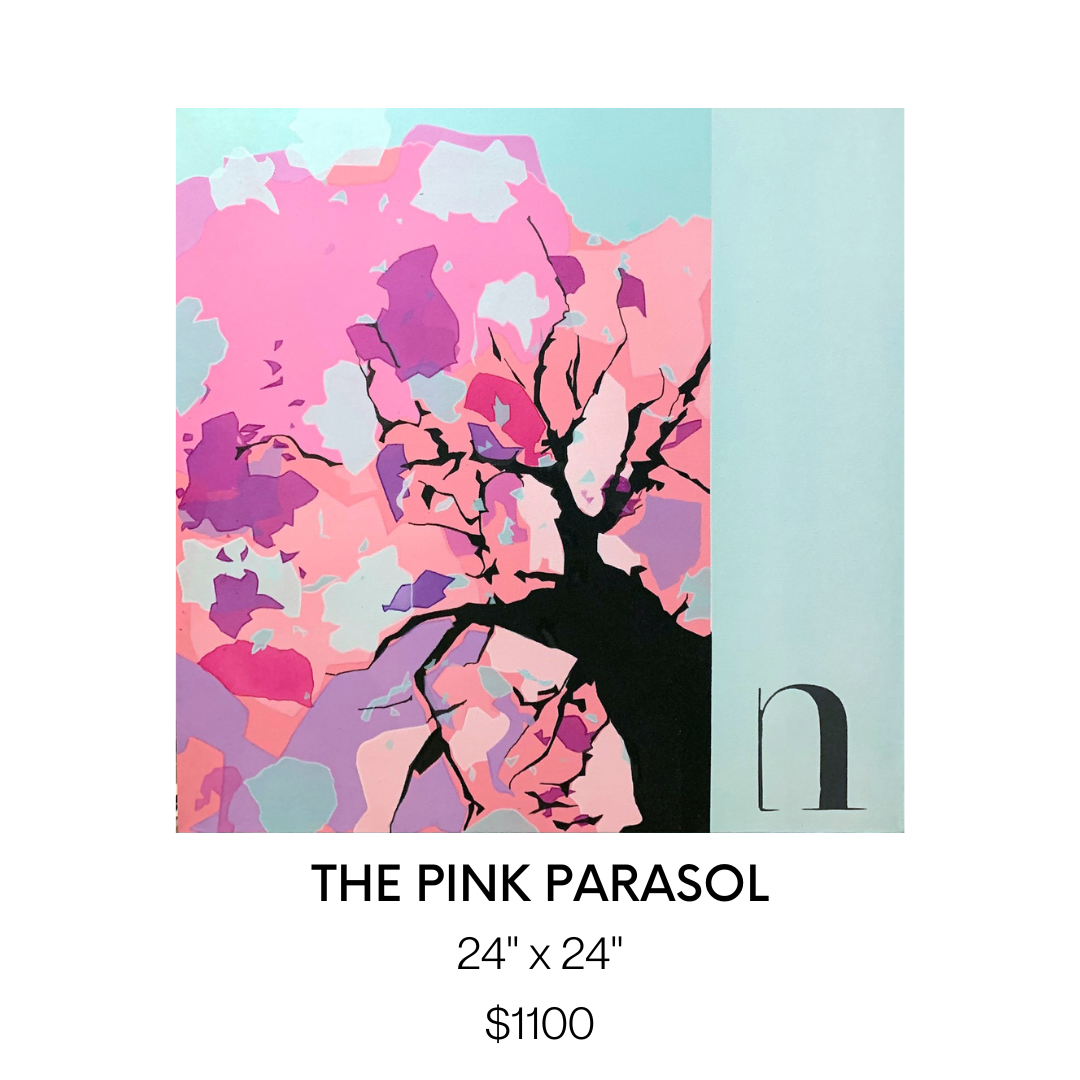
The Pink Parasol | 24" x 24" | $1100 | by Nerso
Family is very important to him. The branches symbolize the protecting arms of a family and the pink parasol itself represents the bonds within a family, characterized by deep affection, respect, loyalty, and unconditional love. What viewers can take away from his art is a state of being calm, peaceful, and untroubled.
Michael Brennan
Michael Brennan’s motivation to paint fulfills the need to practice creativity and freedom. After years of making art for other people commercially, it feels good to have the freedom to make his own choices and make something for himself. Michael is endlessly experimenting with materials, paints, brushes, and surfaces. Constantly trying out new things or painting at new locations to keep him stimulated every day. As an artist, Michael finds he is learning something new about art, so he can't get enough.
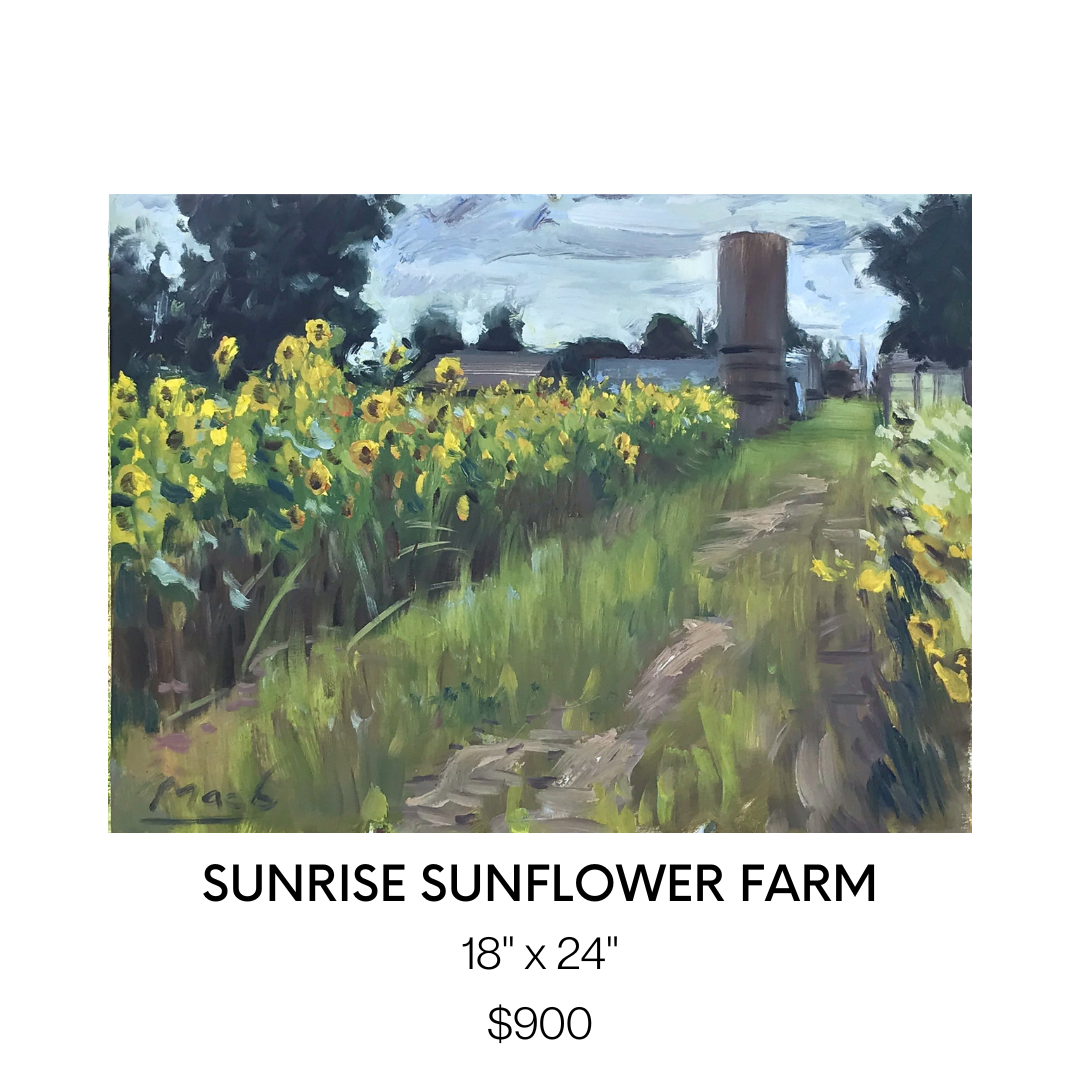
Sunrise Sunflower Farm | 18" x 24" | $900 | by Michael Brennan
The hardest part of creating a painting for Micheal is making it look fresh and spontaneous. He finds it easier to get the look he’s after when working from life, but there are times it just doesn't work out and it is better to just start over instead of reworking. That is one of the reasons why he enjoys painting with oil. He can wipe and start over.
For Evergreen, Michael shares his space in the gallery with his aunt Maria Grazia. They come from a creative family, so he finds it nice to have a collaboration where they can showcase work together. We couldn’t agree more!
Maria Grazia
For Maria Grazia, painting is equivalent to a type of meditation. Her focal point is what inspires and moves her the most in life and that’s why most of her subjects include the natural world, whether it's the sky, water, trees, or flowers.
Maria has learned over the years that ALL paintings go through an “ugly” or not-so-desirable stage. Back when she was first learning to paint she threw away a lot of paper and painted over a lot of canvases because she would not like something she painted and just give up. Now Maria knows that it's only a natural part of the process and if she keeps at it, the piece transforms right in front of her eyes.

Quiet Is The Night | 11” x 14” | $240 | by Maria Grazia
The paintings Maria features in Evergreen specifically highlight the sky. Maria loves the sky and that’s why she paints it. She lives on the 20th floor of a condo and it faces the West, so almost every night of the week she is treated to a beautiful light show of various stunning colours during sunset. Nature is a master artist and it inspires her!
Janet Horne Cozens
Janet Horne Cozens is drawn to painting Canadian landscapes because they were part of her childhood, growing up in Northern Ontario. Even after decades of living in Southern Ontario, she still feels that sense of "home" when traveling north and experiencing the rocks, the trees, the water, and the skies of that area.
Painting landscapes is a very personal expression of Janet’s life journey. Janet sees herself as an ambassador of the Northern Experience, not only the physical world but also of the culture and spirituality that exists in Northern Ontario. It's hard for her to explain in words but there is a different feeling that you experience when you are outdoors there - a sense of awe at the natural world, a connection to the land that is fostered by the natives, a sense of vastness and separation from others, and a serenity that one cannot find in the hustle and bustle of the big city or urban sprawl. She tries to convey those impressions and experiences to the viewer in my work.

Reflections (BLACK RIVER) | 30" x 40" | $2000 | by Janet Horne Cozens
Janet’s style of painting is influenced by Canadian artist, Tom Thomas. When Janet studied at Ontario College of Art (now OCAD), she used to spend hours pouring over his small plywood oil sketches that were kept in drawers in the gallery, taking in each brush stroke. Janet’s favourite work of his is Morning, now in the Tom Thomson Gallery in Owen Sound, because of the colours that he uses in it: purples and pinks and mauves.
Janet loves indigenous art of all styles because at first glance it seems so simple, but as you look at it you become aware of the artist's personality, culture, and personal experiences coming through in the art.
Heather Munsie
Throughout Heather Munsie’s artistic career, she’s had lots of support and inspiration. Heather and her husband travel to find references for her paintings and her husband’s enthusiasm and support keep her going.
When she first started painting, living in Calgary, Heather had a mentor who pushed her to deeply analyze a scene and gave her the confidence to pursue painting as a career. Heather is inspired by master painters and her current favorite is William Blaire Bruce (b. 1859) from Hamilton, Ontario.

Rapids Amphitheater | 22”x 30” | $1000 | by Heather Munsie
Prior to being a painter, Heather was a geologist. Both geology and painting involves looking at the bigger picture and working down to the details. Heather has an appreciation for the complexity of how the terrain was formed and strives to paint accurately to best depict the geology of the landscape.
When she’s outdoors it’s easy to feel the energy of the scene because it engages all senses. “The trick is to hold onto the energy of the location and bring that into the studio.” Heather will ask herself these questions; “How do I make this scene feel stormy? How do I make this ice feel glassy? What texture is needed to make the water feel frothy?” By paying attention to how something feels, she can vary the texture of the paint and brush strokes to best suit the scene.
As an artist Heather wants viewers to notice the little things – the glowing ochre tinge on a tree or the vibrant rust color of water when the light hits it. There’s so much variety outdoors and she strives to bring those details onto the canvas so that the viewer can experience what caught her attention.
Danilo Ursini
Danilo Ursini’s inspiration is dictated to represent the intersection of an imaginary line between reality and fantasy. For Danilo painting represents a way of learning himself, representing a subject, with the background with the lights (strengths) and shadows (defects). Danilo likes painting without judgment, he tries to be as objective as possible, like a photo, which stops in a special instant.
His painting style is inspired by his love of the Group of Seven. Many of his paintings feature trees, they represent an extraordinary being that moves in time and space, like following and changing every season, every year. Danilo’s painting Fall n3 was inspired by reality. It was autumn, Sunday afternoon, and he was sitting on the coast of Lake Algonquin Provincial Park.

FALL n 3 | 15” x 60” | $1250 | by Danilo Ursini
Closing Thoughts…
Each individual artist represents the meaning of Evergreen with their own unique style and creative process behind their paintings. Taking inspiration from the natural world, their artwork is a great reminder of the brilliant landscape across Canada.
We would like to thank all of these fantastic artists for their dedication to creating beautiful and meaningful art. Of which, our Evergreen exhibition would not have come to life in the way it has. We hope that Evergreen motivates you to explore the Canadian outdoors and to embrace and preserve the beauty of nature for future generations to come.
Useful Links: Event Space Toronto, wedding venue Toronto, Wedding Reception Toronto

Interviewing Our 8 Vibrance Artists
Twist Gallery is very excited to showcase our new exhibit Vibrance, and give you a chance to get to know the 8 talented artists on a deeper level to better understand their artistic process. Vibrance is centred around life’s moments, both in the mundane and the exciting, encouraging our intertwined connectivity of the human experience. We asked our artists some questions about the ‘vibrancy’ of their work. To find out more, keep reading!
Twist Gallery is very excited to showcase our new exhibit Vibrance, and give you a chance to get to know the 8 talented artists on a deeper level to better understand their artistic process. Vibrance is centred around life’s moments, both in the mundane and the exciting, encouraging our intertwined connectivity of the human experience. We asked our artists some questions about the ‘vibrancy’ of their work. To find out more, keep reading!
Amanda Pistillo
Amanda is a self-taught artist whose work is centred around the feeling of joy, the tranquility of being happy, and extending that to others. She hopes to entice a feeling of inspiration and motivation in others to create their own unique art work.
How does the title ‘Vibrance’ connect to you and your art?
"Vibrance" to me and in terms of my art is about the light that radiates within your heart and soul. It is that powerful energy that brings forth happiness and love! Each piece that I create is a one-of-a-kind creation always made with lots of love and with the hope that they bring happiness to others!

All of your paintings are centred around John Lennon. What aspects of his life inspired your work?
John Lennon's empowering mission for a world with peace and love coupled with his never-ending call for inner courage and strength are very inspirational to me. I wanted to try and capture the light and radiance of his heart and soul within my artwork.
How have you cultivated such a unique style of painting?
I love to create art, it helps to centre me and brings me so much peace. Over time I have learned to exercise a sense of courage when creating my art, just being totally free. I enjoy using a rainbow of colours within my work, along with an edgy/sweet kind of look. I never have an exact plan of how the piece will turn out, I just go with the flow and try to be fearless. I've found that the best process for me when I'm creating my art is to just listen to my heart and let go of any control.

Do you have any advice for beginner artists who are nervous to explore new mediums and areas of art?
I think it's really important to be yourself and to have a sense of fearlessness when creating your art. There are going to be people who will have opinions about what you have created and want to change your style of art, but always remember how unique you are and to never conform to other people's expectations. Always believe in your art and in who you are. Your art is a reflection of you, and all of your divine creativity and your beautiful soul! Always remember to keep persevering, try new techniques, and always always stay true to yourself!
Daniella Williams
Daniella is keen on expression, keen on capturing the moments that truly make us human. Whether it be alone, with a partner, in a public setting with strangers… she makes sure to grasp deep emotion in a way that makes the viewer feel comfortable and understanding. Daniella focuses on all of the little details that are incredibly important in the final composition of her piece, and will make sure to capture every angle and shadow.
How does the title ‘Vibrance’ connect to you and your art?
I wanted to be a part of Vibrance because I felt that the concept and title of the show was one that reflected the overall essence of my work. My paintings emphasize colour and dynamic imagery of people in mundane scenes. Therefore, when I begin a painting my end vision is a scene where I have pushed the colours and skin tones of the subjects in unexpected ways. I want my paintings to be vibrant and energetic as well as probe the viewer to ask questions about the narratives I develop.

Why have you explored the themes of intimacy, self-reflection and voyeurism with your Domesticity collection?
My work touches on themes of intimacy, self-reflection and voyeurism because I’ve always been concerned with the idea of being perceived. I want to explore the tension and discomfort that exists in this as an individual but then paint it in a way that feels intimate to the viewer. As curious humans we love to get a look into the psyche and inner experiences of people around us; hence our fixation on social media and consuming images. Similarly, I have struggled with my own body image, and self-perception as a young bi-racial woman in an age of internet and image consumption, so it's always felt important to create paintings about these ideas.
What is the narrative behind the Domesticity paintings?
The Domesticity series paintings are meant to follow the domestic lives of four young adults who share a home. Their relationship to one another is ambiguous and highlighted by their inherent separateness in each scene. The setting of each painting is clearly a home yet none of the inhabitants ever meet the others gaze or interact. Domesticity was meant to be a look inside a troubled home life, one that looks bright and beautiful at first glance but harbours tension and restlessness at a second glance.

How do you choose your muse for your paintings? (Are they friends of yours? Models? Strangers?)
The subjects of my paintings really depend on where I am and what I’m feeling inspired by at the time. A lot of my most recent pieces were of friends who I had sit and act out different scenarios and narratives for me. Whereas many of my other paintings are of strangers I capture in passing. For instance, my newest painting “In A Sea Full of Women’ was a collage of several people I observed on different beaches in Italy and Greece. Mainly what I look for in my subject is a sense of mundanity, I want them to look like everyday people and to tell some kind of story in their expressions or body language.
Sandra Lambert
Sandra has a spirit that can be seen directly through her paintings. She focuses on the things that make her happy and takes inspiration from the little parts of life that may be overlooked otherwise. High saturation and crisp lines in her art convey an intense wave of emotion and expression.
How does the title ‘Vibrance’ connect to you and your art?
My first love in painting is colour. I’ve always been attracted to fresh, bright colours - colours that remind me of summer gardens or brightly coloured insects and birds. Loving the colours in nature, I’ve wanted to capture that feeling of freshness and aliveness without limiting myself to representation. So, it’s more of a desire to express the essence of an experience of nature - fields, sunset, fruit, flowers, insects, birds - the vitality that, at our core, we share with the natural world.

What attracted you to painting utilizing such rich saturated hues?
When I discovered acrylic gouaches- especially the Japanese colours- I fell in love with them. I rarely mix them, instead using them straight from the tube. They convey the intensity of my emotions and my experience of being saturated with the beauty of the world around me - an intensity that is difficult to convey in words, other than poetry, but seems to come more easily in the language of paint.
What would you say your biggest inspiration has been during your art journey?
I am like a sponge, soaking up visual stimuli- natural and urban landscapes and the work of other artists. I think it was John Berger who talked about the importance of receptivity in the act of painting. That resonates for me- what you take in then moves through you and into the paintings. It’s not that you don’t need to learn techniques and practice a hell of a lot, but I think it’s good to stay open and receptive to the world around you and the impulses of your own soul.
What drives you to create? How does it impact your personal growth?
I don’t really know what drives me to paint, other than I’m not happy if I’m not making something. And there’s nothing like the feeling of being completely absorbed in making a piece of art; it’s that loss of self-consciousness, that sense of rightness, of doing what I’m supposed to be doing. Also I never get bored- there’s always a new idea and something new to learn and try, and you can never get complacent because you can never really capture what you set out to capture so it’s always in front of you like a breathtaking view that is never reached because it’s always just around the next bend in the road.

How do you know when to stop, when do you really know when a piece is finished?
I used to overpaint more than I do now. I didn’t trust what I was doing and was trying too hard and worrying about the end product. I do that less now and trust more in the process. It helps to work on 2 or 3 pieces at a time so you don’t get hung up on getting one perfect. Maybe that is something I’m learning from painting- perfection is not where it’s at in art or in life- instead it’s trying, experimenting, failing sometimes and succeeding sometimes, but keeping on working with an open mind and a playful spirit. Also there are happy accidents - ‘mistakes’ that turn out to be wonderful surprises. I’m trying to keep that attitude in regards to other parts of my life - what we hope and expect often do not occur but sometimes what seems ‘wrong’ can turn out to be a gift.
Allen Ford
Allen, a man well versed in our society’s natural fast pace and how our minds can interpret the advertising all around us, excels in collage style art that encourages the viewer to expand their horizons across many places. He uses second-hand bright and colourful advertising materials to create a whole new piece of art, enticing a sense of unusual inspiration from many different things at once.
How does the title ‘Vibrance’ connect to you and your art?
Excellent question! I feel vibrancy in my art is found in creating new meaning with the posters. Originally all these posters have a clear meaning and intent. Take the huge panel with the Andy Warhol poster from the AGO exhibit. Originally that poster had a very clear purpose. But rip it, tear it, and mash it up with other posters, and something new and unexpected is created with its own energy and meaning. To me that is vibrant.

Your collages reinterpreted old advertising posters from across the city. How do you see advertisements subconsciously affecting our decisions making as consumers?
Advertisements affect our decisions just as all other forms of inspiration do. We are first triggered not by the entirety of something but by one single element of it. It's like being at a club...or an opening night of an art show! You see somebody across the way, you don't know them but the way they wear their hair, or stand, or hold their glass connects with you. Advertising is no different. We see or hear a word, see an image or a colour, and it sticks. And you then want to know more.
What does your artist process look like?
It looks like a mess! When I am in full creating mode, my apartment...err...studio is literally strewn with posters and panels. I then proceed to mimic a squirrel in a park digging for nuts. I know a specific poster is buried somewhere, I just need to find it! There is usually one core poster fragment I build around. It might feature a word or sentence, or perhaps an image or colour. With that foundation, I simply look to then build around it as I add, shuffle, rotate, and rip other poster fragments in. I rarely have a defined image I am looking to create though. It is very much a process that is about finding the finished image. And when do I know something is finished? When I get a tingle on my arms, a smile on my face, and start nodding. Then I know I have created something!

What do you hope the viewer draws from engaging with your work?
I like to imagine viewers of my work as a kind of urban archaeologist. This art requires viewers to reconstruct what they see, but also imagine and parse what they can't. I feel viewing my art also asks people to be creative themselves. These posters, once all ripped and torn, all fragmented words and images, ask every viewer to create their own meaning, find their own inspiration.
Eleanor Lowden
Eleanor’s art will take the viewer to a universal happy place - a beautiful garden, which holds the power to be exactly what we need as humans. She makes sure to share her beautiful imaginations in a way that is inviting while also exciting.
How does the title ‘Vibrance’ connect to you and your art?
It’s such a pleasure to be part of the Vibrance Show at Twist Gallery. I think my work often reflects a certain vibrance, the colours and the mood and the settings that inspire me. I’m thrilled to be showcasing my work with this group of artists whose work I admire.

What inspired you to create your Joyful Garden Series during the pandemic?
I began my Joyful Garden series during the pandemic in the summer of 2020. I was living in a condo with no garden of my own. During lockdown we were all limited and my outings were mostly to walk my dog. I started noticing gardens and outdoor spaces and gained a new appreciation for them. I began creating my garden series around this time, I felt like I finally had a garden of my own. It was my own form of abstract art that also felt very liberating and fun.
Do you have a favourite place to create?
I create in my home studio, I love the early morning hours the most. I’m up at 5:30 am and I paint until 7:30 am. when I walk my dog. I then come back and grab a coffee and paint for another few hours. But the early morning hours are still the best.

Do you ever hit a creative block? How do you overcome it as an artist?
I rarely have a creative block. I am always looking for more time to paint. If I have a day I don’t feel like painting, I always have administrative work to do. My website or my books or my Instagram…..All things that need to be done!
Phero
Phero’s lust for life and appreciation for all shines through his digital and painted art pieces. His idols, exuberant and talented, bring a sense of inspiration to the viewer for this kind of vibrancy in their own life. He combines mediums to fully grasp expression and emotion in his subjects.
How does the title ‘Vibrance’ connect to you and your art?
Vibrance, to me, means full of life and energy, vibrating at the highest possible power or potential. I feel like my pieces are exactly that they are full of energy, they show movement in their stillness because they are vibrant.

What inspired you to paint these POC pop culture icons?
I draw my inspiration or choose my “subjects” based on things I believe in or I enjoy. I love hip hop culture which is why a lot of my pieces are so deeply linked to hip hop and the surrounding elements.
What does your artist process look like?
I usually start it with a mood board or a reference board where I gather pictures of the subject and try to figure out how I can capture them. Then, I start to pencil things in lightly (or outline things digitally), and then I start to drop colour in places and see how the composition comes together, making alterations where I need to.
What attracted you to painting with and utilizing such rich, saturated hues?
Early on my artist journey when I was trying to develop my unique style, I wanted something where people would be able to easily identify my work immediately. I found the easiest way to do that was to use vibrant colours. It is easy to unify an exhibit when the colours are the same across all pieces.

Rahul Ohja
Rahul’s abstract mind encourages the viewer to step out of their comfort zone and feel the emotions of life that may be previously unexplored. He uses colours and shapes in a way that has an other-worldly effect, a way that will inspire creativity in a vibrant and fun manner. Read for further tips for beginners that Rahul was nice enough to share with us.
How does the title ‘Vibrance’ connect to you and your art?
I believe vibrance is a state of being full of energy and life. My thoughts and variant emotions represent my belief in colours being a central part of all living beings and non-living objects.
I love working with bright sparkling colours & textures in creating bold, vibrant, and colourful abstract art. I try to reinvent myself through my artwork and observe the world with extreme detail — from colour to line, and light to shadow. I do this because it fulfills me, helps liberate me, enriches me.
How have the events in your life influenced your creative process?
As beings, I believe we are all creators – some masterful with their words, others captivating through their actions and outliers, like myself, through our ability to enthrall with colours on canvas. I have trotted the globe, living and serving in three continents and hence, it is safe to say that my creations transcend cultural and geographic contexts to offer any beholder a sight worth more than what meets the eye. Predominantly through abstract work, I use colours, brushes and strokes as media to explore parts of my own subconscious that have been shaped, ostensibly, by experiences I do not vividly remember.
What attracted you to painting in the style you have come to adopt?
I do abstract art! I believe every colour has a meaning, it speaks of something, when many colours blend it has a language, a language that has nothing to do with realism or perfectionism... it’s just so powerful… and that is where abstract is born. I direct these colourful, bold, and boundless abstract language onto canvas and try to connect to people with an aim to sooth, to heal, to energize and help them search for inner peace and tranquility and give life a real meaning!

Do you have any advice for beginner artists who are nervous to explore new mediums and areas of art?
Abstract art can be a challenge. Beginners may believe that it is very easy, and anyone can do it. For those who have created abstract artworks or have taken a course, know that things can get a little complex. Creating an abstract piece requires certain skill sets. Don’t let the challenge turn you away. If you are a beginner , there are some tips you can keep in mind to start your journey as an abstract artist. You have to keep the following three main components of abstract artwork in mind:
1. Composition: While composition plays an important role in all types of artworks, it is especially essential in abstract art. Since abstract art is generally vague, it is important to have a focal point in your painting to capture the viewers’ attention. The shape, size, and placement of the objects on the canvas help create a good composition.
2. Colour: Since there aren’t any objective rules when it comes to abstract art, it can be easy to get carried away with the colour. However, it is advised to not throw all the colours on your palette onto the canvas before calling it a day. In fact, think about your colour palette before you even pick up the brush. Ideally, choose a limited number of colours and try to get creative with them. Mix these colours on the canvas to create an endless stream of changing shades and colours instead of picking a different tube every two minutes.
3. Texture: While using the right colors and composition, to ensure that you create an attractive piece of artwork, the texture makes the abstract painting really stand out. You can use various techniques and materials to add texture to your painting. In fact, you can just apply the paint more thickly in places. However, make sure that the texture is consistent throughout the artwork. Even if you have multiple different ideas on how to add texture, leave the rest for your next projects and only use one or two techniques per painting.
Nicole Dimt
Nicole guides you to the future through vivid colours and unique shapes with impeccable attention to detail and design. Her art is limitless, combining a magical imagination with real-world vibrancy that will leave the viewer craving more.
How does the title ‘Vibrance’ connect to you and your art?
Vibrance is the perfect word to describe my art. Every piece I make incorporates multitudes of every colour, which is the main goal of everything I create. In my work, I use the most saturated version of every colour I can, as I want my art to be eye-catching, as well as remind myself, and viewers, of the fascination and the joy that being a child once brought. I use vibrant colours so that my art feels lighthearted, fun, and just a little chaotic.

The subject in your artwork varies from nature and cityscapes to self-portraits. How do you decide on what subject to focus on?
My undergrad and the assignments it gave me are what opened me up to exploring many different subject matters within my art. I like to keep a very open-ended and diverse portfolio, and like to play with as many styles as I can. Anything can inspire me. Whenever I see a picture, or another artwork that I like, I get inspired to make something just like it, no matter what it is.
Do you prefer an abstract or realism style? Why?
It's hard to choose between the two - I often refer to my art as "abstracted reality," because that's exactly what it is. I always start my artworks with a reference of something from real life, such as nature, architecture, or fabric, and edit it digitally to create new wonderlands and worlds, which I then replicate. I would say this is my natural style. Granted, I do love to play with pure realism, and have a few pieces that showcase that in this exhibition. I like to create realism pieces when I find a reference that catches my eye, and I want to test my skill and
What would you say your biggest inspiration has been during your art journey?
My biggest inspiration throughout my art journey has definitely been all the amazing artists, and friends I met during university. My professors, peers, and mentors are who pushed me to be the artist I am now, and showed me new worlds and possibilities within painting. Many of these people helped me come up with themes and motifs, and really helped me connect with my art and understand it for what it is - something that did not come easily to me. It has been amazing to be around such creative people in my life, and this has continued post-grad into my workplace where I work as a concept artist, surrounded by brilliant minds who are fluent in the digital arts.
We hope you enjoyed getting to know a little more about the talented artists behind Vibrance! Don’t forget to come check out the exhibit, on from October 4th - 29th.
Also Read: Event Space Toronto, wedding venue Toronto, Wedding Reception Toronto
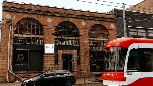
Twist Gallery is located on Queen West, one of Toronto’s most charming and vibrant neighbourhoods.
When spring arrives, Queen West becomes the perfect place to spend a relaxing and inspiring day, filled with creative energy and cultural spaces. Whether you love art, food, or simply exploring the city, there is always something exciting waiting for you here.