

Toronto Wedding Photography Spots That Look Like Art Prints
Choosing the right location for your wedding or engagement session can transform your memories into sunning works of art. Toronto is full of natural beauty and striking architecture that can make your photos look like curated art prints. Whether you love soft, romantic light or bold, urban backdrops, here are some of the city’s most unforgettable spots for capturing timeless moments.
Choosing the right location for your wedding or engagement session can transform your memories into sunning works of art. Toronto is full of natural beauty and striking architecture that can make your photos look like curated art prints. Whether you love soft, romantic light or bold, urban backdrops, here are some of the city’s most unforgettable spots for capturing timeless moments.
1.The ROM’s Crystal Facade

The Crystal Façade of the Royal Ontario Museum is a beautiful, modern structure with dramatic angles and reflective glass. It makes for a unique and contemporary atmosphere for couples wanting a bold shoot. The light plays beautifully in and around the structure with dynamic reflections and bold silhouettes, particularly during golden hour.
Tip: Late afternoons provide the most advantageous natural light. Plus the lovely artistic staircases within the museum makes for some unique shots.
2. Scarborough Bluffs

If you're envisioning romantic and airy scenes in nature, the Scarborough Bluffs does not disappoint with tourism-style towering cliffs and good views of Lake Ontario. This picturesque location can provide soft glowing light in the early morning and at sunset, making it the perfect backdrop for peaceful fine art portraits.
Tip: Always know the limitations of the cliff edges, and always check park regulations before your visit.
3. Allan Gardens Conservatory

Step into a vintage glasshouse with a lushness of green and bright polarising light, when you are surrounded by tropical foliage and original iron works, you have an enchanting timeless sense of intimacy anywhere for soft, elegant portraits.
Tip: Visit on weekdays to avoid crowds and get uninterrupted photo sessions.
4. Graffiti Alley

Graffiti Alley is a treasure trove of urban art, perfect for couples after some vivid, colorful energy. This street art gallery, in-fact ever-changing, screams colors and stunning backdrops teeming with character and attitude that will add depth to your photos.
Tip: Go in the day for the best colors, and early morning or weekdays will help you escape the crowds too.
5. The Aga Khan Museum & Garden
The Aga Khan Museum provides a space that is both peaceful and also visually appealing with its minimalistic style and tranquil gardens. They have a wonderful light and shadow relationship on the white stone surfaces of the museum, making it a tasteful and artful experience.
Tip: As you photograph, take advantage of the garden paths and reflect/bring attention to the reflecting pools to provide depth and peace to your images.
6. The Distillery District

Toronto’s Distillery District is a photographer’s dream for wedding photos that feel like fine art prints. With its cobblestone streets, Victorian-era brick buildings, and rustic charm, this historic area offers a timeless backdrop that blends industrial elegance with romantic vibes. It creates a canvas that elevates every shot and makes it frame worthy.
Tip: Schedule your shoot during the golden hour, right before sunset - for warm, glowing light that enhances the district’s rustic textures and turns your photos into ethereal masterpieces for a modern twist.
7. Harbourfront at Dusk

Harbourfront provides terrific lake views and Toronto city skyline lit in a gorgeous golden light. When dusk arrives and the city lights begin to glimmer, it adds a cinematic, romantic feel to your portraits.
Tip: Consider bringing a tripod or stabilizer for shooting in low-light situations and explore shooting spots in the area near Queens Quay that allow for unobstructed views.
8. Evergreen Brick Works

Evergreen Brick Works has a combination of reclaimed brick buildings along scenic, forested trails for couples that want both rustic industrial features and natural beauty. This is a great venue for photos in an editorial-style that focuses on rich textures.
Tip: utilize both indoor market areas and outdoor trails so you can have many different backdrops.
9. TIFF Bell Lightbox Rooftop

The rooftop at TIFF Bell Lightbox boasts stunning views of the city skyline, providing a sleek and cinematic background for your photos. This space is a great option for couples who seek an iconic Toronto feel, with dramatic backdrop opportunities.
Tip: Book rooftop access ahead of time and try to plan your shoot during sunset for the best light.
Final Thoughts
Toronto has so many different backdrops for couples looking for wedding and engagement images that feel like art. With the massive urban structures, cool streets, parks, nature reserves, and more, Toronto's iconic spots can frame your love story in many different moods and styles.
Since you just wrapped your photo session, you should also think about creating fine art prints from your portrait collections. We recommend using local Toronto printers and framers to create wedding memories with quality integrity while also supporting and showcasing Toronto's creative community.
Have a favorite spot in Toronto to capture your photos? Or maybe you have questions regarding locations for portraits you have in mind? Leave a comment below — we would love to hear from you!

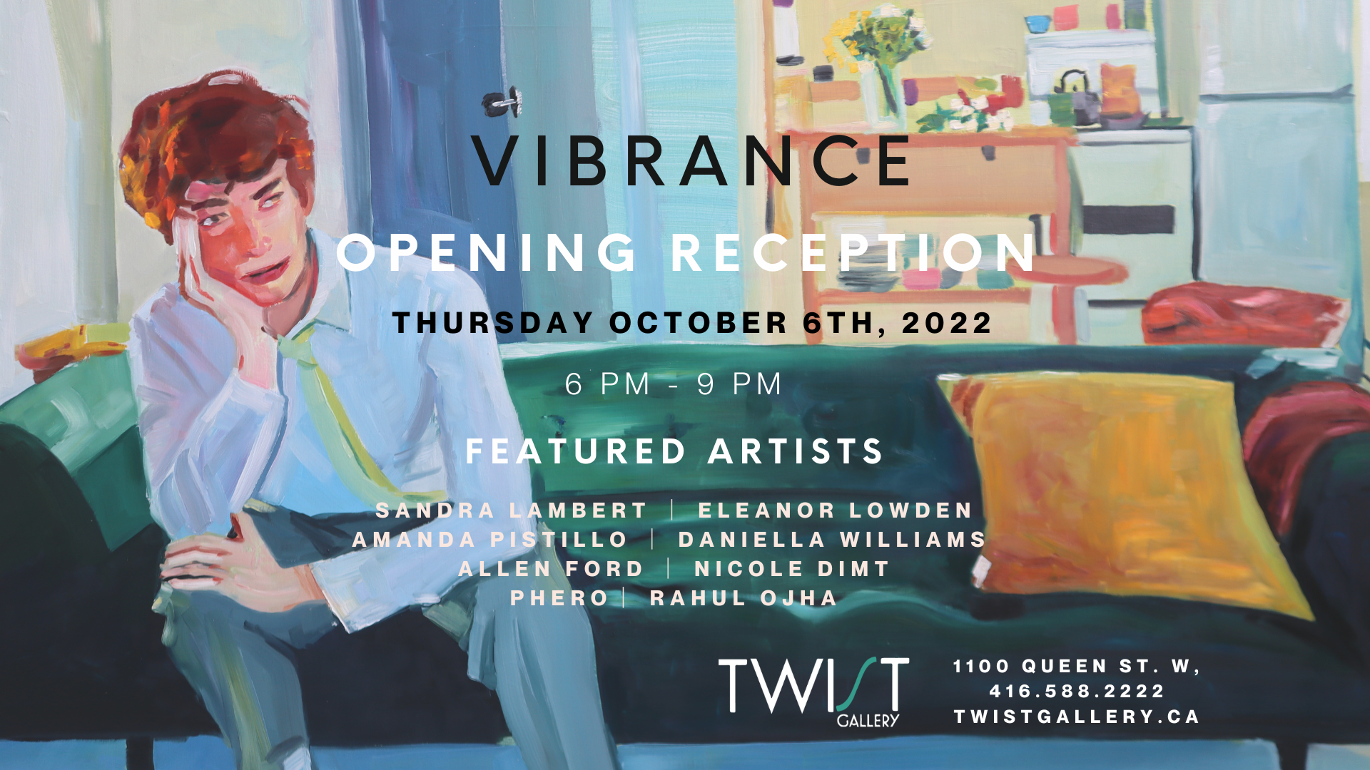
Interviewing Our 8 Vibrance Artists
Twist Gallery is very excited to showcase our new exhibit Vibrance, and give you a chance to get to know the 8 talented artists on a deeper level to better understand their artistic process. Vibrance is centred around life’s moments, both in the mundane and the exciting, encouraging our intertwined connectivity of the human experience. We asked our artists some questions about the ‘vibrancy’ of their work. To find out more, keep reading!
Twist Gallery is very excited to showcase our new exhibit Vibrance, and give you a chance to get to know the 8 talented artists on a deeper level to better understand their artistic process. Vibrance is centred around life’s moments, both in the mundane and the exciting, encouraging our intertwined connectivity of the human experience. We asked our artists some questions about the ‘vibrancy’ of their work. To find out more, keep reading!
Amanda Pistillo
Amanda is a self-taught artist whose work is centred around the feeling of joy, the tranquility of being happy, and extending that to others. She hopes to entice a feeling of inspiration and motivation in others to create their own unique art work.
How does the title ‘Vibrance’ connect to you and your art?
"Vibrance" to me and in terms of my art is about the light that radiates within your heart and soul. It is that powerful energy that brings forth happiness and love! Each piece that I create is a one-of-a-kind creation always made with lots of love and with the hope that they bring happiness to others!

All of your paintings are centred around John Lennon. What aspects of his life inspired your work?
John Lennon's empowering mission for a world with peace and love coupled with his never-ending call for inner courage and strength are very inspirational to me. I wanted to try and capture the light and radiance of his heart and soul within my artwork.
How have you cultivated such a unique style of painting?
I love to create art, it helps to centre me and brings me so much peace. Over time I have learned to exercise a sense of courage when creating my art, just being totally free. I enjoy using a rainbow of colours within my work, along with an edgy/sweet kind of look. I never have an exact plan of how the piece will turn out, I just go with the flow and try to be fearless. I've found that the best process for me when I'm creating my art is to just listen to my heart and let go of any control.

Do you have any advice for beginner artists who are nervous to explore new mediums and areas of art?
I think it's really important to be yourself and to have a sense of fearlessness when creating your art. There are going to be people who will have opinions about what you have created and want to change your style of art, but always remember how unique you are and to never conform to other people's expectations. Always believe in your art and in who you are. Your art is a reflection of you, and all of your divine creativity and your beautiful soul! Always remember to keep persevering, try new techniques, and always always stay true to yourself!
Daniella Williams
Daniella is keen on expression, keen on capturing the moments that truly make us human. Whether it be alone, with a partner, in a public setting with strangers… she makes sure to grasp deep emotion in a way that makes the viewer feel comfortable and understanding. Daniella focuses on all of the little details that are incredibly important in the final composition of her piece, and will make sure to capture every angle and shadow.
How does the title ‘Vibrance’ connect to you and your art?
I wanted to be a part of Vibrance because I felt that the concept and title of the show was one that reflected the overall essence of my work. My paintings emphasize colour and dynamic imagery of people in mundane scenes. Therefore, when I begin a painting my end vision is a scene where I have pushed the colours and skin tones of the subjects in unexpected ways. I want my paintings to be vibrant and energetic as well as probe the viewer to ask questions about the narratives I develop.

Why have you explored the themes of intimacy, self-reflection and voyeurism with your Domesticity collection?
My work touches on themes of intimacy, self-reflection and voyeurism because I’ve always been concerned with the idea of being perceived. I want to explore the tension and discomfort that exists in this as an individual but then paint it in a way that feels intimate to the viewer. As curious humans we love to get a look into the psyche and inner experiences of people around us; hence our fixation on social media and consuming images. Similarly, I have struggled with my own body image, and self-perception as a young bi-racial woman in an age of internet and image consumption, so it's always felt important to create paintings about these ideas.
What is the narrative behind the Domesticity paintings?
The Domesticity series paintings are meant to follow the domestic lives of four young adults who share a home. Their relationship to one another is ambiguous and highlighted by their inherent separateness in each scene. The setting of each painting is clearly a home yet none of the inhabitants ever meet the others gaze or interact. Domesticity was meant to be a look inside a troubled home life, one that looks bright and beautiful at first glance but harbours tension and restlessness at a second glance.

How do you choose your muse for your paintings? (Are they friends of yours? Models? Strangers?)
The subjects of my paintings really depend on where I am and what I’m feeling inspired by at the time. A lot of my most recent pieces were of friends who I had sit and act out different scenarios and narratives for me. Whereas many of my other paintings are of strangers I capture in passing. For instance, my newest painting “In A Sea Full of Women’ was a collage of several people I observed on different beaches in Italy and Greece. Mainly what I look for in my subject is a sense of mundanity, I want them to look like everyday people and to tell some kind of story in their expressions or body language.
Sandra Lambert
Sandra has a spirit that can be seen directly through her paintings. She focuses on the things that make her happy and takes inspiration from the little parts of life that may be overlooked otherwise. High saturation and crisp lines in her art convey an intense wave of emotion and expression.
How does the title ‘Vibrance’ connect to you and your art?
My first love in painting is colour. I’ve always been attracted to fresh, bright colours - colours that remind me of summer gardens or brightly coloured insects and birds. Loving the colours in nature, I’ve wanted to capture that feeling of freshness and aliveness without limiting myself to representation. So, it’s more of a desire to express the essence of an experience of nature - fields, sunset, fruit, flowers, insects, birds - the vitality that, at our core, we share with the natural world.

What attracted you to painting utilizing such rich saturated hues?
When I discovered acrylic gouaches- especially the Japanese colours- I fell in love with them. I rarely mix them, instead using them straight from the tube. They convey the intensity of my emotions and my experience of being saturated with the beauty of the world around me - an intensity that is difficult to convey in words, other than poetry, but seems to come more easily in the language of paint.
What would you say your biggest inspiration has been during your art journey?
I am like a sponge, soaking up visual stimuli- natural and urban landscapes and the work of other artists. I think it was John Berger who talked about the importance of receptivity in the act of painting. That resonates for me- what you take in then moves through you and into the paintings. It’s not that you don’t need to learn techniques and practice a hell of a lot, but I think it’s good to stay open and receptive to the world around you and the impulses of your own soul.
What drives you to create? How does it impact your personal growth?
I don’t really know what drives me to paint, other than I’m not happy if I’m not making something. And there’s nothing like the feeling of being completely absorbed in making a piece of art; it’s that loss of self-consciousness, that sense of rightness, of doing what I’m supposed to be doing. Also I never get bored- there’s always a new idea and something new to learn and try, and you can never get complacent because you can never really capture what you set out to capture so it’s always in front of you like a breathtaking view that is never reached because it’s always just around the next bend in the road.

How do you know when to stop, when do you really know when a piece is finished?
I used to overpaint more than I do now. I didn’t trust what I was doing and was trying too hard and worrying about the end product. I do that less now and trust more in the process. It helps to work on 2 or 3 pieces at a time so you don’t get hung up on getting one perfect. Maybe that is something I’m learning from painting- perfection is not where it’s at in art or in life- instead it’s trying, experimenting, failing sometimes and succeeding sometimes, but keeping on working with an open mind and a playful spirit. Also there are happy accidents - ‘mistakes’ that turn out to be wonderful surprises. I’m trying to keep that attitude in regards to other parts of my life - what we hope and expect often do not occur but sometimes what seems ‘wrong’ can turn out to be a gift.
Allen Ford
Allen, a man well versed in our society’s natural fast pace and how our minds can interpret the advertising all around us, excels in collage style art that encourages the viewer to expand their horizons across many places. He uses second-hand bright and colourful advertising materials to create a whole new piece of art, enticing a sense of unusual inspiration from many different things at once.
How does the title ‘Vibrance’ connect to you and your art?
Excellent question! I feel vibrancy in my art is found in creating new meaning with the posters. Originally all these posters have a clear meaning and intent. Take the huge panel with the Andy Warhol poster from the AGO exhibit. Originally that poster had a very clear purpose. But rip it, tear it, and mash it up with other posters, and something new and unexpected is created with its own energy and meaning. To me that is vibrant.

Your collages reinterpreted old advertising posters from across the city. How do you see advertisements subconsciously affecting our decisions making as consumers?
Advertisements affect our decisions just as all other forms of inspiration do. We are first triggered not by the entirety of something but by one single element of it. It's like being at a club...or an opening night of an art show! You see somebody across the way, you don't know them but the way they wear their hair, or stand, or hold their glass connects with you. Advertising is no different. We see or hear a word, see an image or a colour, and it sticks. And you then want to know more.
What does your artist process look like?
It looks like a mess! When I am in full creating mode, my apartment...err...studio is literally strewn with posters and panels. I then proceed to mimic a squirrel in a park digging for nuts. I know a specific poster is buried somewhere, I just need to find it! There is usually one core poster fragment I build around. It might feature a word or sentence, or perhaps an image or colour. With that foundation, I simply look to then build around it as I add, shuffle, rotate, and rip other poster fragments in. I rarely have a defined image I am looking to create though. It is very much a process that is about finding the finished image. And when do I know something is finished? When I get a tingle on my arms, a smile on my face, and start nodding. Then I know I have created something!

What do you hope the viewer draws from engaging with your work?
I like to imagine viewers of my work as a kind of urban archaeologist. This art requires viewers to reconstruct what they see, but also imagine and parse what they can't. I feel viewing my art also asks people to be creative themselves. These posters, once all ripped and torn, all fragmented words and images, ask every viewer to create their own meaning, find their own inspiration.
Eleanor Lowden
Eleanor’s art will take the viewer to a universal happy place - a beautiful garden, which holds the power to be exactly what we need as humans. She makes sure to share her beautiful imaginations in a way that is inviting while also exciting.
How does the title ‘Vibrance’ connect to you and your art?
It’s such a pleasure to be part of the Vibrance Show at Twist Gallery. I think my work often reflects a certain vibrance, the colours and the mood and the settings that inspire me. I’m thrilled to be showcasing my work with this group of artists whose work I admire.

What inspired you to create your Joyful Garden Series during the pandemic?
I began my Joyful Garden series during the pandemic in the summer of 2020. I was living in a condo with no garden of my own. During lockdown we were all limited and my outings were mostly to walk my dog. I started noticing gardens and outdoor spaces and gained a new appreciation for them. I began creating my garden series around this time, I felt like I finally had a garden of my own. It was my own form of abstract art that also felt very liberating and fun.
Do you have a favourite place to create?
I create in my home studio, I love the early morning hours the most. I’m up at 5:30 am and I paint until 7:30 am. when I walk my dog. I then come back and grab a coffee and paint for another few hours. But the early morning hours are still the best.

Do you ever hit a creative block? How do you overcome it as an artist?
I rarely have a creative block. I am always looking for more time to paint. If I have a day I don’t feel like painting, I always have administrative work to do. My website or my books or my Instagram…..All things that need to be done!
Phero
Phero’s lust for life and appreciation for all shines through his digital and painted art pieces. His idols, exuberant and talented, bring a sense of inspiration to the viewer for this kind of vibrancy in their own life. He combines mediums to fully grasp expression and emotion in his subjects.
How does the title ‘Vibrance’ connect to you and your art?
Vibrance, to me, means full of life and energy, vibrating at the highest possible power or potential. I feel like my pieces are exactly that they are full of energy, they show movement in their stillness because they are vibrant.

What inspired you to paint these POC pop culture icons?
I draw my inspiration or choose my “subjects” based on things I believe in or I enjoy. I love hip hop culture which is why a lot of my pieces are so deeply linked to hip hop and the surrounding elements.
What does your artist process look like?
I usually start it with a mood board or a reference board where I gather pictures of the subject and try to figure out how I can capture them. Then, I start to pencil things in lightly (or outline things digitally), and then I start to drop colour in places and see how the composition comes together, making alterations where I need to.
What attracted you to painting with and utilizing such rich, saturated hues?
Early on my artist journey when I was trying to develop my unique style, I wanted something where people would be able to easily identify my work immediately. I found the easiest way to do that was to use vibrant colours. It is easy to unify an exhibit when the colours are the same across all pieces.

Rahul Ohja
Rahul’s abstract mind encourages the viewer to step out of their comfort zone and feel the emotions of life that may be previously unexplored. He uses colours and shapes in a way that has an other-worldly effect, a way that will inspire creativity in a vibrant and fun manner. Read for further tips for beginners that Rahul was nice enough to share with us.
How does the title ‘Vibrance’ connect to you and your art?
I believe vibrance is a state of being full of energy and life. My thoughts and variant emotions represent my belief in colours being a central part of all living beings and non-living objects.
I love working with bright sparkling colours & textures in creating bold, vibrant, and colourful abstract art. I try to reinvent myself through my artwork and observe the world with extreme detail — from colour to line, and light to shadow. I do this because it fulfills me, helps liberate me, enriches me.
How have the events in your life influenced your creative process?
As beings, I believe we are all creators – some masterful with their words, others captivating through their actions and outliers, like myself, through our ability to enthrall with colours on canvas. I have trotted the globe, living and serving in three continents and hence, it is safe to say that my creations transcend cultural and geographic contexts to offer any beholder a sight worth more than what meets the eye. Predominantly through abstract work, I use colours, brushes and strokes as media to explore parts of my own subconscious that have been shaped, ostensibly, by experiences I do not vividly remember.
What attracted you to painting in the style you have come to adopt?
I do abstract art! I believe every colour has a meaning, it speaks of something, when many colours blend it has a language, a language that has nothing to do with realism or perfectionism... it’s just so powerful… and that is where abstract is born. I direct these colourful, bold, and boundless abstract language onto canvas and try to connect to people with an aim to sooth, to heal, to energize and help them search for inner peace and tranquility and give life a real meaning!

Do you have any advice for beginner artists who are nervous to explore new mediums and areas of art?
Abstract art can be a challenge. Beginners may believe that it is very easy, and anyone can do it. For those who have created abstract artworks or have taken a course, know that things can get a little complex. Creating an abstract piece requires certain skill sets. Don’t let the challenge turn you away. If you are a beginner , there are some tips you can keep in mind to start your journey as an abstract artist. You have to keep the following three main components of abstract artwork in mind:
1. Composition: While composition plays an important role in all types of artworks, it is especially essential in abstract art. Since abstract art is generally vague, it is important to have a focal point in your painting to capture the viewers’ attention. The shape, size, and placement of the objects on the canvas help create a good composition.
2. Colour: Since there aren’t any objective rules when it comes to abstract art, it can be easy to get carried away with the colour. However, it is advised to not throw all the colours on your palette onto the canvas before calling it a day. In fact, think about your colour palette before you even pick up the brush. Ideally, choose a limited number of colours and try to get creative with them. Mix these colours on the canvas to create an endless stream of changing shades and colours instead of picking a different tube every two minutes.
3. Texture: While using the right colors and composition, to ensure that you create an attractive piece of artwork, the texture makes the abstract painting really stand out. You can use various techniques and materials to add texture to your painting. In fact, you can just apply the paint more thickly in places. However, make sure that the texture is consistent throughout the artwork. Even if you have multiple different ideas on how to add texture, leave the rest for your next projects and only use one or two techniques per painting.
Nicole Dimt
Nicole guides you to the future through vivid colours and unique shapes with impeccable attention to detail and design. Her art is limitless, combining a magical imagination with real-world vibrancy that will leave the viewer craving more.
How does the title ‘Vibrance’ connect to you and your art?
Vibrance is the perfect word to describe my art. Every piece I make incorporates multitudes of every colour, which is the main goal of everything I create. In my work, I use the most saturated version of every colour I can, as I want my art to be eye-catching, as well as remind myself, and viewers, of the fascination and the joy that being a child once brought. I use vibrant colours so that my art feels lighthearted, fun, and just a little chaotic.

The subject in your artwork varies from nature and cityscapes to self-portraits. How do you decide on what subject to focus on?
My undergrad and the assignments it gave me are what opened me up to exploring many different subject matters within my art. I like to keep a very open-ended and diverse portfolio, and like to play with as many styles as I can. Anything can inspire me. Whenever I see a picture, or another artwork that I like, I get inspired to make something just like it, no matter what it is.
Do you prefer an abstract or realism style? Why?
It's hard to choose between the two - I often refer to my art as "abstracted reality," because that's exactly what it is. I always start my artworks with a reference of something from real life, such as nature, architecture, or fabric, and edit it digitally to create new wonderlands and worlds, which I then replicate. I would say this is my natural style. Granted, I do love to play with pure realism, and have a few pieces that showcase that in this exhibition. I like to create realism pieces when I find a reference that catches my eye, and I want to test my skill and
What would you say your biggest inspiration has been during your art journey?
My biggest inspiration throughout my art journey has definitely been all the amazing artists, and friends I met during university. My professors, peers, and mentors are who pushed me to be the artist I am now, and showed me new worlds and possibilities within painting. Many of these people helped me come up with themes and motifs, and really helped me connect with my art and understand it for what it is - something that did not come easily to me. It has been amazing to be around such creative people in my life, and this has continued post-grad into my workplace where I work as a concept artist, surrounded by brilliant minds who are fluent in the digital arts.
We hope you enjoyed getting to know a little more about the talented artists behind Vibrance! Don’t forget to come check out the exhibit, on from October 4th - 29th.
Also Read: Event Space Toronto, wedding venue Toronto, Wedding Reception Toronto
Introducing our #Vibrance Artists
Twist Gallery’s October 2022 exhibit #Vibrance, on from October 4th to 30th, is a dynamic, joyful, and effervescent interpretation of what it means to live, to feel, and to dream. Spotlighting eight exceptional artists from Toronto, this exhibit garners the unrestrained power of light, hue, and texture, inviting the viewer on a journey into colour itself. Through a fearless employment of colour and bold brush strokes, these artists open the door of creativity for the public. Don’t miss #Vibrance’s Opening Reception, taking place on October 6th from 6-9pm. Click here to RSVP.
Twist Gallery’s October 2022 exhibit #Vibrance, on from October 4th to 30th, is a dynamic, joyful, and effervescent interpretation of what it means to live, to feel, and to dream. Spotlighting eight exceptional artists from Toronto, this exhibit garners the unrestrained power of light, hue, and texture, inviting the viewer on a journey into colour itself. Through a fearless employment of colour and bold brush strokes, these artists open the door of creativity for the public. Don’t miss #Vibrance’s Opening Reception, taking place on October 6th from 6-9pm. Click here to RSVP.

Daniella Williams

Daniella is a local Toronto painter that is centralised around community and relationships, everywhere from friends and the neighbourhood beyond. She prioritizes creating narratives that are expressive in their use of colour, paint handling and subject matter. Daniella strives to push the colour palette of the atmosphere and skin tone of her subjects towards one that comes off as vibrant and imaginative; giving the figures life and vitality. Her paintings are marked by themes of intimacy, self-reflection and voyeurism, but they are most importantly defined by the juxtaposition of the bright vibrant manner which they are painted in. Expressive brush strokes and an imaginative colour palette provides the lens for her work and aligns her paintings with the #Vibrance of life as a human being in this world.


Allen Ford

Allen has chosen collage as a medium because it so beautifully reflects how we experience and remember the things we see, and how advertisements have become such a large part of what we take in. created these collages from advertising posters ripped down, torn from, and peeled off of hoardings and walls in Toronto, Montreal and Ottawa. In their original form, each poster was the result of an intentional creative process directed by marketing and design teams. Decisions were dictated by business goals, creative briefs, target audiences, and budgets. Every element was considered and directed towards a specific outcome. Once these advertisements have been pasted and posted on the streets of cities, their makers have ceded absolute control of their work. Instead, he transforms the specific images, taking them in new directions based on his own experiences and perspectives, inviting the viewer to do the same.


Eleanor Lowden

Toronto native Eleanor has been painting professionally for about 35 years. Her work is an interpretation of life from a happy point of view. Her style plays with patterns and repetition of forms, it is both illustrative and impressionistic too. She is inspired by many things: country roads, umbrellas, trees, polka dots, mass cultural objects, people, dogs, and most recently, spring flowers. Through these differing subjects, She is continually exploring unique compositions while creating bright, luminous paintings with her own unique colour palette.


Nicole Dimt

Nicole, a 23-year-old painter from Toronto, got very inspired by futurist architecture and landscape while roaming Downtown Toronto at the start of her third year of university, and integrated these themes into her artwork very quickly. In her art, Nicole reflects on her childhood, projecting feelings of joy, innocence, and wonder. Nicole’s art relies heavily on the use of highly saturated and vibrant colour, as well as line, and shape. Nicole’s artwork, with themes of architecture, nature, and technology, depicts futurist, dystopian, and psychedelic wonderlands full of overwhelming detail, pattern, and fascination. Nicole’s art can be described as “organized chaos.” Nicole’s art also works hand-in-hand with the digital world, collaborating with heavy photo manipulation, colour inversion, and total distortion, adding an unnatural or synthetic quality to her paintings. This added quality to her works speaks upon the narrative of the grasp that the digital world has had on us, and how it has warped our perception of reality.


Amanda Pistillo
Amanda is a self-taught artist with a passion for designing mixed media artwork, exploring the freedom and wonder of art. Her artwork is always created with the sincere hope that they provide happiness to others, as one of the goals in designing her artwork is to encourage others to create in their own unique artistic style. Amanda's heart is at the centre of her design process, always guiding her to create with love. She presents her John Lennon Collection, as she was inspired by his passion to bring love and peace into the world.


Rahul Ojha

Rahul, as a creative by nature, his mind wanders the depths of his innermost self and the ideas and experiences that make up his core. With time, his art has evolved with his personality. While up for interpretation, his work is, in a way, a depiction of his journey through the rollercoaster of life. You can consider Rahul’s work as his life as told on canvas through acrylics and mixed media. Viewers and patrons can find meaning and the rawness of human emotion that stirs the soul. Each piece exudes sensitivity and connection, creating a visual and emotional experience that goes beyond what is in sight.


Phero

Ahmed, artistically Phero from Cairo, Egypt, is a classic 3rd generation kid; exploring a unique balance of the arts, culture & lifestyle of his ancestral origins and his surroundings. Drawing was (and still is) his form of creative expression, it is what grounds him and what helps him move through life. Phero loves all mediums of art and his own style evolved many times throughout the years. He takes great inspiration from superheroes, music, and sports - which is very evident in his works. He combines digital and traditional media in ways that are exuberant and vibrant, inviting the viewer to feel as strongly as he does when he sees his passions come to life.


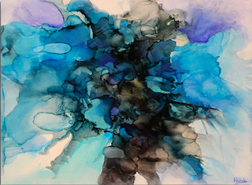
Sandra Lambert

For Sandra, painting is both a playful and intense experience. Her paintings are containers of emotion. Within their boundaries she feels free to play; to lose (or find!) herself in the pleasure of sensory exploration. She enjoys exploring the use of various techniques and media to express the essence of experience. Her #Vibrance paintings represent three different approaches; three small panels on the left shock the senses with pure, intense colours in flat organic shapes. The two small panels on the right are more spontaneous, loose and lyrical. The two larger panels are dense, layered and lightly textured through the technique of scratching back. All the paintings are pulsing with colour and a sense of power, though contained exuberance.


#Vibrance ties together the excitement and exhilaration of life and its passions and love. The combination of expression and vibrancy in this exhibit will ensure viewers have a new appreciation for livelihood and the possibilities of exploring your mind. Remember, don’t miss out on #Vibrance’s Opening Reception on Thursday, October 6th, from 6-9pm!
Useful Links: Unique Wedding Venues Toronto, Wedding Venue Downtown Toronto
Meet Megan Tracy!
A wife and a mother of four kids, our “Colour Me Bold” artist Megan Tracy is also a full time photographer.

What inspires your art?
I think that I am most inspired by nature. The ocean, flowers, the sky would be my main, but color combinations could also come from music, fashion, interiors and other areas of design that I love.

Isleys (1 of 2), 12” by 12”, $280 for both
What medium and technique do you use?
I use resin with acrylic and alcohol inks.
Faith, 8” by 10”, $140
Walk us through your process of creating a piece.
When I start a piece, believe it or not it begins with music. Whatever vibe I’m feeling that day, I pick a playlist. Lay out my materials and off we go. I create. Sometimes there’s a plan in my head, sometimes it just goes wherever it goes.

Supreme,16” by 20”, $250
How did you start out as an artist?
I’m a photographer full time, so creating this type of art was really just exchanging people for acrylic and resin.

Green, 5” by 7”, $100
Do you use bold colours for a specific reason?
I love color. I do have my “go to“ colors, although most of them are usually bold color selections.
Meet Gloria Blatt!
What inspires your art?
My inspirations come from nature and the natural beauty around us. I’ve always been able to view the world through a lens of colour, shapes, and dimensions, and have the ability to translate this into artistic expression.
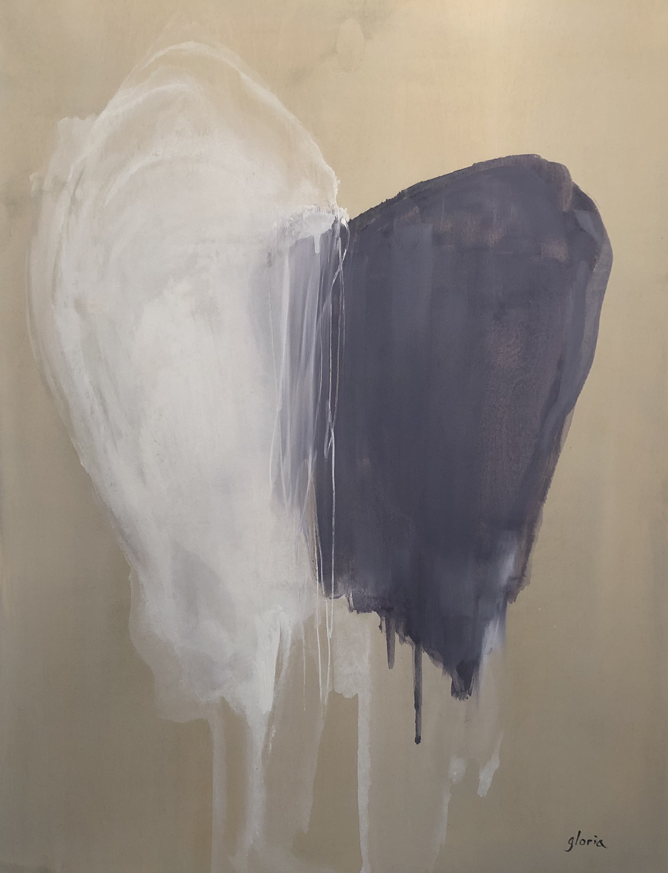
“Wings” acrylic on birch (30” x 40”) $1,500
Can you talk about your process? What tools do you use to create?
I begin my creations by imagining abstract renditions of images in my mind that have been formed through my life experiences. At times I even surprise myself when the process seems to take on a life of its own. I take advantage of a variety sources of mediums and continually experiment with innovative techniques. Some of my work is done with conventional paint and brush, and at other times they can involve my fingers and other non-conventional tools.

Source: www.gloriablatt.com
When did you first discover art? Are you self-taught or did you go to school for it?
For as long as I remember, I have been fascinated by artistic expression. I attended formal study both at York University in the Fine Arts program, and Ontario College of Art and Design. York University provided me with a deep appreciation of art history, while OCAD allowed me the freedom to express myself in an incredibly innovative, fearless manner.
What is your personal goal as an artist?
My goal as an artist is first and foremost to be proud of my creations and share my passion for the craft with as many people as possible. It gives me incredible satisfaction when others are able to derive pleasure from my creations and discover their own life-story in my work.

“Freeze” acrylic, oil, ink, enamel on birch, wood float frame (30”x 30”) $1,300
How do you title your artworks?
The process of naming my art is often a reflexive response to the creation. It is always spontaneous and natural as my art always conveys a strong personal message.
Do you have a particular piece that has a special connection to you?
Of all of my paintings, the one that is closest to my heart is one inspired by my children, my greatest creations.

“Dragon” acrylic, ink, oil on birch, wood float frame, (30”x 30”) $1,300
Who are some of your favourite artists?
Having studied art history and having visited many world-famous galleries, I am awe struck and overwhelmed by the works of Picasso, Monet, Modigliani, Chagall, and Miro (although my list could go on).
What is it like to be an artist in today’s world?
Being an artist is both maddening and transformative, as I serve as my harshest critic. At the same time, the creative process allows me to escape into a state of inner peace and tranquility.

“Dusty Rose” acrylic on stretched canvas, (42.5”x 51”) $2,500
What are you passionate about?
In today’s troubled world, being an artist affords me the ability to remain optimistic and inspired.
What does “Energy” mean to you?
Energy is the life force that I derive from my family and friends, and that ultimately manifests in my artistic expression in the form of colour and movement.
Energy at Twist
Don’t miss this one Toronto! Be sure to visit us at 1100 Queen Street West and check out our newest artists featured. Our doors are open every Tuesday to Saturday from 11am till 6pm.
You can call us at (416) 588 - 2222 or email your questions and inquiries to info@twistgallery.ca.
And since you’re here, check out the Twist Artist Showcase? CLICK HERE.
To see what’s Upcoming at Twist Gallery CLICK HERE.
Follow us @Twistgalleryand @TwistGallery!
Meet Tanmay Upadhyaya!
Who is Tanmay Upadhyaya?

Source: @tanmay.art
“I'm a Toronto based marketer, passionately in love with colours. My venture into the joys of merging colours with canvas only began very recently. I look forward to seeing where this new voice for expression will lead. I enjoy creating abstract art - using acrylics primarily - and try to evoke a sense of beauty and inspiration through the interactions between colours as they find their place on the canvas. I endeavour to create pieces that produce the same passion for colours in others that I have always felt.”
What are you passionate about?

“54 Shades of Happiness”, acrylic on canvas (32 x 48”), $600
“I LOVE LOVE LOVE colours. They make me happy, energize me and inspire me. My lifelong love for colours started quite early in my childhood. I grew up in a culture that is very colour-centric and that affected my sensibilities in the most positive way. My work on display at Twist Gallery screams COLOUR. I have employed bold, vibrant colours in a congrous manner, laid on the canvas using non-traditional painting tools. All my pieces also explore order in chaos. There is a sense of controlled randomness.”
What does ‘Energy’ mean to you?

“And a Very Good Evening to You Too Mr. Rothko”, acrylic on canvas (32 x 48”), $600
“Energy, to me, is the invigorating power of colours. Colours have immense transformative powers and are capable of affecting our moods and general well being. I hope that my work is able to channel this energy and help people feel the joy.”
Energy at Twist
Don’t miss this fantastic exhibition! Be sure to visit us at 1100 Queen Street West and check out our newest artists featured. Our doors are open every Tuesday to Saturday from 11am till 6pm.
You can call us at (416) 588 - 2222 or email your questions and inquiries to info@twistgallery.ca.
And since you’re here, why not browse the Twist Artist Showcase? CLICK HERE.
To see what’s Upcoming at Twist Gallery CLICK HERE.
Follow us @Twistgalleryand @TwistGallery!
3 Tips for Hanging a Painting
So, you’ve just fallen in love with a piece of art you’ve seen in your local art gallery. You know that it would be the PERFECT addition to your home, so you pass through and buy it. The gallery director puts a little red sticker on it, signifying that this particular piece is spoken for; its dance card is full. Now comes the hard part: waiting for the exhibition to be over, so you can proudly display your new cherished treasure. But how should one display art? There must be rules to follow or a guideline? Sort of. Below are Twist Gallery’s 3 Tips for Hanging a Painting. Enjoy!
🎨 🎨 🎨
3 TIPS FOR HANGING A PAINTING
🎨 Hang a painting by its focal point.
Every piece of art is exceptional and different. Art tells unique stories, boasts diverse triumphs and impacts viewers individually. Therefore, it’s your job; nay your duty, scratch that; your privilege to decide where the art’s focal point is located. Essentially, the focal point, is where the viewer’s eye is naturally drawn. Often times, this is the centre of the painting, however many artists play with asymmetry in space and varying scale. So, what does that mean? It’s up to you! You fell in love with this painting for a reason. Where does your eye naturally fall on the canvas? This part of the painting should be hung level with your eye.
For instance, check out this vivid piece by Sandra Di Leo below.

Figure 1 “Rebel” by Sandra Di Leo; 30 X 40 acrylic on canvas; $2,100
At Twist, we’ve been debating where one’s eye instinctively falls on Di Leo’s work. Some follow the curves of the powerful black lines reaching rest inside the circular shapes. However, other eyes tend to focus on the bright colours, especially the electrifying greens and glowing pinks. Wherever you decide the focal point is located, it should be hung close to eye level.
🎨 Carefully think about lighting the artwork.
Lighting can be tricky, especially if you don’t have track mounted lights at your home. You want to avoid direct sunlight because it can be very damaging to surfaces. Try to mount the art in a room with lots of natural indirect light. Also, you’ll want to give your artwork even light. This is why many gallery’s mount works on walls with numerous light sources to ensure an even amount of light bathing the canvas. Lastly, consider the type of light (if not natural light). Fluorescent light is awful for dramatic art. You’d be wise to stick with bulbs and light sources that replicate soft daylight. For example, take a glance at Courtney Senior’s “Where the Magic Happens”.

Figure 2 “Where the Magic Happens” by Courtney Senior; 48 x 48 acrylic on canvas; $2,000
As the bright colours shatter and splinter apart revealing the strong dark tones of the background, Senior’s expression is fully realized. A robust piece such as this requires a room full of indirect light. Any direct sunshine or incandescent light would overwhelm the already strong colour pallet presented.
🎨 Group pieces of art together for dramatic effect.
When you are decorating a space, consider how several paintings can work together. Perhaps the canvas’ were created by the same artist and represent similar thematic elements or feelings? Conversely, this can work when the paintings are dissimilar. Imagine the contrast and complication to viewers by pairing pieces that clash or challenge each other. Can you think of a time when artistic elements clashed so strongly that the effect was incredibly profound and memorable? After all, art is about expression and creativity. Ultimately, it's up to you. Consider the work of Elena Dinissuk featured next.

Figure 3 “Beach Tranquility” by Elena Dinissuk; 24 x 24 acrylic on wood; $500

Figure 4 “Flying Over the Ocean” by Elena Dinissuk; 24 x 24 acrylic on wood; $500
These two pieces compliment and accent each other. The wild and energetic ocean waters of the first painting is referenced by the same blue hues in the second. Furthermore, viewers regard the land and sky embodied with oranges and pale blues in the second painting. This only highlights the lack of land in the first painting. As viewers begin to consider both paintings simultaneously, they see elements that are repeated and elements that exists individually. Dinissuk’s work instigates an exciting story of the majestic mighty ocean and our beautiful planet.
We hope you’ve enjoyed reading our 3 tips for hanging a painting. And if you think we’ve missed anything, please comment below and let us know your tips. We’d also love to hear from anyone who has purchased from Twist Gallery in the past. How did you hang your art? Share a picture on Instagram and remember to tag us! @twistgalley
And since you’re here, why not check out the other artists in our Artist Showcase? CLICK HERE.
To see what’s Upcoming at Twist Gallery CLICK HERE.
Keep us in your focal point by following us @Twistgallery and @TwistGallery!
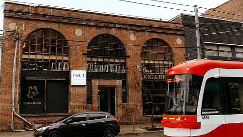
Twist Gallery is located on Queen West, one of Toronto’s most charming and vibrant neighbourhoods.
When spring arrives, Queen West becomes the perfect place to spend a relaxing and inspiring day, filled with creative energy and cultural spaces. Whether you love art, food, or simply exploring the city, there is always something exciting waiting for you here.