

Finding Your Dream Wedding Venue: A Comprehensive Guide
The path to a blissful marriage starts well before the ceremonial walk down the aisle. It commences with the pivotal task of selecting the ideal wedding venue. This choice will influence everything from the event's decor and attire to the overall mood of your guests. In this detailed guide, we will assist you in discovering your dream wedding venue, with a particular emphasis on unique wedding venues that can elevate your wedding reception to new heights.
The path to a blissful marriage starts well before the ceremonial walk down the aisle. It commences with the pivotal task of selecting the ideal wedding venue. This choice will influence everything from the event's decor and attire to the overall mood of your guests. In this detailed guide, we will assist you in discovering your dream wedding venue, with a particular emphasis on unique wedding venues that can elevate your wedding reception to new heights.
Your Wedding Vision

To begin the search for the ideal wedding venue, it's essential to understand your wedding vision. This personal and emotional process involves reflecting on your desires, preferences, and the kind of experience you wish to create for your guests.
Are you envisioning a traditional church wedding or drawn to the rustic charm of a barn against a picturesque sunset? Perhaps you seek something more unique, like an art gallery or a historic mansion. Alternatively, the dream of a beach wedding with the soothing sound of waves may capture your heart. Defining your dream wedding will guide your venue selection process.
Exploring Unique Wedding Venues
Recently, couples have moved away from traditional wedding venues in favor of more unique wedding locations. These distinctive wedding venues add personality and charm, leaving a lasting impression on both you and your guests.

Art Galleries
Art galleries have emerged as a popular choice for modern couples. They offer a sophisticated and elegant setting for both the ceremony and reception. The artwork serves as a stunning backdrop for your wedding photos, while the open floor plan allows for a flexible layout. The ambiance of creativity and culture adds a unique touch to your celebration.
Historic Mansions and Estates
Historic mansions and estates exude grandeur and elegance that is difficult to replicate in traditional venues. Often accompanied by beautiful gardens, these locations are perfect for outdoor ceremonies or cocktail hours. The rich history and architectural beauty provide a unique backdrop for your wedding photos.
Beaches and Outdoor Spaces
For nature-loving couples, beaches, parks, and other outdoor spaces present ideal wedding venues. With stunning landscapes and a relaxed setting, these locations create a magical atmosphere. However, it's important to consider contingency plans for weather-related contingencies.

Industrial Spaces
Those seeking a modern, edgy vibe for their wedding may find industrial spaces an excellent choice. Think old warehouses, factories, or lofts with exposed brick walls, high ceilings, and large open spaces. These venues offer a unique, blank canvas that can be transformed to fit your wedding theme. Architectural elements like large windows or exposed beams add character to your wedding photos.
Vineyards and Wineries
For those who appreciate fine wines, a vineyard or winery could be the ideal wedding venue. These locations offer a blend of romance and rustic charm, set against the scenic backdrop of vineyards and the encompassing countryside. Many such venues also provide on-site catering services, featuring menus that are designed to pair beautifully with their own wines. However, given that these venues are typically situated in more rural settings, guests may need to plan for transportation accordingly.
Considerations When Selecting a Wedding Venue
It is important to consider several factors when choosing a wedding venue. Consider these factors:

Venue Availability
Ensure the venue is available on your desired dates. Popular venues are often booked well in advance, particularly during peak wedding seasons. Reach out to your preferred venues early to check their availability and any time restrictions they may have.
Venue Style and Aesthetic
The venue's style and aesthetic should align with your wedding vision and theme. Consider the architecture, decor, and overall vibe of the venue, as it will set the tone for your wedding and serve as a backdrop for your photos.
Capacity
Ensure the venue can comfortably accommodate your guest list, including space for tables, a dance floor, entertainment, and other wedding essentials. Evaluate the flow of the space to ensure it accommodates your planned activities, such as cocktail hours, dinner, and dancing.
Location
Consider the venue's accessibility for your guests. Proximity to hotels or airports may be important for out-of-town guests. Additionally, the surroundings of the venue, such as beautiful views or nearby attractions, can enhance your guests' experience.

Services and Amenities
Evaluate the services and amenities offered by the venue, such as catering, event planning, or equipment rentals. These services can greatly reduce the stress of wedding planning. Some venues provide comprehensive packages that include decorations, food and beverage options, and even accommodations, offering convenience and cost-effectiveness.
Budget
Consider your budget when selecting a wedding venue. In addition to the venue cost, take into account any additional services or rentals. Ask about payment terms and any potential additional charges.
To Summarize
Finding your dream wedding venue requires careful planning and consideration. Whether you opt for a traditional church, a rustic barn, a unique venue like an art gallery or historic mansion, or a beautiful outdoor space, the most important aspect is that the venue aligns with you and your partner's vision.
Twist Gallery: Your Dream Wedding Venue in the Heart of Toronto

For those in the Toronto area seeking a distinctive wedding venue, Twist Gallery is a prime consideration. Nestled in the vibrant Queen West district, this expansive 5,000 square-foot loft boasts a New York-style aesthetic, complete with skylights, French Arch windows offering cityscape views, and elongated wooden beams that highlight the lofty ceilings.
Twist Gallery redefines the traditional art gallery model by incorporating a wider lifestyle focus. It's a hospitable environment that invites everyone, from seasoned art enthusiasts to novices, to feel comfortable. The gallery fosters a close connection with its visitors, ensuring they are well-informed about forthcoming events and exhibitions taking place within the venue.
With a specialization in wedding receptions and a range of social and corporate events, Twist Gallery prides itself on its meticulous attention to detail and personalized care from inception to completion. Our goal is to create an extraordinary atmosphere that leaves a lasting impression on every event. Our venue offers customization to accommodate your ideal event, ensuring your wedding is uniquely tailored with a flexible and personal approach.
To discover more about planning your wedding at Twist Gallery, visit our website or contact us at (416) 588-2222. Let Twist Gallery, Toronto's distinctive wedding venue and event space, turn your dream wedding into reality!

Exploring Toronto’s Architectural Gems: Where Art and History Unite
Everyone knows about the diverse culture of Toronto, but what not everyone knows is that the city boasts a rich tapestry of architectural marvels all around the city; right from historical landmarks to modern skyscrapers, buildings of toronto depict a strong art mindset and tell a captivating story of art, history and the city’s evolving identity.
Everyone knows about the diverse culture of Toronto, but what not everyone knows is that the city boasts a rich tapestry of architectural marvels all around the city; right from historical landmarks to modern skyscrapers, buildings of toronto depict a strong art mindset and tell a captivating story of art, history and the city’s evolving identity.
Toronto’s historical buildings are a treasure trove of stories; Casa Loma, a Gothic Revival-style mansion situated in the heart of the city is a prime example of the city’s historical landmarks.
This mansion once served as Sir Henry Pellatt residence; the mansion showcases intricate detailing, soaring towers, and the gardens of Casa Loma will give you the peek into the grandeur of Toronto’s past.

Credit: www.ultimateontario.com
While embracing the past of the city, we can not miss the Distillery District, located in downtown Toronto; it is a preserved heritage site that showcases Victorian era industrial architecture.
Before it was used as a whiskey distillery, but now it has been revitalized into a vibrant cultural hub filled with shops, studios, restaurants and galleries. Now it is a breeding ground for artistic expression, performances, hosting art exhibitions, and festivals all year round.

Credit: www.thedistillerydistrict.com
The Elgin and Winter Garden Theatre is another historical marvel of the city, located in downtown Toronto, the theater is the last surviving double decker theater in the world.
The theater hosts a variety of shows and performances over the years including musicals, concerts and ballets.
This theater built in 1913 is the grandeur of architecture and rich history of performances and is a beloved cultural spot of the city.

Credit: www.rosspetty.com
Not just the historic buildings, the skyline of the city is a true testament to the progressive nature, as the modern skyscrapers dominate the skyline. Toronto’s architectural mastery is depicted through structures such as the CN Tower, rising high above the city, this iconic tower not only offers breathtaking views but also hosts rotating art exhibits that celebrates local and international talents.

Credit: www.cntraveler.com
Toronto’s ever evolving art scene is not limited to the art exhibits and historical marvels; the Graffiti Alley in Queen Street West is a proof to the city’s creative spirit. A walk-through this colorful laneway is a must visit as it reveals the ever-changing life size canvas of urban expressions, where artists transform walls into powerful visual narratives.
You will find it all, from thought provoking social expressions to burst of vibrant colors; this street art in Toronto adds an extra dimension to creativity and dynamism to the cityscape.

Credit: www.tripsavvy.com

Last, but certainly not least is the incredible OCAD building. OCAD University is Canada’s largest and oldest university for art and design. The stunning, black and white “tabletop” structure, which was completed in 2004, stands above OCAD U’s main campus building on 12 multi-coloured steel legs. The award-winning facility was designed by acclaimed British architect Will Alsop in partnership with Toronto-based Robbie/Young + Wright Architects Inc., along with structural engineers from Caruthers & Wallace Ltd. And MCW Consultants Ltd. It’s recognized today for its incredible colour and size!
Toronto embraces its past, present and future and the importance of architectural preservation. Efforts are made to restore and safeguard the historical buildings.
From the public art installations that kindle our imagination to the awe-inspiring historical landmarks and the innovative modern structures, Toronto’s buildings serve as a living testaments of the city’s creative spirit and cultural vibrancy.
Useful Links: Event Space Rental Toronto, wedding venue Toronto, Wedding Reception Toronto

Meet Dark Blossom Solo Artist Robert Saffer
Robert Saffer is an abstract contemporary symbolist artist and addictions counsellor from Toronto, Canada. Robert describes his work as having a stark textured aesthetic with a fierce expressive power. “My aim is to choreograph a sense of movement and menace to express moods and emotions that challenge our very preconceptions of beauty. Let’s face it, love isn’t always beautiful, life isn’t always wonderful, but it is nevertheless a profound experience. WE must face our demons on so many levels. This is what the art attempts to do. The real question is — will we blossom into the best possible versions of ourselves?
Robert Saffer is an abstract contemporary symbolist artist and addictions counsellor from Toronto, Canada. Robert describes his work as having a stark textured aesthetic with a fierce expressive power. “My aim is to choreograph a sense of movement and menace to express moods and emotions that challenge our very preconceptions of beauty. Let’s face it, love isn’t always beautiful, life isn’t always wonderful, but it is nevertheless a profound experience. WE must face our demons on so many levels. This is what the art attempts to do. The real question is — will we blossom into the best possible versions of ourselves?

Photo of Robert Saffer
You describe your work as ‘starkly textured’ with expressions of movement and menace. Can you tell us what this signifies to you and why you choose these specific terms to describe what you wish to encapsulate?
I think there is an illuminating quality, and I think that most of the paintings are texturized for this reason. I like to let my imagination run wild. So, there is an emotional que that happens when these starkly textured images are viewed. I know menace, traditionally has a negative interpretation, but that is part and parcel of the movement of every painting. What moves someone is a personal experience, but that has traditionally been the superpower behind abstract art.
How does your inner world and life experiences inspire you to create this work? And what role does the external world play in your process?
A mixture of anxiety, chaos, spirit, dealing with so many life and death situations as a former addict and now as an addiction’s counsellor. That might sound grim, but the truth is, art is an essential tool in absorbing so many lived experiences and packaging them in the best possible light. Finding balance in a painting is an equivalent to finding peace of mind. Colours alone are suggestive of our moods. The fact that anyone can pick up a brush and paint out their internal state is incredibly rewarding and therapeutic. But more to your question, the external world contributes to my moods and emotions, so it is actively involved in everything I paint.

IV of the Golden ore, Robert Saffer
You bring up radical practices from the 21st century. Can you give some examples of these practices? What holds them so important to you?
More and more art in the 21st century is evoking a form of interpretation which is why abstract artists like Damien Hirst for instance really made it big, allowed for a real deep conversation about how people relate to their own mortality, and what better way to show the dichotomy between the giant mammal (the great fish) and human nature. For me, radical is simply implying abstract decorations of hidden spirits.
I’m fascinated by Painterly attempts to let one’s unconscious memories and desires flow without constraints but always looking to expand my process of Abstract Expressionisms. I suppose because my own worldview was shaped by existentialism where the artists condition was of isolation and anxiety. I gained a lot of insight into this art form by examining works, most notably by Frank Kline in a work entitled ‘Moniter’ or William De Koonings and remember being mesmerized by ‘Number 15’ a 1951 Jackson Pollock art piece.
All these artists including Gerard Richter dripped paint from above as they moved continually around the canvas...the work therefore acts as a map of the artist’s movement, an expressionism of one’s physical actions where the painting is both chaotic and structured like the musical cadence we’re attracted to.
The exhibition is named 'Dark Blossom’. What inspired this name and what deeper significance does it hold?
When I began this piece, I was in anything-but-spiritual mood on the night of a pink moon. Suddenly moved to storytelling about these moods, my deepest inner thoughts and emotions would surface. I had no idea I was unconsciously aiming to awaken in abstract phenomena. But alas, this is my painting process. Pinks and blacks blossoming in the painting became symbolic of ‘being in the moment’ and transporting me out of my own headspace. Alas, a therapeutic attempt to let go let G-d. But I would say, Dark blossom at its very core, highlights the conflicting aspects of our human nature.

Dark Blossom, Robert Saffer
What techniques do you apply in your process to convey the stories/ideas you wish to communicate through your use of texture?
Like I said the work comes from inner thoughts, feelings, intuition. I think the texture and colours alone helps to build up the story involved in our own communication process. Abstraction is a language made of optical signs & signals; a reflective tool that decorates our being. Painting is an eternal return to our greater selves. At least this is the goal. It definitely is a useful tool in externalizing our perceptions of the universe.
The idea of essential truth reverberates through your work. Do you wish for the viewer to glean a specific essential truth from your art, or to apply their own understanding of essential truth via their unique lens?
An aura of investigative measures are being portrayed in my work. I try to challenge my own conceptions of the human condition, my own limitations. Trying to slow down as an endless range of effects runs through wild colourful terrains on the canvas each representing a specific feeling. Truth in many cases is an abstraction which can create a highly emotional & no doubt, aesthetic experience for the observer or the observing mind.

Curiosity of Heart, Robert Saffer
What do you hope your audiences to receive from you through your works of art?
To be moved in some way. Designs create visual sensations that we interpret very quickly, and I hope the audience will feel provoked in some way from the art pieces. Ultimately creating a somatic experience, meaning, the art or canvas is a conceptional representation of their own emotional map.
Why were you interested in doing a solo show as opposed to a group exhibition? And how does that affect how your art is seen by the audiences?
Best answered by an article I read some time ago; ‘A solo exhibition is both a mark of recognition and an opportunity to put a focused selection of work before the public. Where group exhibitions allow a curator to explore themes across a range of practices, the solo exhibition is the artist’s chance to demonstrate the strength and depth of their work.’

Robert Saffer, photographed by Amber Liang
Paintings for the Dark Blossom Exhibition were selected by intuition and designed in rich hallucinatory flavour to highlight this method. They symbolize an essential truth, an evolving of our emotional condition and to awaken the spiritual experience in abstract phenomena.
Useful Links: Event Space Toronto, wedding venue Toronto, Wedding Reception Toronto
Five Art Galleries Around The World You Should Visit This Summer
If you are looking for a cultural and artistic vacation abroad this summer, you are in luck. Aside from sipping cocktails and tanning on the beach, visiting famous galleries is also a great way to spend your summer! We have put together this list of the world's best galleries for you to consider.
If you are looking for a cultural and artistic vacation abroad this summer, you are in luck. Aside from sipping cocktails and tanning on the beach, visiting famous galleries is also a great way to spend your summer! We have put together this list of the world's best galleries for you to consider.
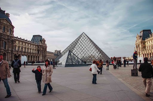
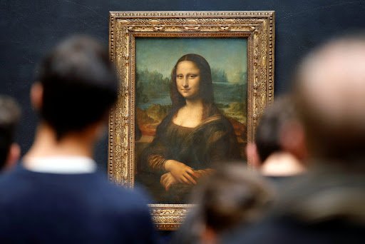
Louvre Museum
The Louvre is the world's most visited museum and a historic landmark in Paris. It houses some of the best-known works of art, as well as thousands of other masterpieces from prehistory till modern times. You can explore the Mona Lisa painting and admire the architecture. Not to mention that the beauty of Louver's gardens will take your breath away. Whether you are a fan of ancient civilization or modern art, there will be something for you there. It is truly one of the world's greatest gems!
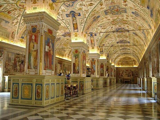
Vatican Museum
If you are looking for a place that is both spiritual and artistic, you won't be disappointed by Vatican City. Aside from being the official museum of the Pope, it is also the home of some of the most important arts in history. Works such as the Raphael Rooms and Michelangelo's Sistine Chapel will take you on a journey like no other gallery! Take a day to stop by this magnificent palace, it will only add colours to your summer Italy trip.
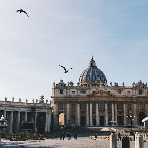
Photographer: Valerie Gong
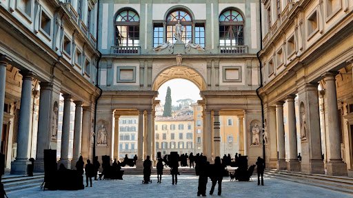
Uffizi Gallery
Founded in 1581 by the Medici family, the Uffizi Gallery is one of the oldest art museums in the world. It is famous for the Medici collection of art from the Renaissance period. Aside from this, there is also a wide range of artworks in different mediums spanning from ancient times to the 18th century. Some of the highlights are the Birth of Venus and the Primavera by Sandro Botticelli, the Annunciation and the Adoration of the Magi by Leonardo da Vinci, and the Venus of Urbino by Titian. The Uffizi Gallery also has a very stunning architecture, with long and elegant corridors overlooking the Arno River. If you love art history, you cannot miss the chance of going to the Uffizi Gallery.
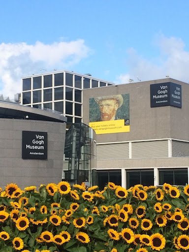
Van Gogh Museum
If you are a fan of Vincent Van Gogh’s works, you cannot miss the Van Gogh museum in Amsterdam, which holds the largest collection of the most influential and beloved artist’s works. It features some of his most famous works, such as Sunflowers, Almond Blossom, etc.
It is not only a gallery of his arts, but also a museum of his stories. One of the most special things you can see there are letters that he wrote in his life, and through them, you will learn about his history, his struggles, and inspirations.
National Gallery of Art
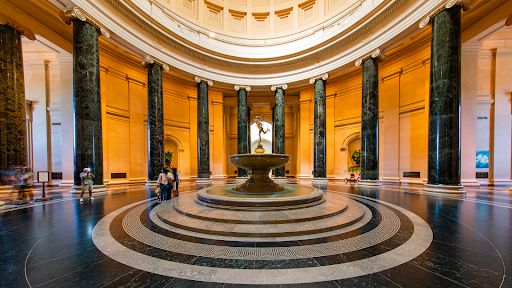
Boasting around 141,000 works, including pieces from the likes of da Vinci, van Gogh, and Picasso, the National Gallery of Art in Downtown Washington D.C. is not to be missed. Not only is the gallery one of the largest museums in North America, it also has no admission fee. For that reason, as well as its scope and the magnitude of the works featured inside, the gallery is widely considered to be one of the best in the United States of America. If you are looking for a destination closer to home that features treasured collections from esteemed artists, then come inside the neoclassical architectural wonder that is the National Gallery of Art and observe a broad range of highly acclaimed works.
Useful Links: Event Space Toronto, wedding venue Toronto, Wedding Reception Toronto

Top 5 Father’s Day Brunch Spots In The GTA
Celebrate the special bond between fathers and their loved ones this fathers day with a delightful Father's Day brunch experience like no other. Here are some of the top rated Father’s Day brunches within the GTA. Let's come together on this joyous occasion as we pay tribute to all the amazing fathers out there with Father's Day brunch being a perfect opportunity to show your appreciation and create lasting memories.
Celebrate the special bond between fathers and their loved ones this fathers day with a delightful Father's Day brunch experience like no other. Here are some of the top rated Father’s Day brunches within the GTA. Let's come together on this joyous occasion as we pay tribute to all the amazing fathers out there with Father's Day brunch being a perfect opportunity to show your appreciation and create lasting memories.
ROUX

Roux emerges as the freshest evolution of what was formerly known as The Junction Eatery on Dundas West, marking an exciting new chapter for this beloved establishment. Under the continued ownership and operation of Delany, Ross, and Markland, the revitalization of Roux is seen as a deserving upgrade for the neighborhood. Indulge in a delectable brunch experience where an enticing selection of eggs, waffles, and brisket awaits.
Image By Jesse Milns Via Website
KOST

Perched atop the magnificent Bisha Hotel, Kost is an elevated dining destination that boasts breathtaking views from 44 stories above the bustling city. This captivating restaurant takes inspiration from the vibrant flavors of Baja, offering a menu that showcases fresh and light dishes, perfectly complementing the breezy and luxurious atmosphere that envelops it.Experience the most radiant Father's Day brunch imaginable, bask in the sunshine and indulge in a delightful culinary affair that promises to please.
Image By Jesse Milns Via Website
CRAFT BEER MARKET
Dedicated to the art of craft brewing and embracing a culinary approach reminiscent of renowned chef Guy Fieri, this establishment prides itself on curating a menu that showcases the best of local ingredients. Indulge in an epic Father's Day brunch at this beer hall located in the heart of the Financial District, boasting an impressive selection of dozens upon dozens of taps. This culinary extravaganza promises to delight your dad's taste buds.
Image By Hector Vasquez Via Website
FARMHOUSE TAVERN

Transport yourself to a serene countryside retreat within the heart of the city at The Farmhouse Tavern. Nestled in an area known for its industrial heritage and urban landscapes, this hidden gem creates an enchanting ambiance that allows you to momentarily escape the bustling surroundings. Reliably satisfying hungry families, this Junction Triangle gem with a charming patio serves up an enticing combination of incredible Caesars and eggs in a nest.
Image By Marni Wolf Via Webiste
NORTHERN MAVERICK

Northern Maverick stands tall as a sprawling craft brewing company, encompassing not only a bottle shop but also a remarkable mega-restaurant that boasts an oyster bar. Within its expansive space, you'll discover the heart of the operation—a multi-level brewery where all the exceptional beers are meticulously brewed on site. The brewery's giant patio provides ample space to unwind, and relax in the company of friends and family. Take a seat and indulge in the perfect pairing of their house-made lager served in $5 tulips.
Image By Hector Vasquez Via Website
Useful Links: Event Space Toronto, wedding venue Toronto, Wedding Reception Toronto
The ESSENCE Artists
ESSENCE is all about capturing the fundamental nature of things in life, distinguishing the core immaterial components of existence. With the ESSENCE exhibition of June fast approaching, it’s an opportune time to discuss with our eight talented artists about their work, creative philosophy, and what makes them the artist that they are.
ESSENCE is all about capturing the fundamental nature of things in life, distinguishing the core immaterial components of existence. With the ESSENCE exhibition of June fast approaching, it’s an opportune time to discuss with our eight talented artists about their work, creative philosophy, and what makes them the artist that they are.
JOHN AUGER

Artist Bio
John Auger, Born 1978 in Massett, British Columbia, now resides in Barrie, Ontario where he has his home studio. He has been painting for over 20 years but has only recently made a leap jump into the art scene. He engages the viewer through the use of a semi-abstract form of painting. His landscapes and Canadian/Provincial symbols have quickly gathered a dedicated base of collectors.
Artist Statement
"With my latest work I’m trying to take the semi-abstract lines and make them more prominent by adding more definition and making the pieces more complex. The skies and bodies of water are really popping out. The use of lines and light and dark really add a dramatic feel to each piece. I love using Canadian landscapes and nature because I believe that Canada has so much more to offer than most see. I have been all over this country and I am always surprised at what I can find."
“Evolution of the Strawberry,” by John Auger
There is a strong focus on avian subjects in your work. What inspired you to paint birds? Do they represent anything special to you personally?
I decided to paint birds because I painted a theme of Provincial Flowers as well as Provincial Landscapes. The next step was birds. There was no real attachment to the theme but I would have to say that I found it very educational. I paint themes of Canada and the provinces primarily and I feel representation of this country in art is important.
Distinct shapes can be found throughout your brushstrokes. What prompted this artistic stylistic choice, and what do you want the viewership to take away from it?
I am and have always been a fan of Picasso, Cézanna and Braque. I started out by replicating what they painted and then later moved on to painting my own style but I always got "stuck" like I could never find what I was looking for. A good friend of mine and artist assured me I was in the right direction and sort of mentored me to where I am now and I have been "evolving since. I want the viewer to take away what they want. I, in all honesty, paint for myself and whatever the viewer sees or feels about a piece is how they feel. My art is the only thing in my life that I feel I can be selfish about.
Do your paintings represent any reflections of your own perspectives and experiences?
All my paintings reflect where I have been, what I feel about the subject and especially my perspectives. Even the birds were kind of a "next-step" in the provincial paintings but my attachment to this country and its provinces I feel is very deep and spiritual. Every one of my paintings stirs something inside me and I want the same for the viewer. Painting is very emotional for me.
What feelings do you hope to inspire in the viewer?
When a viewer sees one of my pieces I want them to believe that it already belonged to them. I want a memory to instantly become attached, like they have been there or seen that. I want them to have an emotional attachment like I do when I paint it. My art is primarily my memories so I want the viewer to attach my piece to their memories.
CHANTEL BETTENCOURT

Chantel Bettencourt
Artist Bio
Chantel Bettencourt is an evocative expressionistic painter living in Halton Hills, ON. Primarily focusing on painting landscapes with expressive palette knife techniques with acrylic on wood canvas. She Graduated from Visual and Creative Arts and Sheridan College in Oakville ON.
Her journey into art and mental health began to unfold in January 2021. Not only did painting allow her to express her pent-up emotions, but it also brought her a feeling of inner peace and got her into a meditative state of mind. Her love of art was reinstated. Chantel knew she needed to continue painting, tell her story, and help others feel less alone by seeing their emotions expressed through art.
She is an advocate for mental health and donates 5% of proceeds towards the Canadian Mental Health Association.
Artist Statement
I am delighted to have the opportunity to showcase my artwork as part of the "Essence" art exhibition. As an artist, I draw inspiration from the Canadian landscapes that I visited when I was younger. These landscapes have always held a special place in my heart, and I use my art to capture their beauty and evoke a sense of nostalgia in the viewer.
My featured pieces in this exhibit are an expression of my desire to capture and convey the essence of emotions and experiences that move me deeply. I use a palette knife to create dynamic movement in my paintings, allowing the colors and figures to dance around the canvas in an expressionist style. Each painting is an extension of my soul, and I strive to stay authentic to the feeling of the painting with my unique vision.
My paintings are not only a reflection of the landscapes themselves but also symbolize the memories and emotions that they hold. I aim to transport the viewer to a specific moment in time, allowing them to relive their own experiences and memories. Through my art, I hope to promote self-exploration and awareness, as painting is a personal form of meditation and therapy for me.
I am inspired by nature and textures to convey evocative paintings. The use of a palette knife creates a rough texture and thick layers, allowing me to sculpt the paint and create a sense of depth. I strive to incorporate these textures and patterns into each piece to create a unique visual experience.
I believe that art is a powerful tool for communication and connection, and I hope that my pieces in this exhibit will spark a sense of curiosity and contemplation about the fundamental nature of things. I am excited to be a part of this exhibit and share my vision with others.
Thank you for taking the time to view my art, and I hope that my pieces will evoke a sense of nostalgia and wonder in the viewer.

Through working on your paintings, how have you achieved greater self-exploration and meditative reflection?
Grieving is a journey that never really ends, but there's a distinction between "new grieving" and "old grieving." When I'm painting, it's the "old grieving" that comes to the surface. It's bittersweet because it brings up those memories and emotions, but at the same time, it's a way to honour them and feel grateful for the time I had with the people I've lost. It's like a mix of sadness and happiness, all wrapped up in my artwork. It's my way of capturing the ups and downs of life and turning them into something meaningful.
Your work features more muted colours in a lot of places. What inspired the specific colour palettes that you choose?
Using muted colours gives the viewers a chance to project their own emotions onto the painting. It's like they find a space within the artwork to place their feelings and create a sense of peace around them. The colours create this calm and contemplative atmosphere, allowing people to connect with the art in their own unique way. It's pretty cool how colours can evoke such powerful emotions and give us a sense of serenity.
Throughout your paintings, you seem to gravitate towards skies and bodies of water. Do these places hold any particular special meaning to you, and what do you want them to mean to the viewership?
For me, water and the sky hold a special significance that goes beyond their physical presence. These elements have been associated with a wide range of emotions throughout history. On one hand, they can evoke a sense of depth, weight, and even fear. On the other hand, they possess a serene and peaceful quality.
Water and the sky are fascinating because they represent opposing forces in terms of their placement in the world, yet they share similar emotional traits. They both embody the concept of constant change. Just like the viewers themselves, these elements are in a perpetual state of transformation.
By incorporating skies and bodies of water into my paintings, I invite viewers to experience and connect with these emotions. I want the viewership to engage with the ever-changing nature of their own emotions and find solace in the fact that change is a fundamental part of our existence. Whether it's the vastness of the sky or the flowing currents of water, these elements serve as a visual reminder that our emotions are fluid and dynamic.
What inspired the artistic decision to stick with rougher textures and patterns?
By incorporating rough textures and patterns, I aim to create a tactile and visceral experience for the viewers. These elements add depth and character to the artwork, mirroring the diverse textures and patterns we encounter in our own lives. They serve as a visual representation of the complexities, imperfections, and beauty that coexist within our world.
Furthermore, the rough textures and patterns provide a visual language through which viewers can connect with the artwork on a more visceral level. It invites them to explore the layers and nuances, inviting a deeper emotional engagement. It's about embracing the rawness and embracing the imperfections, as they hold a unique beauty that reflects the intricacies of the human experience.
SIMON RASKINA

Simon Raskina
Artist Bio
Toronto-based artist Simon Raskina creates displays of majestic color through his detailed paintings of familiar and exotic subjects. His work focuses on the enduring natural beauty of landscapes and animals, with applications of kaleidoscopic brushstrokes and smoky textures to produce a picturesque quality. Although working in a realistic style, Raskina's compositions contain an idealized palette that tends towards fantasy and neon opulence. This effect, however, only adds to the naturalistic style and the overall sense of positivity and unrestrained energy in his works. Simon has had the opportunity to exhibit and showcase his paintings in New York, Denver, Toronto and Los Angeles.
Artist Statement
Wildlife and landscape paintings have been a tremendous part of my artistic journey. Capturing a moment in time with my paintbrush and presenting that moment with my own style and bizzare palette is what I do best. When we visit a zoo or a wildlife sanctuary, the animals there mystify us with their beauty. When I return to my studio with my reference photos to paint, I use my technicolor palette to enrich the experience for the viewer. These paintings of purple iguanas, green giraffes and red tigers allow us to fall in love all over again with these majestic creatures viewing them in a new light. I hope to spread awareness of these endangered species and their value to our world. Essence in art is capturing a moment in time with my paintbrush.

There is a cosmic atmosphere incorporated into several of your works. What inspired this artistic choice and what feeling do you hope for viewers to take away from it?
Perhaps one of my favourite series I've painted was titled "Creation". I combined oil pastel along with acrylics to create wondrous galaxies and nebulas intertwined in a surreal imaginative realism animal portrait. I have one painting as part of that series showcasing in the ESSENCE exhibit titled "Wolf Nebula". I have always enjoyed incorporating a fantasy element into my paintings. I grew up admiring fantasy illustrators like Frank Frazetta, Julie Bell & Boris Vajelio. Combining galaxies with these majestic animals creates a sense of awe and mysticism. I hope for viewers to emotionally connect with whichever painting is their "spirit animal".
Your artist statement mentions capturing a moment in time. Can you tell us a bit more about the techniques and choices you make to immortalize these works specifically as singular moments in relation to the chronology of time?
I have always admired the painters and illustrators that would paint a scene or situation precisely the moment before something critical occurs. My painting titled "Prowl" depicts a tiger with glistening and attentive eyes ready to pounce on its prey any minute. I want viewers to take the time to create a narrative for these beautiful creatures. My references I either create using multiple photos or take myself at Toronto Zoo must always have a proud and grand presence to them.
What process do you go through to decide on which theme color to use for specific animals?
As an artist you are forever learning how to see. Sometimes the animal itself gives me a warm or cool feeling which translates to the color choices. I have painted green elephants, purple elephants and blue elephants. But never red. Colours mean something different to each person. The colour purple to me is royal, rich and majestic. Sometimes the pose of the animal also helps me decide the colour palette as well.
You manage to make the animals quite distinct despite using similar colors for both the subject and the background. What is the thought process and technique behind this?
I love creating paintings that are almost completely monochromatic except for a few contrasting highlights to accentuate areas for a focal point. I begin my paintings with different values of the same color and do not introduce complimentary or different colours until the end. Once I have found all of my shadows and created the form of the subject, then it's time to jazz up the subject with an explosion of colour. I always want a balance between abstraction and controlled painting.
ALANA PANCYR

Alana Pancyr
Artist Bio
Alana Pancyr is an Actress and a Multimedia Artist from Saskatoon Saskatchewan, now living in Toronto, Ontario. As seen in 'The Handmaid's Tale' as OfWyatt and 'Murdoch Mysteries' and works in social media content creation. Grossing over 100k on Instagram alone. Her works cover mediums from digital, acrylic to oil painting. She is known for her forest collections and isolation series, which she created during the COVID lockdown. Her works are an ever changing expression of her environments and emotions.
Artist Statement
A lot of the enjoyment of a forest, or being in nature, is the feeling it gives you. I love focusing on the feeling I get from nature and how that moves from me onto the canvas. I am excited to be showing in 'Essence' as that is what my work embodies, an essence, rather than an exact portrayal of a landscape. The places you see depicted don't really exist, they are a collaboration of images from my mind and photos to create the landscapes shown. It's important to me to convert something true and deconstruct it a little. I love the idea that a painting should represent something but not spell it out exactly, leaving the interpretation to the viewer. Playing unconventional colours helps me push the feelings of the work versus a direct image.
What do I want to say with my art? I want the viewer to be free to interpret how it makes them feel. May they find solace in the ponds, comfort under the brands and experience all their own feelings they have felt in nature again in my work. Feel the light through the leaves and be left with the impression you could walk right into the painting and into your own little world.

Your approach to encouraging viewer interpretation is fascinating as people bring their own lived experiences and perspectives into how they digest a work of art. As for you personally, what feeling does being in a forest inspire in you, and how does this translate into your desire to open your work up to a multiverse of takeaways?
For me the forests and landscapes come from a certain relaxing place in my mind. I find a lot of comfort under trees and in nature. I think with any art it's important to stay open to interpretation, we are all so different in our thought processes so there is some magic in that. I think as an actor I was taught to create and let go of the end result so that happens a lot in my art also, the audience is their own chapter in the creative process.
You play around with very different colour palettes and styles in your work. What motivates you to incorporate such a diverse range into your work?
Honestly I don't have the best answer for that, I guess that is where 'style' comes into play and the recognizable features of an artist. My friends recognize my work from my brush strokes and the fact that my palettes lean blue. My first landscape ever was just using a lot of blues, again it's almost not on purpose even, just a lot of my work ends up like that. Blue isn't even my favourite color but it's hugely used in my work so that's somewhat comical. There must be something about it for me but I haven't found the true meaning even for myself. I think it's also about adding my own interpretation of things and letting go, like if I wanted a picture of a forest I'd take one but I want artwork, I want to recognize the forest even as something less exact.
On the matter of taking something real and present and deconstructing it, how do you make use of various techniques and stylistic choices to deconstruct and represent a reality into a feeling?
I think I follow impressionists in that way, I love that you don't need a lot of detail for something to be recognizable, or exact colours. I find it more playful and exciting to allow myself to interpret how I see things, what I consider beautiful. I use a lot of play of colour and larger brushes to allow for that.
There is strong usage of fairly defined lines in your work. What inspired this artistic choice and how does it play into the message you want to convey?
I grew up working a lot in a more cartoon/comic style so I think that's why I am so line heavy. I like the division of light and space and that takes something to create that divide. Also nature, plains, treas, branches, I just see a lot of lines and nature and use that to reflect the subject in my work.
SARAH MATTINSON

Sarah Mattinson
Artist Bio
Sarah Mattinson is a local Canadian Artist who grew up in barrie and has always lived within the GTA. Starting out making artworks for family and friends she did her first festival in 2019 and grew her art career from there! During covid she was featured in virtual galleries and launched a website and an etsy store. Zoom forward to today and at 28 specializes in nature inspired abstract and landscape works. With a love for high contrasts and inspiring powerful scenes from nature.
With an educational background in Anthropology prior to finding her passion as a painter she had the opportunity to study the evolution of man and the beauty that cultures around the world have to offer. This same beauty found worldwide is the same essence that is intended to be captured within these pieces.
Artist Statement
As an artist, my passion is to share the beauty of nature and my abstract creations with the world. I believe that art has the power to transform spaces and bring joy to people's lives. My paintings are a reflection of my connection to nature, and I strive to capture its beauty and complexity in my work. Each piece I create is a unique expression of my love for the beauty the world has to offer, and I pour my heart and soul into every brushstroke. Please enjoy.

Could you tell us more about how you incorporate temperature into your work?
Typically in the past I have catered to cooler tones in my pieces but recently have started choosing a colour of the year and incorporating that in all my works. This year is a Deep Navy Blue called Annapolis blue and has brought a very deep cool tone to my works that I have been thoroughly enjoying. In the future I am excited to work around warmer tones as well and am enjoying the process or exploring each thoroughly.
You have chosen a focus on more wintry subjects. What draws you to this sort of winter-esque atmosphere?
Growing up in a Northern climate you tend to see the beauty winter has to offer and I try to bring that serenity into my nature work. The Wintery scenes seamlessly blend with my navy blue art theme for this year's collection of works, I also find myself irresistibly drawn to the allure of snow capped mountain peaks! I'll be trying to take advantage of as many navy aesthetic mountain or seascape inspirations I can before I move on to a new colour theme for 2024.
Your artist statement says that your paintings are a reflection of your connection to nature. How do you make use of certain techniques and artistic aspects to reflect the essence of this connection as a reflection of something that is personal to you?
I strive to capture the personable and intuitive connection we all share with nature in my paintings. My Goal is to evoke that uplifting and energizing feeling of being away from urban life, surrounded by the beauty of the natural world. I believe many nature lovers seek that same sensation when they explore the outdoors. Through my art, I aim to bring a piece of that experience into peoples homes allowing buyers a chance to enjoy and cherish everyday.
The style in which you paint is well-defined and pinpointable. How does this play into your desired artistic message and what you hope for the viewer to take away?
Thank you for noticing the well-defined and pinpointable style in my paintings. This is a deliberate choice in an attempt to convey the same essense between my paintings. By Developing a consistent style I aim to establish a visual identity that sets my work apart and sparks curiosity in the viewer. I want them to recognize my paintings and immediately associate them with my artistic vision. Through my style, I hope to create a lasting impression that resonates with viewers, evoking emotions, and ultimately leaving them with a meaningful memorable experience.
MARY PERKINS

Mary Perkins
Artist Bio
Mary Perkins is a self-taught artist born and raised in North Toronto. Her love for the outdoors is exhibited in her oil painting nature landscapes, inspired by her recurring time in Toronto, Ottawa, Huntsville and Brampton. Mary’s approach is simply that of capturing what she feels when she gets in front of her canvas. Much like the landscapes that inspire her, her style conveys nature’s power, emotions and beauty with elegance and realism.
Artist Statement
Natural spaces hold immense soothing, healing and restorative powers and immersing ourselves in said spaces helps us find connections to the landscape and experience the varied emotions evoked from their beauty. Nature is a source of inspiration, relaxation, reflection and rejuvenation and my landscape vignettes are an expression of those essences.

Your work has a very heavy emphasis on blues and dark colours. Can you tell us what draws you to this specific colour palette?
Since childhood I've always been drawn in by blues of any hue, it has simply always been my favourite colour. As an oil painter, I find blues, especially dark blues, such a joy to create and connect with as they allow me to create an atmosphere that is quite palpable to me, as well as the viewer. Indigo is simply a staple and go-to in my often limited palette. I gravitate to it time and time again.
You mention wanting to evoke a varied range of emotions, including those that are relaxing and rejuvenating. Could you elaborate on what sort of artistic choices you make in the process of coaxing such an emotional takeaway?
When I sit in front of my canvas I usually have no plan as to what I am going paint. I do not use reference photos, nor sketch onto the canvas. What I create often depends on my mood and sometimes the mood I'd like to arrive at on that day. A feeling or memory is what I try to capture on the canvas. I find nature scenes, particularly nocturnes, can beckon the viewer to get lost in the vista and connect with nature in its simplicity, its quiet, it stillness, its sounds, and at the same time be acutely aware of nature's constant movement. In our lives we can identity with serene moments in nature, just as we can relate to the ferocious ones.
There is an incorporation of heavy shadows in your work. What do these mean to you and what do you want them to convey?
Shadows. So much happens under the cover of night. The perhaps heard, but unseen goings on in natural spaces. Watchful eyes upon us we don't even know are there. Shadows may also occupy our thoughts. Darkness can envelop us in so many ways, physically and emotionally, and I'm attracted to exploring dark moments which can hold beauty and pain concurrently. Examining the dark moments truly allows us to appreciate the light that does break through.
The skies you make have a complex, textured feel to them. How does this play into your desired message?
Our skies hold so much, some days clear as a bell, others an absolute turmoil, roilling above our heads. I love the movement we find in the sky above us - slow and quick moving clouds, moonlight that can seem like a beacon, simply its vastness. We often find ourselves looking up at the sky, sometimes in exasperation, sometimes to quiet our mind or simply to just take in its beauty. Sometimes we just need to lose ourselves in that sky above us.
KATHERINE POLACK

Katherine Polack
Artist Bio
Katherine Polack is a Peruvian-Canadian mixed media marine life artist who resides in Clarington, Ontario surrounded by nature and infinite inspiration.
The years she spent during her childhood along the Pacific Coast in Lima, Peru are at the root of her artwork. Her work is inspired by both ocean conservation initiatives and her travel adventures focused on marine life exploration.
Her work has been published in Artist Talk Magazine and EAST Magazine. Katherine’s paintings have been juried into multiple exhibitions by the Federation of Canadian Artists, Summer & Grace Gallery, the Robert McLaughlin Gallery, Camelback Gallery and Propeller Art Gallery.
As a portion of every sale goes toward ocean conservation, every collector can select one of three Canadian ocean conservation institutes (Canadian Sea Turtle Network, Oceana Canada, or Canadian Whale Institute), when purchasing one of Katherine’s pieces.
Artist Statement
Tranquil art to connect our feelings of love, security, and inner peace with the purity of marine life and the power of the ocean.
In this exhibition, I invite you to immerse yourself in the soul-stirring beauty of the ocean and contemplate its essential nature.
My art focuses on highlighting the beauty of the sea and the purity of marine life as a reminder of the responsibility that we have toward our ocean.
At the core of my art practice, I aim to evoke a sense of joy and tranquility and help you to connect with a feeling of love, security, and inner peace.
Using calming blue hues and smooth gradients to evoke a sense of tranquility while simultaneously channeling the brightness of my cultural upbringing through bold and vibrant colours, I ultimately hope to create a conversation where we can explore the positive impact that nature has on us.

What inspired you to gravitate towards water and marine life as your primary subject matter?
I’ve always felt a deep connection with the ocean even before I could put it into words. The ocean is at the core of my soul and art is how I am able to channel it. Art has always been a part of me before I understood the power of what that meant in my life. I’ve always felt an admiration and joy toward sea turtles and it was the second animal I ever painted back in 2016 (penguins were the first). The strong gravitation toward marine life as the focus of my artwork however, didn’t begin until January 2021 when I was quarantined at home for a few weeks with Covid but ill for much longer. I lost my voice and could only write or nod at my husband who was also sick and quarantined with me. When I finally regained the strength to move around, all I wanted to do was paint.
So I walked into my home studio with a paintbrush and no voice and came back full circle as I painted a family of penguins swimming underwater in search for their next meal “Gone Fishing” (15 x 30” acrylic on canvas). My very first painting in 2016 was actually a group of three penguins which still hangs proudly on my living room wall!
The synchronicity of these events and the five year gap between the penguin paintings has always felt like a nudge from the universe. After that painting I began to develop an insatiable appetite for painting marine life and using visual storytelling to bring awareness to the beauty of our ocean along with the positive impact that nature has on us.
How have your own lived experiences and perspectives influenced your painting process and artistic choices?
I spent part of my childhood years along the Pacific Coast in Lima, Peru where I would spend the majority of my summers at the beach with my family. When we moved to Canada in the spring of the year 2000, my passion for sketching and painting came to halt by the end of that summer.
18 years later, I was standing in the middle of my apartment staring at an empty living room wall and had the wild idea of going all out and creating a 30 x 40” large painting of three penguins after not having picked up a paintbrush since childhood. Little did I know, this was the beginning of a new path.
The following year, my husband and I traveled to Australia and my memories of the sea came flooding back to reignite my deep rooted connection with the ocean. Since then, I have experimented with resin, acrylic pours, wood working, acrylics, and now oils. I try not to question why a certain medium speaks to me but I trust that it is for a reason. I’ve been on a self love and self healing journey and the smoothness of oils is what pulled me in. It’s helping me reconnect with myself in ways I couldn’t imagine so I know to trust the process and continue listening to my soul.
The colors of your works blend in very smoothly, rather than being more roughly textured. What inspired you to do this and how do your techniques as an artist play into this tranquil smoothness?
I have always been drawn to soft, calming, and peaceful experiences. The colours I use and the smooth gradients you can notice in my backgrounds aim to evoke a sense of peace and tranquility with calming hues of blue using wide synthetic brushes. Every piece that I create teaches me to be more patient and compassionate toward myself; I could blend my backgrounds for hours and it has become a different meditative process than with the intricacy of the details of marine life like the fins or shell of a turtle or even the barnacles of a whale.
You note that tranquility, love, and purity are among your themes of focus with regards to the emotions you wish to express. Can you tell us a bit more about why you chose these specific emotions and themes?
Absolutely. The three core values I hold closely are love, security, and inner peace because if you lead with love, you create a safe space for others which then invites inner peace. Once that triangle is established, I have found that tranquility can then enter freely.
The feeling of purity ended up surfacing when I turned my focus toward painting marine life versus seascapes. The connection I feel toward animals and specifically marine life is one that I cannot fully explain rather I can feel. It’s a combination of the way marine animals glide through the water, protect their kind, and show a sense of ease and comfortability in their home.
ROBERT SCOTT

Robert Scott
Artist Bio
Born and raised in Toronto, Ontario, Canada, Robert Charles Bruce Scott has followed his lifelong passion for art. Rob focused on art studies throughout his high school years and spent two years studying a wide variety of art forms and techniques at Ontario College of Art (now OCAD). Shifting to business, Rob put his artistic skills to work while practicing marketing and business communications for several large Canadian and global organizations for almost 40 years. During this time, Rob continued to paint and draw for his personal enjoyment, while also completing numerous freelance art projects for business clients - logo design, letterheads, presentation illustrations and meeting themes. At the beginning of 2019, Rob shifted to full-time artist, naming his creative studio Charles Bruce Art. The subject matter of Rob’s art is focused largely on landscapes and various still life images, as well as neon signs, old buildings and interesting urban settings. Preferred art media are painting in oil and pencil drawing in both graphite and colour. Today, Rob lives in Mississauga, a suburb of Toronto, where he continues to explore new art themes and ideas.
Artist Statement
“If you look closely, art subjects are everywhere. Nature provides powerful visual references for my art; I want audiences of my landscapes to almost feel the sandy beach around their buried toes or imagine the spray from a rolling wave hitting the shore. Nothing is more dramatic than an angry, black sky or an early morning golden sunrise - I like using oil paint’s vivid depth of colour to record nature’s endless palette. Even the bark of a mature tree reminds me of an elder’s weathered skin that I can present as an abstract image of light and dark shadows and textures with graphite pencil on paper. No matter where you live, experiencing nature is universal and I strive to realistically capture images that people can relate to and appreciate.”
You play around with realistic depictions and pixelated imagery. What inspired this artistic choice and what do you hope to convey with it?
I have always been fascinated by pixelized images - how your brain processes various images so effortlessly. For a small series of flower paintings, I created a very traditional painting style and inserted half of the image as pixels. I was excited to see the juxtaposition of old and new styles in the same painting. Where I can, I look for ways to add a creative surprise in my artwork.
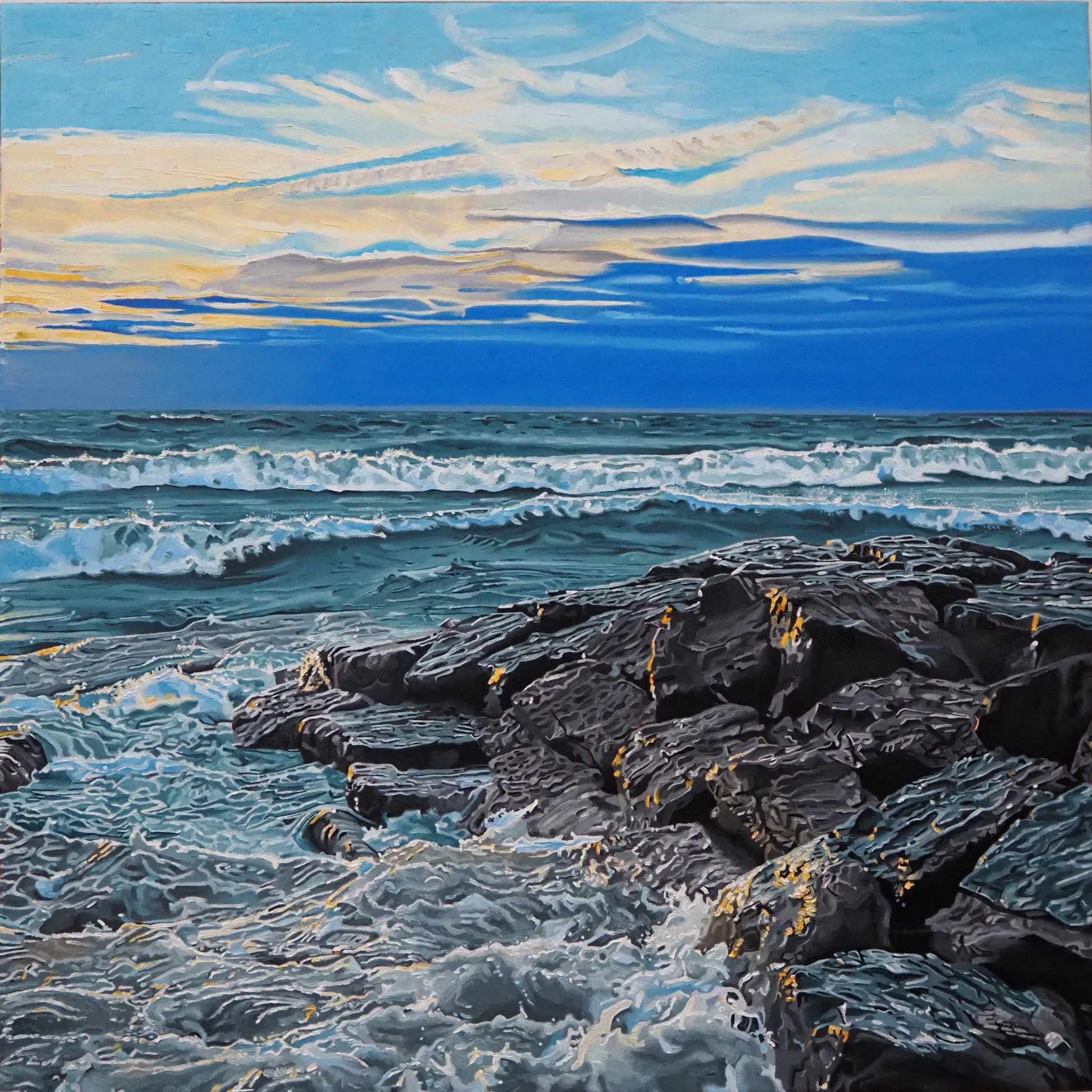
There is a strong focus on bodies of water in much of your work. What draws you to this particular subject and why?
Before I started painting full-time, I was focusing on subject matter like old buildings, neon signs/letters and still-life images for my art. Once I painted or drew daily, my subjects expanded - I started seeing art everywhere. I got hooked with my first landscape painting of a dramatic nearby lakeshore. The awesome skies and water imagery provide interesting colour, shadows and movement that sometimes feels very abstract. I must like painting water, skies and nature - my first series with a significant amount of related artwork is my Lakeshore-themed paintings. I’ll do more moving forward.
How do your personal lived experiences and perspectives play a role in influencing your choice of subject matter and how you portray them?
I think every artist pours their personal views of the world into their art. Selfishly, we create art that we love first, and then hopefully other viewers will too. Taking my little toddler twin grandsons to the beach inspired me to start painting lakeshores. My love of quirky objects like old typewriters and old cameras inspired still-life paintings. A healthy coffee addiction turned into paintings of cups of coffee - like I said, art is everywhere… if you look for it. After a long corporate career full of endless deadlines and deliverables, I take a very selfish approach to creating art. I don’t have to do anything I don’t want to do - I will not accept art commissions and I’m just starting to sell my art now. My goal is to fulfill my passion for creating art that interests me with no stress or drama while striving for improvement and exploring new creative ideas.
Why did you decide to gravitate towards realism?
Every artist has a unique, fingerprint-like style for creating art that is a reflection of their personality. I love most types of painting styles; I just love art in general. I would love to create bold, unconstrained painterly art. I have consciously tried to create loose paintings and I always gravitate to more realism in the results. I have come to grips with the fact that no matter how much I think about adopting another style, my precise painting style prevails. So, I didn’t decide to gravitate to realism…I decided to stop fighting my natural tendency towards realism as my painting style. So far, most people seem to like the results, thankfully!
Also Read: Event Space Toronto, Wedding venue Toronto, Wedding Reception Toronto

TOP 5 MOST EXPENSIVE PAINTINGS IN THE WORLD
What amount are you prepared to spend on a captivating work of art? The impact of a breathtaking painting is undeniable, as it can stir up various emotions and serve as the focal point of a space. However, what is the cost? For certain collectors, there is no limit regarding how much they are willing to pay for exceptional art. Every year, both auction houses and private galleries witness record-breaking sales for works by both Old Masters such as Leonardo da Vinci, as well as 20th-century luminaries like Jackson Pollock and Pablo Picasso. This article will explore the top 5 most expensive paintings ever sold in art history.
What amount are you prepared to spend on a captivating work of art? The impact of a breathtaking painting is undeniable, as it can stir up various emotions and serve as the focal point of a space. However, what is the cost? For certain collectors, there is no limit regarding how much they are willing to pay for exceptional art. Every year, both auction houses and private galleries witness record-breaking sales for works by both Old Masters such as Leonardo da Vinci, as well as 20th-century luminaries like Jackson Pollock and Pablo Picasso. This article will explore the top 5 most expensive paintings ever sold in art history.
Salvator Mundi by Leonardo da Vinci

SOLD FOR: $450 Million
In 2017, an anonymous buyer purchased Salvator Mundi for slightly over $450 million at a Christie's auction. This painting, which translates to "Savior of the World," not only holds the title of the most expensive painting in the world but also the most controversial. Several scholars have expressed doubt that the work was entirely created by Leonardo da Vinci, as the overall composition doesn't completely match da Vinci's style. In 2018, the Louvre conducted an analysis that suggested the painting may have evolved over time, with Leonardo possibly adding the hands and arms later.
Interchange by Willem de Kooning
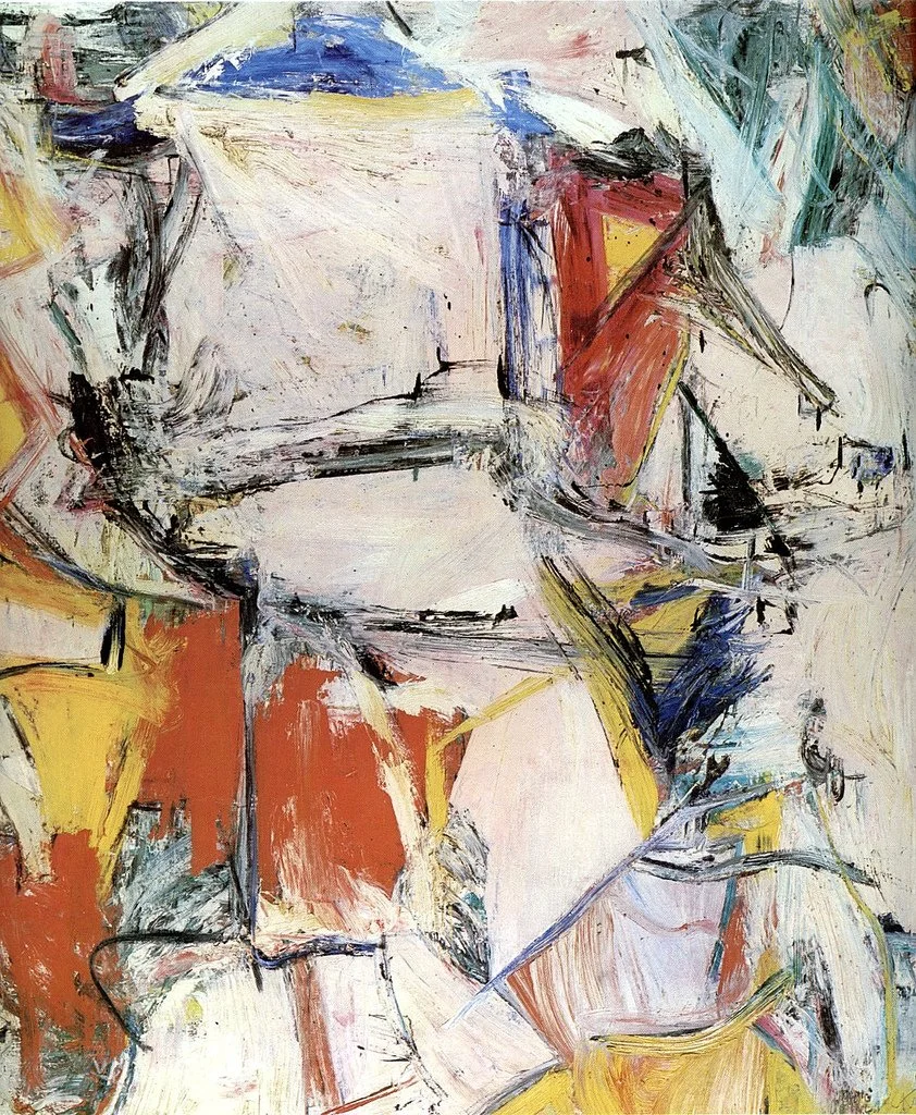
SOLD FOR: $300 Million
Willem de Kooning, the Dutch-American artist known as the "artist's artist," played a significant role in shaping the abstract expressionist movement. One of his notable works, Interchange, marks a shift in his artistic approach from painting mostly women to more abstract urban landscapes. The painting's central focus is a pink center that depicts a woman reclining amidst a bustling background. In September 2015, Kenneth C. Griffin purchased the oil painting from the David Geffen Foundation.
The Card Players by Paul Cézanne
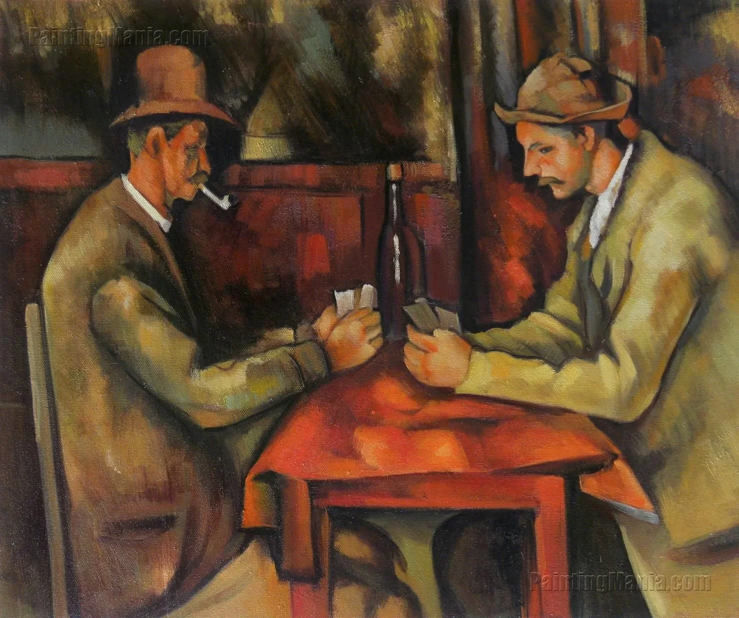
SOLD FOR: $250 Million
In the 1890s, Paul Cézanne produced a sequence of five paintings featuring labor workers engrossed in card games. This particular piece portrays two men deeply engaged in a game and deviates from Cézanne's earlier vivid and dramatic works. Although most paintings from the series are exhibited in museums worldwide, the royal family of Qatar acquired this specific artwork in 2011.
Nafea Faa Ipoipo? by Paul Gauguin

SOLD FOR: $210 Million
"When Will You Marry?" or Nafea Faa Ipoipo?, was one of Paul Gaugin's initial paintings after returning from his maiden voyage to Tahiti in 1891. The artwork highlights a local young woman adorned with a white flower in her hair, symbolizing her readiness for marriage in Tahitian customs, with her mother protectively seated beside her. Although initially sold for $300 million, a lawsuit in 2017 revealed that the actual selling price of the painting was $210 million.
Number 17A by Jackson Pollock
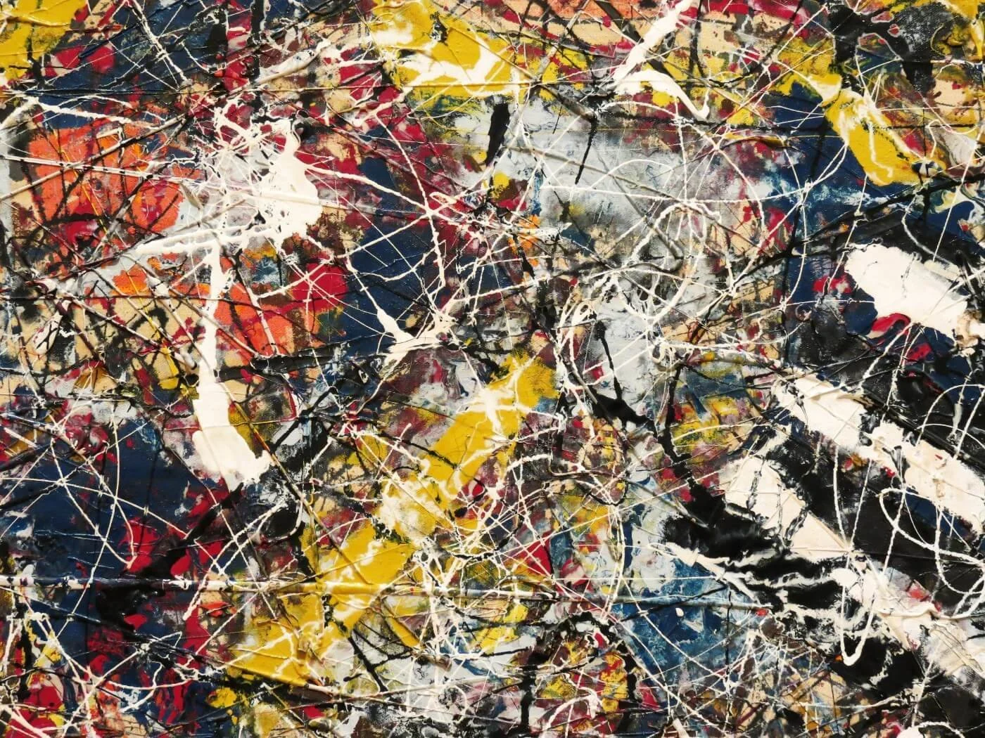
SOLD FOR: 200 Million
Jackson Pollock, a key figure in the abstract expressionist movement, gained recognition for his unique "drip" method of pouring paint onto canvases, frequently placed on the floor, to express emotions through movement. Number 17A, an early work by Pollock, showcases a spectrum of colors across fiberboard canvas in an abstract manner, utilizing this distinctive technique. The painting was purchased by billionaire Kenneth C. Griffin from the David Geffen Foundation in 2015.
Useful Links: Event Space Toronto, wedding venue Toronto, Wedding Reception Toronto

5 Best DIY Gift Ideas for Mother’s Day
As Mother’s Day approaches, you might be wondering what to get for your mom for the special occasion this year. If you want to have a gift that is more personal and thoughtful, why not DIY some gifts for her? Here are five best DIY gifts that you can easily make within a short amount of time to give your mom as warming Mother’s Day gifts.
As Mother’s Day approaches, you might be wondering what to get for your mom for the special occasion this year. If you want to have a gift that is more personal and thoughtful, why not DIY some gifts for her? Here are five best DIY gifts that you can easily make within a short amount of time to give your mom as warming Mother’s Day gifts.
DIY Bath Salts

Photo by Sarah White
Bath salt is one of the best thing to gift to your mom, as there are many benefits of using them to enhance a bathing experience. It helps relax your muscles, detoxify your skin, and improve your mood. It will be the perfect gift for her to relax and unwind at the end of a tiring work day.
Making your own bath salt is easy and fun. You only need a few ingredients that you can find online or in your local store. You can also customize your bath salt according to your mom’s preference and needs. Below are some choices of ingredients and their benefits.
Dead Sea Salt: Helps with allergies and skin conditions.
Pink Himalayan Salt: eases swelling and stress.
Celtic Salt: anti-inflammatory and good for the brain.
Epsom Salt: Releases magnesium and sulfate ions, which can relieve muscle tension and joint pain.
Lavender Oil: Promotes relaxation and sleep.
Rose Oil / Rose Hip Seed Oil: Uplifts your mood and nourishes your skin.
Peppermint Oil: Stimulates your senses and clears your sinuses.
Lemon Oil: Cleanses your body and boosts your immunity.
To make your own bath salt, simply mix the following ingredients (or your customized ones based on this measurement) in a big bowl before storing them into glass jars and gifting them to your mom!
2 cups of Epsom salt
½ cup of coarse sea salt
¼ cup of baking soda
10 - 15 drops of essential oil (or a blend of oils)
Optional: dried flowers or herbs
Violet Syrup
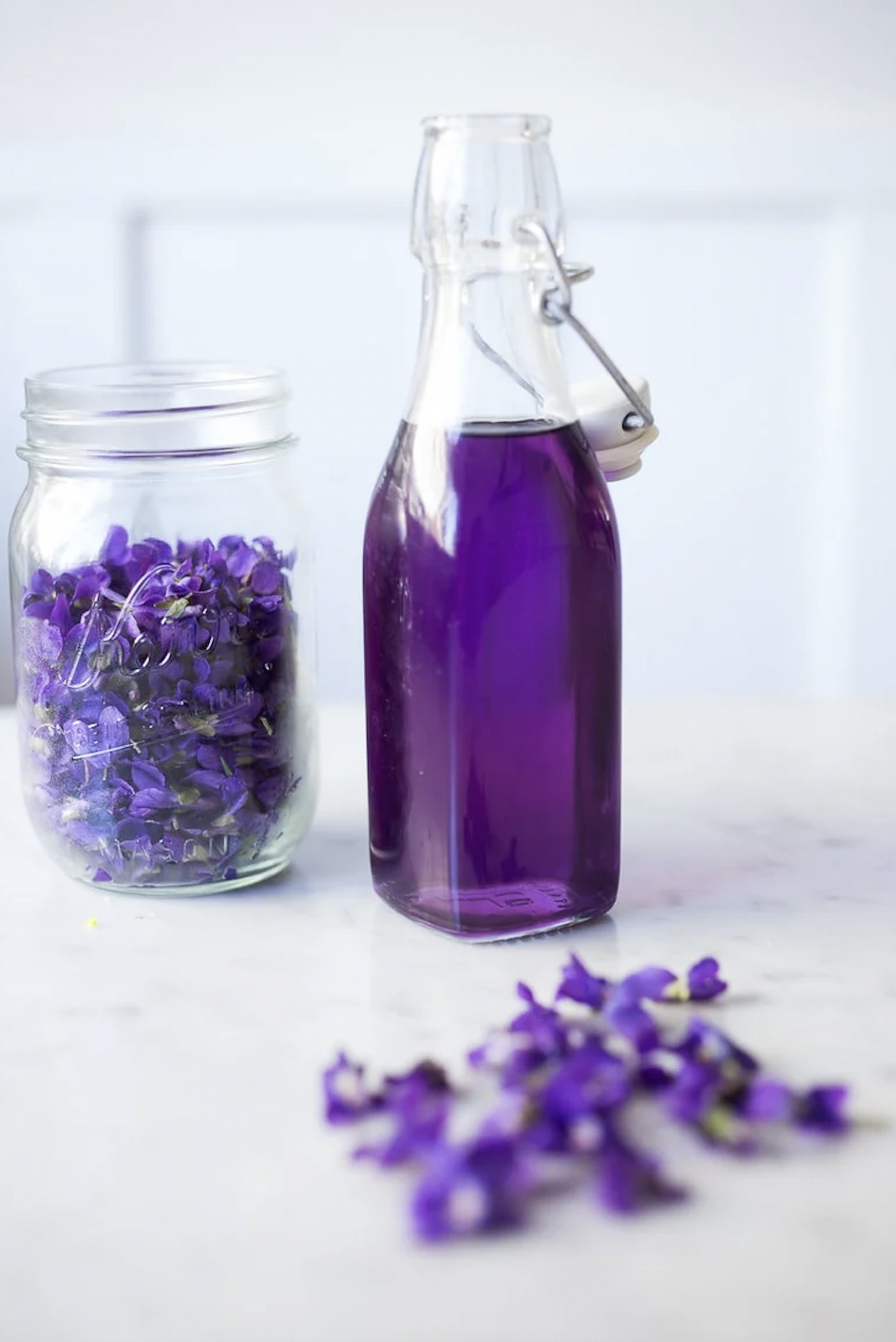
Photo by Sylvia Fountaine
Violet syrup is a sweet and floral syrup that you can make from foraged violet flowers, which are in season and blooming everywhere right now! Why not make your mom some violet syrup, so she can use it to flavour drinks, desserts, yogurt, pancakes, or anything else she might enjoy!
It has a lovely dark blue colour that turns purple when you add a few drops of lemon juice in it, just like magic!
Foraging for violet flowers is easy and fun. You can find them growing wild in shady, moist areas such as woodlands, meadows, lawns, or gardens. Here are some tips on how to identify the type of violet flowers you will need for this recipe.
Photo by Rita Heikenfeld
Flowers: Purple/blue in colour. The flowers slightly droop, and have an inner white area.
Leaves: Violet leaves are palmate, alternate, and are oblong heart shaped. The leaf margin is toothed and they do not have hairs.
Height: Anywhere from 15cm - 25cm tall, although depending on their environment, they could be on the shorter side.
Edible Parts: Violet flowers and leaves are edible with the leaves having a high level of vitamins A and C. Aside from using their flowers to make syrup, they can also be used in salads or cooked as greens.
Here are the steps to make violet syrup:
You will need approximately two cups of violet flowers.
After gently washing and rinsing the flowers, soak them in 1 cup of warm water (note: you do not want to soak them in water that’s too hot, as it burns away their colour), leave them overnight.
Strain the water out, add to a cooking pot, and add 1 cup of sugar to the cooking pot.
Stir over low to medium heat until the sugar has dissolved, then remove from heat. You do not want to overheat the pot, as it can burn the violet colour.
Pour into a sanitized glass jar.
Add three drops of lemon juice to the mixture and stir well to make it purple!
Homemade Lip Balm
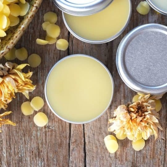
Photo by Sarah Cook
Homemade lip balm is a simple and fun DIY project you can do with just a few ingredients and tools. It helps moisturize, protect, and heal the lips. It can also add a subtle shine and scent to your mom’s amazing smile! You can customize your lip balm with different oils, fragrance, and even flavor based on your mom’s preferences and needs.
For this project, you will need:
A double boiler or a glass bowl over a pot of boiling water
A whisk
A funnel (optional)
Empty lip balm tin
Some beeswax pellets or shavings
Some coconut oil
Some carrier oil of your choice (sweet almond oil, grape seed oil, olive oil)
Some essential oils of your choice (refer to DIY bath salts recipe for choice of essential oils)
Optional ingredients: honey, food colouring.
Here are the steps to make violet syrup:
Melt the beeswax and oils in your double boiler, combine one part beeswax and two part coconut oil over low heat until completely melted.
Stir in three parts your choice of carrier oil, and whisk until well combined.
Stir in ¼ teaspoon (per ounce of lip balm) of honey for a touch of sweetness and extra moisture.
If you want to add some scent to your lip balm, add a few drops of your choice of essential oil, and stir until mixed well.
Pour into the container and let it set. You can fill about 10 tubes or 5 tins with one ounce of lip balm. Let them solidify and cool down completely before putting on the lids.
Now your homemade lip balm is ready to be gifted!
Homemade Scented Soap

Photo by Kendra Lynne
Homemade soap has many benefits, aside from moisturizing to cleansing, it is also a great addition to your mom’s washroom for Mother’s Day. This is an easy project that you can do at home with limited resources and tools, with a lot of space to customize it according to what your mom enjoys.
Here are the basic steps on how to make your own DIY scented soap for Mother’s Day:
Choose your soap base: You will need a soap base that you can melt and pour into molds. You could buy ready-made soap bases online or in craft stores, or you can make your own from scratch using oil and lye. Some common types of soap base are goat’s milk, shea butter, olive oil, or coconut oil.
Choose your scent: You will need some essential oils or fragrance oil to add scent to your soap.
Choose your colour and shape: You will need some colorant to add colours to your soap. For natural colorants, herbs, spices and coffee grinds are very useful.
Steps to make the soap:
Cut the soap base into small pieces and place them in a microwave-safe container. Cover the container with a lid and microwave for 30 seconds at a time until fully melted.
Add the essential oils of your choice and stir well.
Add the colorant of your choice and stir until the colour is even.
Carefully pour the soap mixture into your mold, tap the mold gently on the counter to remove any air bubbles. Let the soap cool down in the mold completely.
Your homemade soap is now ready to be packaged and gifted!
Plantain Healing Salve

Photo by Ashley Adamant
Ever notice small cuts on your mom’s hands because she is always taking care of house chores? Make her some healing salve to solve that problem!
There is an abundance of plantain in the city of Toronto growing in parks and lawns everywhere. What’s often overlooked is that they are a great natural source of antibiotics, which is quite helpful for small cuts, insect stings and bites, or skin irritations.
This project is a little more work than the previous ones we introduced in this blog, but it’s worth the effort! Not only do you end up with a useful herbal remedy, it also gives you a chance to be the one who takes care of your mom.
To make this healing salve, you will need:
Foraged plantain leaves (or you can buy ready to use dried plantain leaves from your local herb stores or online)
Double boiler or glass bowl on top of cooking pot
Olive oil or another carrier oil of your choice
Beeswax
How to forage plantain:

Source: www.biolib.de
The plantain used for this recipe can be either broadleaf plantain or ribwort plantain, both have interchangeable healing properties that work well for this recipe. Although broadleaf plantain are more commonly found in downtown Toronto. Broadleaf plantain has ovate shape leaves with deeply ribbed veins, and produces flower stalks once mature. The young leaves are tender and succulent.
How to make healing salve:
Dry your freshly foraged plantain leaves in the oven on the lowest heat setting. Leave the oven door slightly ajar to let out any moisture. If you have a dehydrator, feel free to use that instead.
Crumble the dried leaves into a clean mason jar, and cover them with olive oil, or another carrier oil of your choice. Place the jar in a small pan of cold water, low to medium heat to give the water a gentle simmer. Cook slowly for 2 hours, and don’t let the water reach a big boil or get water into your mason jar. Once ready, remove the jar from hot water, pour the contents through a cheesecloth to strain out the leaves. When it is cool enough to handle, wring the herbs out and extract as much oil as you can.
Measure 100g of plantain oil and 15g of beeswax. Combine the two into a double boiler, or use a glass bowl over a cooking pot of boiling water. After the beeswax has fully melted, whisk until well mixed.
Pour into small tins and wait till they are completely cooled down to place lids on them. Your healing salve is now ready to be used or gifted!
Twist Gallery wishes all mothers and grandmothers out there to have an amazing Mother’s Day weekend in advance! And hope that everyone will have fun with making these DIY projects!
Images Cited (In Order):
https://www.thisdoctorskitchen.com/diy-rose-bath-salts/
https://www.feastingathome.com/violette-syrup/
https://www.iamcountryside.com/canning-kitchen/viola-violet/
https://www.sustainablecooks.com/my-name-is-sarah-and-im-chapstick/
https://www.newlifeonahomestead.com/how-to-make-soap-at-home/
https://practicalselfreliance.com/plantain-salve/
https://dspermaculture.wordpress.com/2015/03/28/broadleaf-plantain-plantago-major/
Also Read: Event Space Toronto, Wedding venue Toronto, Wedding Reception Toronto

Best Places to Visit on Queen Street West
West Queen West was voted the world’s second “coolest neighbourhood” by Vogue magazine in 2014. Toronto's Queen St West is the city’s hub for locally and independently-owned galleries, restaurants, cafes, boutiques, and shops. It is also a popular filming location. Here are some places to visit while exploring this popular neighbourhood.
West Queen West was voted the world’s second “coolest neighbourhood” by Vogue magazine in 2014. Toronto's Queen St West is the city’s hub for locally and independently-owned galleries, restaurants, cafes, boutiques, and shops. It is also a popular filming location. Here are some places to visit while exploring this popular neighbourhood.
Graffiti Alley
When talking about Queen Street West’s art scene, you can’t miss Toronto’s destination for colourful and bright murals. Graffiti Alley is the only legal spot for graffiti in Toronto, it stretches an impressive 1,000 feet, a perfect spot for your next Instagram post. The alley runs from Spadina Ave to Portland St. If you’ve already been to the alleyway it’s worth a revisit since artists are constantly covering up and drawing around each other’s works so there is always something new to see.
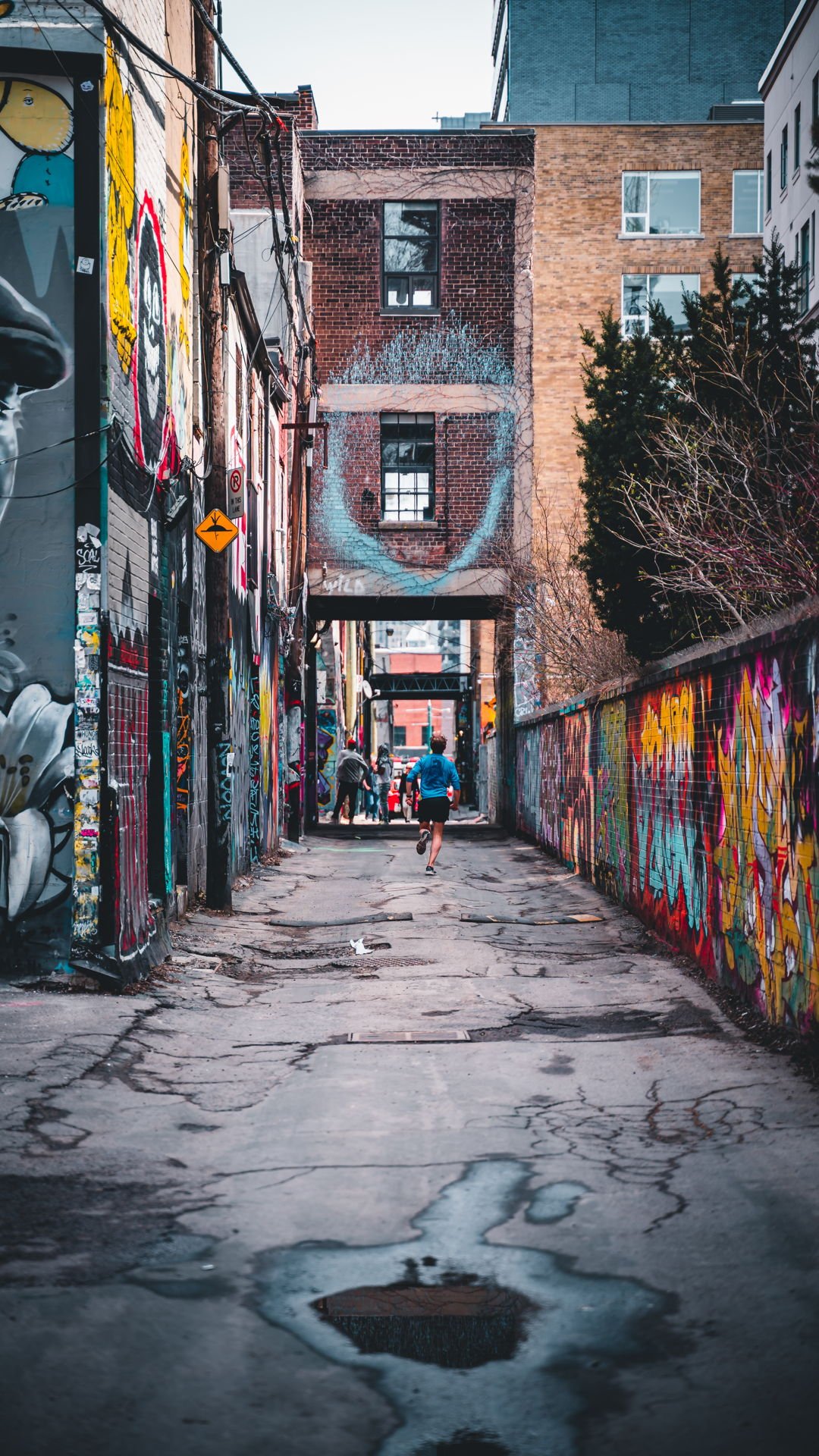
Trinity Bellwoods
One of the largest parks in the downtown core, at Trinity Bellwoods there’s always something to do. In the warmer months from the blooming of Cherry Blossoms in the spring to the weekly farmer’s markets in the summer. The park also makes a lovely daytime spot where you can enjoy an assortment of outside activities utilizing the baseball diamonds, tennis courts and picnic tables. In the colder months, the foliage turns into various shades of reds, browns, yellows and oranges transforming the dreamy landscape into the perfect fall walk, and once the snow hits, it is the ideal spot for all your winter outdoor activities like tobogganing and skating.
Bellwoods Brewery
Bellwoods Brewery is a popular neighbourhood brewpub and bar located on Ossington Avenue just a bit north of Queen St W. It began as a small brewpub in the west end of Toronto in 2012 and has since grown to encompass two retail shops selling fresh cans and bottles, and a production brewery in North York. The brewery is known for its immaculately brewed beers alongside delicious seasonal fare. Chef Jason Browne’s dynamic menu is celebrated for being inviting, uncomplicated, and thoughtful – a culinary parallel to the award-winning Bellwoods beers.
If you are looking for a place to enjoy great beer and food with friends and families, Bellwoods Brewery may surprise you with its unique features.

Dog & Bear
Dog & Bear is a sports-friendly pub that mirrors the traditional English Pub and has comfortable u-shaped booths lining the east brick exposed wall, purposely set up to face the bar. It is equipped with several TVs as well. The menu boasts items such as burgers, all day breakfast, wings and nachos.
Dog & Bear has 20 beers on tap and is quite popular in the neighbourhood thanks to its sports-friendly atmosphere and traditional pub offerings. If you are looking for a casual place to hang out with some friends while enjoying some good food and drinks with sports playing on the TV, you won’t be disappointed by this charming spot!

Cafes
There are also tons of cafes located on this strip, a Twist staff favourite is Forno Cultura, a local coffee chain that has amazing coffee and desserts, as well as the popular Cafe 23 located near trinity bellwoods, which is known for its beautiful garden patio.

Dessert
Delysees Luxury Desserts is a bakery and French pastry shop located on Ossington Avenue. Thye offer a variety of exquisite curated desserts for any special occasion. Their menu includes top-of-the-line French pastries, macarons, cakes, eclairs, classic French baked goods along with a selection of modern gluten-free and vegan desserts. They also offer sophisticated cocktails that can be paired with their desserts.
Delysees Luxury Desserts is definitely worth checking out if you are looking for a place to buy some treats for a date, or simply want some luxurious dessert experience for your refined palette.

Best Pizza Places
The Queen West neighbourhood is also the ideal place to explore some of the best pizza spots in downtown Toronto.
Blondies Pizza and Pizzeria Badiali are two of Toronto’s most popular pizza places. While both are known for their delicious pies, some differences set them apart.
Blondies Pizza is a chain known for its New York-style pizza. They have several locations on both the East and West sides of Toronto, one of them being on Ossington Avenue only a bit north of Queen Street West. They offer a variety of toppings and have a great selection of vegetarian options as well. Blondies also have a great selection of craft beer on tap.

Pizzeria Badiali, on the other hand, is a small Neapolitan-style pizza place tucked away in a residential area of the west side of Toronto. They use fresh ingredients and cook their pies in a wood-fired oven, giving them a unique flavour that sets them apart from other pizza places in the city.

Both places have great reviews and are highly recommended by locals and visitors alike. If you are looking for a delicious slice of pizza in Toronto, you can’t go wrong with either of them!
Shopping
Shopping on Queen St. West is always a must, this area contains many interesting and unique stores. When it comes to grabbing a gift, you may want to check out Hanji Gifts, a gift shop that carries items from Korea including ceramics, stationary and some locally sourced items like teas and soaps. They also offer a free gift wrapping service for items bought in store. Another store you may want to look out for is Helen and Hildegard, an apothecary and beauty store run by a mother and daughter duo. The store carries copious local and global green beauty brands as well other gift worthy items like jewelry and tote bags.

Twist Gallery
A New York style loft with large French arched windows, during the day Twist features the artwork of local Toronto artists. The current exhibition for April and May is titled VIVID, featuring eight different artists’ journeys with their use of colour. Twist receives its name from the twist of the gallery turning into an event venue at night, hosting various events including weddings and an upcoming paint night session hosted by You And I Paint. Twist was recently named one of Canada's Top 4 wedding venues by Narcity.


Images Cited (In Order):
https://www.itsonvillage.com/graffiti-alley
https://www.mytorontomyworld.com/cherry-blossoms-in-toronto/
https://www.yellowpages.ca/bus/Ontario/Toronto/Bellwoods-Brewery/7884582.html
http://www.teenaintoronto.com/2019/06/dog-bear-pub-toronto-on.html
https://www.mumblesandbumbles.com/blog/2021/4/26/favourite-toronto-coffee-shops-the-sequel
https://streetsoftoronto.com/a-luxury-dessert-cafe-thats-been-closed-for-years-is-finally-reopening/
https://www.blogto.com/restaurants/blondies-pizza-toronto/
https://www.stephaniedickison.com/articles/at-the-pass-with-ryan-baddeley
https://www.yellowpages.ca/bus/Ontario/Toronto/Hanji-Handmade-Paper-and-Gifts/7838609.html
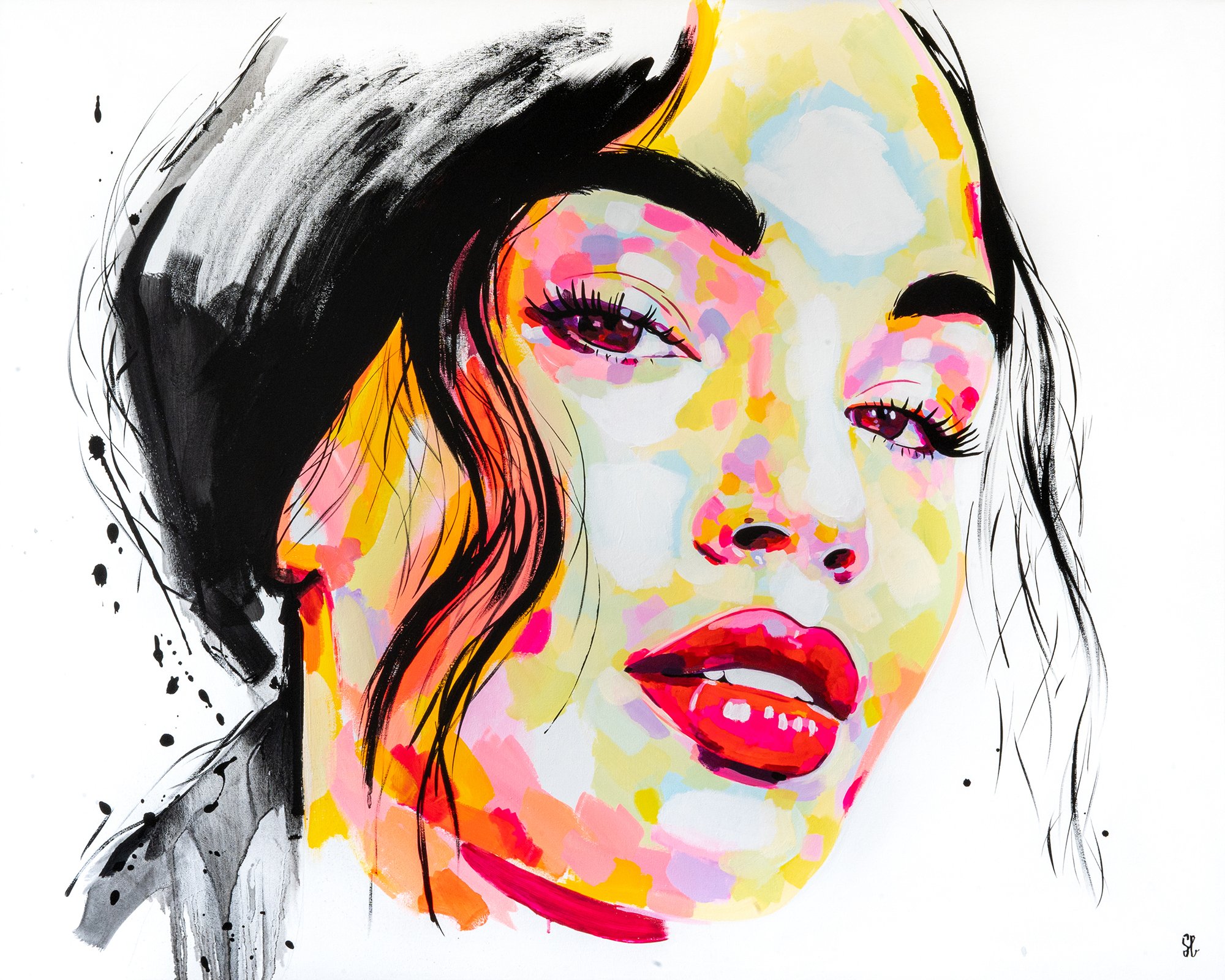
The Vivid Artists
“VIVID“ draws in on the ephemeral quality of colour and its ability to rejuvenate our conversations and senses. This collection features 8 incredible artists and their artwork that uses the quality of colour to captivate an audience.
“VIVID“ draws in on the ephemeral quality of colour and its ability to rejuvenate our conversations and senses. This collection features 8 incredible artists and their artwork that uses the quality of colour to captivate an audience.
Holly Stapleton
Artist Bio
Holly Stapleton is an illustrator and painter based in Toronto. Her work explores the complexities of the human experience, through a lens bathed in golden hour light. She often seeks to evoke themes of selfhood, relationships, and nostalgia. Holly works primarily as an editorial illustrator for clients such as The New York Times and The Washington Post.
Artist Statement
This series aims to explore elements of personification through textiles. That which is shed, layered and hung to dry acts as playful pillars of our identity. Like garments, we carry emotions and memories with us. Some we shed, and others we handle with great care. We hang them on the back of the chair, fold them, or tuck them away in a drawer. We are draped in our own stories.

Can you tell us how you balance the use of colours and harmonize them into your work?
It’s kind of an intuitive thing for me. I usually just try to have a dynamic presence of light contrast and warmth in my work. Sometimes it’s on the monochromatic side of things and other times there’s a lot of different tones in the mix. I think I just have specific hues that I’m drawn to that I’m usually opting for in my work.
You have unique pieces of human experiences, how did you come up with the inspiration to do this?
I try to paint moments that feel peaceful for me, or evoke feelings of peace to the viewer. I’m usually just drawing from my own personal experiences or from things I notice when people-watching or spending time with friends.

Among the may aspects of living, why did you consider the following themes for your artworks: selfhood, relationships, and nostalgia?
I guess I would say that these are concepts that I reflect on everyday in my own personal life, that show up in my work. I try to pull from my own unique experiences in a way that’s accessible and relatable to others.
Would you also say that some of the artworks you create are from self-reflections and own experiences?
They definitely are a form of self-portraiture in a way. I think the best storytelling comes from our own lived experience. I try to share that in my work through a lens that’s a little bit more colourful and dream-like.
Jennifer Trueman

Artist Bio
My mantra for creating abstract art has always been “there is no right or wrong way to create any emotional expression“. Personally, creating art has always been about the freedom of feeling and emotion, rather than the production. The beauty of abstract art is being open ended and free. I love creating paintings with no plan other than having a colour scheme and letting go, letting the canvas and brushwork take over. The beauty of art and passion for creating expressive paintings for me is usually in overdrive, I always seek new design ideas and often create and develop multiple canvas’ at a time.
Artist Statement
My compositions are full of artistic freedom and take an “intentional twist on the conventional expression of nature“. I enjoy taking realistic photos of landscapes and putting my own personal abstract twist to embrace my artistic style, and seek to put my emotional journey into the objective of the painting. When I paint, I embrace the emotional freedom and push myself to create without limits. My creative vision consistently include four aspects — bold vivid colour, movement, emotion, and energy.
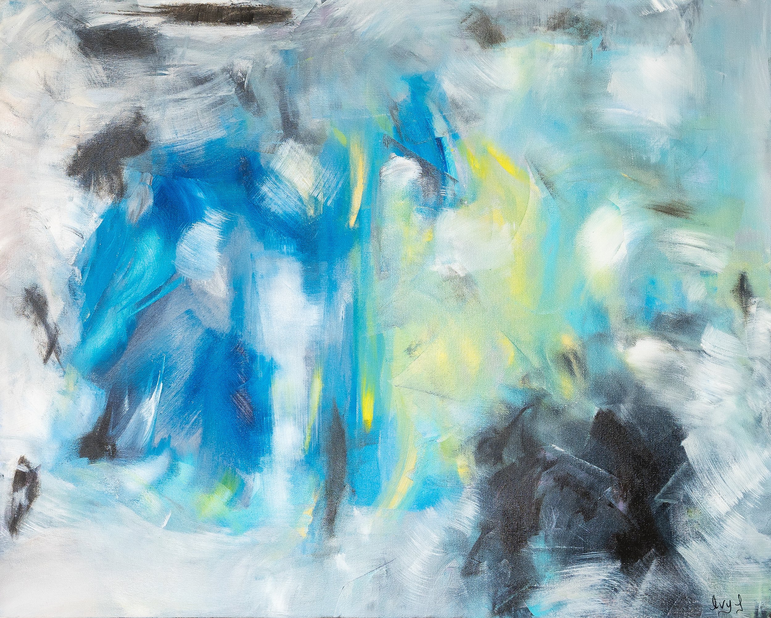
Can you tell us how you balance the use of colours and harmonize them into your work?
I really try to use bold bright vibrant colours in all my work. I enjoy building up the layers of contrast week after week. Oil paint has a variety of tones to work with so often I find myself using contrasting colours to harmonize the arrangement of my composition. Base coats/underpainting are really where I find the right colour combinations, I start with neutral tones, then build to strong bold pigments of rich brilliant colours.
As an artist, how do you want your artworks to connect with people?
Abstract art for me is really about the emotional response. I hope the arrangement of bold colours brings to light the creative expression in my paintings; and I hope people are able to connect to the joyful and blissful movement of the brushstrokes. I consistently paint with music playing at high volume..... I love hearing different takes and opinions on how people relate to unrecognizable compositions -for me , that is the connection. I enjoy the art journey of not knowing how the painting is going to turn out. I enjoy viewing and creating art that is unfamiliar ; it allows each person to interpret the pieces very differently. Each of my painting compositions are really quite different and unique - each one tells a different story that is open to interpretation through the details and techniques.
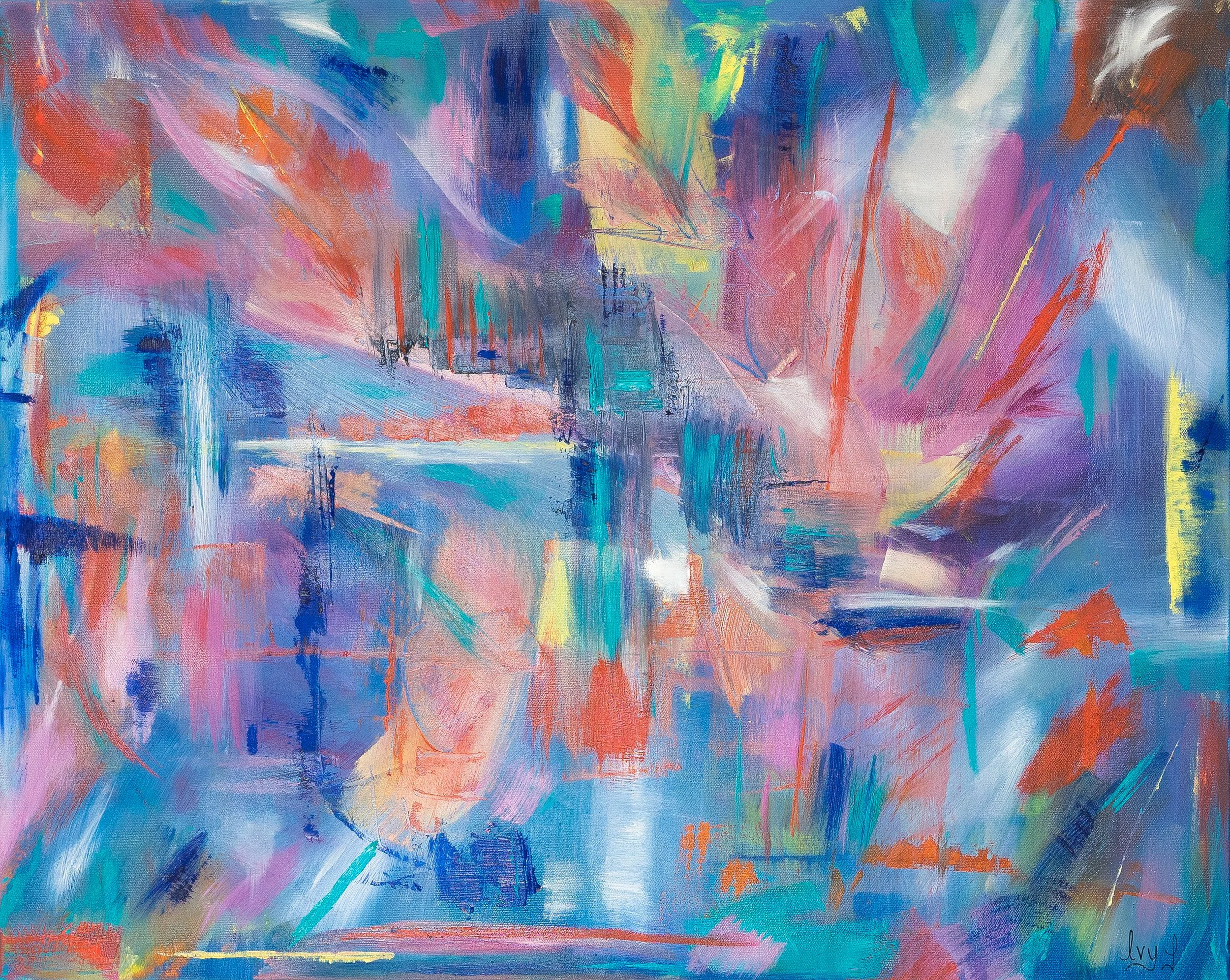
Your mentioned emotional freedom and pushing yourself to create without limits in your statement, can you expound on this?
Art for me has always been my escape, my down time, my time to be in my zone without an endless 'to-do' list that never ends. Painting is my calm and refreshing time. I'm elated when I take a risk on a piece and it works. Furthermore -I love creating different art pieces in various styles, I don't like limitations - I crave the artistic freedom to try everything and go with the ideas that come to my mind on that day. I want to maximize my creativity and versatility ...I often have several paintings on the go and find I need variety - always change the canvas size, scale, brush size, colour palette and movement of my brustokes to maximize the impact of new creative ideas.
Aside from brushwork details, what other elements in your painting would you like to emphasize?
Great question - I really like my painting to have multiple layers of colour texture and vibrant movement. Aside from my abstract style, I really try to get my paintings to a point where they have an " identity" of vibrant elegance. Creative and colourful energetic freedom are what you will see in this collection of new paintings!
Sasha Sutherland

Artist Bio
Sasha Sutherland is an artist and art teacher. In 2022, she graduated from York University with a BFA and BED. Sasha has received awards for the quality of her paintings; one being the Best of Painting Award in 2022 for participating in TOAF online fair. As an artist and art teacher, Sasha aspires to create an inclusive and welcoming class environment where her students can explore and learn about their creativity and passion in the visual arts.
Artist Statement
Sasha Sutherland has explored painting well-known cities and located them high within the clouds to suggest what these cities could look like after years of continuous development. Her work in done with acrylic paint, acrylic markers, and glitter spray paint. Within her paintings, she chose to work with vibrant colours in order to lend a utopian dimension to the cities. Sasha’s futuristic paintings of these imagined cities portray various perspectives that all consist of tubes as a means of transportation throughout each place.
Can you tell us how you balance the use of colours and harmonize them into your work?
When painting with numerous colours to create these vibrant places, I always start with a digital sketch to help me figure out where I would like to place each colour. When I paint, I put a neutral colour or dark colour next to a bright colour so it can stand out the most. For example, for some of the buildings in my pieces, the base colour is dark grey, purple, dark green, and dark blue. To make the building look brighter, I create a neon outline or design on top of that base colour to catch the viewer's attention. Another method to harmonize my colour choices is to use a monochromatic colour scheme for some buildings, so using different shades of one colour. I would always have the bright colour on top so it stands out the most.
Sometimes it can be challenging to figure out where I would like to put a specific colour; that is why I create a quick digital sketch on my iPad to test out colours. If I dislike their appearance, I can undo them and try a different colour. My focus for my futuristic city paintings was to make them as colourful and vibrant as possible. I created these imagined cities with the intention of viewers looking at how bright and eye-catching it is that you would want to see more of these places and want to visit them.
However, when I paint with numerous colours, it is only sometimes plan ahead of time as things tend to change while in the middle of painting. This leads to me sometimes painting bright colours next to each other because I liked how they looked side by side.
What made you focus on well-known cities as subjects? Do you have visions of places even before you recreate them?
This city series started with my idea of painting places I have never been to and would like to visit one day eventually. For viewers to figure out what places I have painted in a futuristic way, I have painted known monuments from these places and placed them somewhere in the painting. Looking at my Tokyo 2.0 painting, I have painted Mount Fuji very small near the bottom of the piece, and the Tokyo Tower can also be found on the right side of the work.
As for my vision of each place I paint, I wanted them to be high in the sky with tall skyscrapers where you cannot see their base. I wanted to try different perspectives of the buildings to get a different angle of the cities and push myself to try more difficult perspectives to grow as an artist. A third point I knew before I started painting each city is that I wanted to keep some of the architectural designs you see from each city I painted. That was an important detail for each place; as cities keep developing over time, some original and well-known architectural designs remain for each location instead of completely changing.
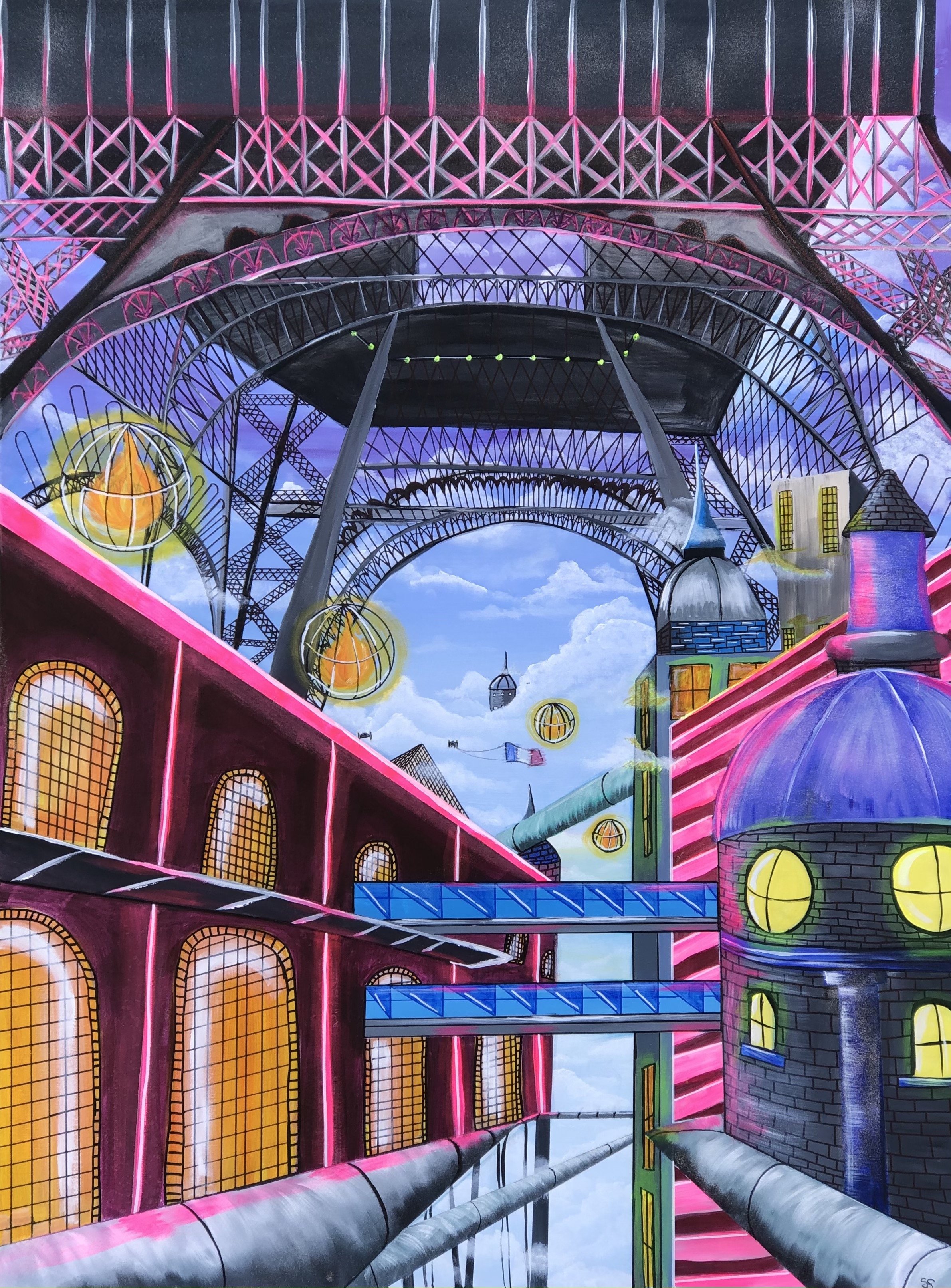
How would you describe the places you’ve recreated? Do you have some personal connections with the elements in your painting?
The places I have created are a combination of two things. One is my imagination of how I would see cities in the future as they are continuously being developed and getting taller as the years go by. The second thing is researching my chosen cities, taking parts of them, and adding them to my paintings. When I look up a city I am about to paint, I look at the colours that are mostly seen and what kind of architectural design is present. So it is a combination of my imagination and a bit of research. I also wanted to keep a similar theme within all the works by having these large turquoise tubes seen throughout the cities as a means of transportation. I decided the tubes were the way to get around to places and use them to travel to other cities and countries.
As both an artist and a teacher, how do you encourage your students to explore their creativity and passion?
As an art teacher, I encourage my students to explore their creativity and passion for art by not limiting them to what they can draw for their art projects. By that, I am providing a few expectations, such as using a specific medium and a technique I want to see in the project; but they can choose colours and what they would like to draw. As a class, we explore and use different art mediums and practice with them so they become more comfortable with them, as some practice is needed before jumping right in and starting on their final piece. Having time to practice, sketch, and write/ draw out your thoughts is a necessary process that helps students explore their creative minds.
I provide my students with examples of what they could do with every art project, but I always want them to make it their own and add their own twist to the art projects. I give time as well at the start of class for students to work in their sketchbook, to draw whatever comes to mind, finish up something they were working on outside of class in their sketchbook, and also provide a drawing prompt if they do not know what to draw as sometimes you don't know what you want to create and that is okay.
Elena Pope

Artist Bio
Elena is an abstract expressionist based in Toronto. She describes herself as an intuitive painter who seeks to process and express a constantly changing exterior and interior landscape. As a practicing physician she has always used art as a personal outlet, a way to preserve the humanistic side in counterbalance with the scientific rigors of Medicine. She loves the freedom that abstract art affords, the versatility of acrylics and various media, and constantly explores ways to achieve the truest translation of impressions and expressions into an artistic, coherent language. Her art is very personal, raw, and therefore, she has been reluctant to share it. The pandemic changed that, she realized that “while art making is selfish, art sharing is essential because of its universality, transcending languages, cultures and trends. And today, more than ever, we need art to sustain, to heal, to connect, to escape…"
Artist Statement
Colourful acrylics, charcoal, textiles, paper and oil sticks are some of the tools I use to create vibrant, bold, mixed media paintings that evoke emotion.
Painting has always been a joyful and fulfilling part of my life, but only in the last few years I have felt that I found “my voice”. My best work is when I let the right part of my brain direct the strokes at the beginning and I “respond” layer by layer until the painting becomes the story that needed to be shared…sometimes troubled and messy, occasionally light and bubbly. I see my canvases as abstract projections of a constantly changing inner and outer landscape.
While most of my paintings just happen, this current exhibit is more purposeful in its intent. “Interpreting Muskoka” attempts to interpret the beauty of Muskoka woods. I was inspired and challenged to recreate the colors of the trees and leaves, their shadows and highlights, changing with the time of the day, season and ambient temperature, the discarded birch bark lying on the ground (featuring as media in the current series), adding light and reflecting back the color of the moss, stone and ground, and the knotted tree roots marking their territory... But more importantly I tried to convey the many ways in which a walk in nature nourishes and cleanses the soul, reframing our position in the world.
“I took a walk into the woods and I came out taller than the trees.”- Henry David Thoreau

Can you tell us how you balance the use of colours and harmonize them into your work?
I typically start with a limited palette conveying the mood or the feeling I want to create. In the later stages I may add a different colour to complement or create interest by being different than the rest. Rarely, if I start with multiple colors, I mix small amounts of dominant colour with the rest of them. If completely unhappy with the colour scheme I would use a wash or transparent colour to cover big parts or all of the canvas in this way unifying the color scheme.
How would you describe the shift from being reluctant about sharing your artwork to opening your creative work for everyone to see?
I’ve always being a consumer of art, whether by watching exhibited or online art, searching for pieces that inspired or challenged me, matched my mood or uplifted me. I realized how much I was getting out of the process and that by being reluctant to share my own art, I was maybe not providing support for somebody else who might have needed it. I realized that authentic art always has an audience and somebody may experience or resonate to what I was putting down on the canvas.

What attracted you to abstract paintings? And how do you relate this to your lifestyle?
The switch to abstract happened several years ago. Instead of my painting being about something, they became a mirror of my constantly changing inner landscape. I loved the freedom of expression, starting intuitively and switching back and forth, between intuition and intellect, until the canvases reflected what I wanted to say but did not have words for.
How would you describe your art collection for VIVID?
The art collection for VIVID exhibit is part of a bigger series on the beauty of Muskoka woods. While colors are what most of us see, I was fascinated by interplay between various elements of nature, the way everything is connected, even in decay (e.g. discarded birch tree gave sustenance but also beauty to the ground and stones), the renewal and changes with seasons. In the spirit of sharing, I set myself to be an “interpreter” of Muskoka’s beauty.
Yosvany Marrero
Artist Bio
Originally from Cuba, Yosvany is a mixed media painter who moved to Toronto in 2004. His passion for existence, healing and expression drove him to paint these thoughts down on canvas with different types of materials and medias.
Artist Statement
I began painting as an outlet to express emotions and love. I explore these themes using mixed media on canvas. Art is a passion of mine, but also something I do to connect with my three sons. Through the process of teaching, learning, and discovering the magic of art, we find our way of communication, and growing together with joy.

Can you tell us how you balance the use of colours and harmonize them into your work?
For me, using vibrant colour is essential. It reflects the celebration for life, it is inclusive, full, and welcoming.
What’s the over theme of your work for VIVID? How would you describe it to the public?
The over theme of this series is very simple: spring is coming. With all the colours and shapes to give grace and happiness to all hearts.

You mentioned that art lets you communicate with your family, do you also use this as a personal expression for others to see? And why?
Yes, painting came to my life when I needed it the most. Naturally, it became an important activity shared between myself and my three sons. Spending hours together, having fun, creating, collaborating, bonding, making deeper connections and memories, listening to one another… It gave us tools to be more tightly connected with each other.
How would you describe your creation process? Do you visualize your work or create spontaneously?
Personally, I learn to listen to my heart, my feelings, and my energies. When the process of creating happens, sometimes I know exactly how it will end; other times, I simply create freely. I have learned that it isn’t about what I can create on the canvas, but what the process of creating can provide for me.
Sophie Bastien
Artist Bio
Sophie Bastien was born in Dijon, France in 1984. She currently works and lives in a village north of Montreal in the forest.
Sophie’s passion for portraiture started when she joined Fine Art School at the age of 18, where she was tasked with painting her peers. She instinctively started painting with vibrant strokes but couldn’t achieve the same photo-realistic results she did painting still lives so decided to hone her style and began studying graphic design.
After finishing her studies, Sophie lived and moved around the world for a few years before finally settling down in Montreal, Canada. She then decided to concentrate exclusively on her paintings and become a full-time artist.
Artist Statement
Sophie’s work is influenced by her background in the fashion industry. She paints emotionally charged women’s portraits. Through picking pictures of like-minded, strong willed women that move her by both their strength and fragility - her ‘warriors‘ as she calls them, she pays tribute to all of the strong female figures in her life. She seeks to capture the beauty and complexity of human emotions, exploring the ways in which colour and form can be used to evoke different moods and states of mind.
Sophie’s art is characterized by a playful use of colour and form. She often works with bright, saturated hues and bold, geometric shapes, creating compositions that are both dynamic and engaging. She paints her vision instinctively and spontaneously with daring colours — working freely and organically without any rigid planning on how the final painting will look.
Can you tell us how you balance the use of colours and harmonize them into your work?
I paint really instinctively, the only thing I plan is how I’m going to crop the image. I have no idea what it’s gonna look like in the end. I actually don’t think about the colours I’m using, I just paint what I see, my own reality I guess. I just use primary colours and some fluorescent paint that I mix to represent what I see. I feel like the harmony comes from the black ink I usually apply at the end for the hair and some other details, it brings everything together. That’s the only part of the painting process that is very deliberate.
As an artist, you have a very interesting journey from studying Fine Arts and moving to Montreal and doing painting full-time. What made you decide to concentrate on paintings versus graphic arts?
My dad suddenly passed away in 2018 and I felt like loads of things became irrelevant to me. I wanted to be true to myself. Working as a graphic designer for big companies was not fulfilling anymore. There’s a lot of restrictions in terms of creativity, the bigger the company the more limited you are in terms of creativity. My husband got offered a job in Montreal and we moved to Canada in 2019, I decided to make the switch and work on my paintings full time.

Tell us more about how you choose your subjects (or “warriors“ as you call them) and the development of facial expressions behind the artwork.
Most of the time I use pictures of models, I’m really struggling to paint people I know. I like to have the liberty to depict people’s feelings the way I perceive them. I pick pictures of women that seem to reflect what I’m feeling at a specific time. It’s linked to a song I would listen to on repeat while I’m painting a specific painting, like creating a bubble of a particular feeling. It’s very therapeutic, I focus on a specific emotion, work through it and then I can let go. I don’t ask people to pose for me because I just want to browse images and get struck by a certain expression. I generally start the painting straight away, there’s no overthinking at this stage, it all feels very natural and organic.
How would you describe the difference between your subjects and their journeys through your paintings?
I tend to do closeups because I want to explore the psychology of my models. I remember studying cinema at University and being mesmerized by the psychology of framing. You tell a completely different story from the way you frame a subject. I imagine what they think, what they go through. I think when you paint portraits you always paint yourself in a way. I would say most of my models have subtle emotions. I like to make their hair like they try to stay still in a storm but their hair is the only giveaway of something happening. I believe we can turn negative situations into something beautiful, I like the saying no rain no rainbow.
Amy Fitzgerald

Artist Bio
Amy Fitzgerald is a Toronto-based abstract artist who creates vibrant and whimsical paintings full of colour and joy. She works primarily in acrylic, using a mix of bright colours and bold shapes to create her unique pieces. Her art is a celebration of life, and she hopes to inspire others with her work. She uses her art to explore the relationship between colour and emotions, creating pieces that are both visually stunning and emotionally resonant.
Artist Statement
Colour is a powerful language. From vibrant hues that evoke joy and happiness, to subtle shades that convey a sense of calmness and serenity, colour has the power to capture people’s attention and communicate ideas in an impactful way. As an artist, I love exploring the language of colour through my work — using different hues to create pieces that tell stories of hope, beauty, and joy.
Through my art, I aim to bring more light into the world by conveying uplifting messages of resilience and optimism, evoking a sense of joy though vibrant colours, intricate details, and thought-provoking compositions.

Can you tell us how you balance the use of colours and harmonize them into your work?
My colour work is primarily intuitive, although when intentional I primarily work with triad relationships. I also will at times be inspired by vintage lithograph images and their use of vivid colour combinations.
Aside from colours, you also have incorporated shapes to your works, how does this blend with your vision?
In some of my pieces you can see textured layers. These textures are usually created with found objects from both nature and vintage items. One of my favourite tools is a old biscuit cutter that belonged to my grandmother. The larger shapes tend to be linear and circles. These have personal meanings to me, but with abstract art the feelings they invoke can be unique to each viewer.

Can you tell us more about how you use art to explore the relationship between colour and emotion as mentioned in your bio?
There are cultural associations with many colours. Red can signify love and passion but also anger and rage. But I find that the stories are also told in how the colours work together and the intent behind the piece. My painting - A New View, was created at a time of both transition and strife, but also with great hope for the future. It is painted with the same intense colours as many of my other pieces and yet there is a shadow that I believe comes through in the colour combinations.
Your pieces revolve around stories of hope, beauty, and joy. Can you explain why you choose these concepts among others?
My mother tells a story about when she was a young girl in Texas. She went to visit her grandparents, and it was in the last years of the depression. They lived in a small shack, where the walls were covered in newsprint to keep the sand from blowing through the cracks in the walls. She talks about how grey and sad everything looked, devoid of all colour. And then her grandmother served her strawberry jello. She remembers being taken aback by the intensity of the red in the midst of the dreary. To her it was the most beautiful thing she had ever seen. So when she was grown and had a home of her own she filled it with colour. And that was the world I was raised in. And once again we are living in a world that is filled with uncertainty and darkness. The colour in my work is a manifestation of the joy and love that I believe art can bring into this world.
Jessie Chen

Artist Bio
I am a self-taught artist based in Toronto, Ontario. Growing up in a family of science, I held my first paint brush at a young age of 4 and have been interested in the process of creating art ever since. In recent years, I have re-immersed myself in painting and have been experimenting with different media and techniques. Drawing inspirations from nature, painting mountainous sceneries and treescapes became my means of escape from the uncertainties brought on by the pandemic. Making art helps me rediscover my inner peace, and I hope to convey the calm to my audience. My primary medium is acrylic on various surfaces, but I also work with watercolour, gouache and paper collage.
Artist Statement
As my paintings progress, vivid touches are introduced to the colour palette to bring contrast and life to the neutral and earthy tones. Through my work, I want my audience to experience the still, yet dynamic, landscapes through the use of colours, and to feel the catharsis from within.

Can you tell us how you balance the use of colours and harmonize them into your work?
My earlier works were more "telling it as it is" - the colours used would match closely to what is shown in the reference photo. While I learnt to capture the details of the landscape that way, eventually I found the pieces needed more dimension to really bring the scene to life. With landscapes that contain lots of greenery, I like to have a base layer using red colour, and I would use occasional neon colours- such as pink or bright green, as highlights to balance out the otherwise earthy tone of the painting. For deeper tones, instead of using black paint, I use dark purple or brown so as to not have too much contrast with the bright colours.
How would you describe your experience as a self-taught artist based in Toronto?
I started painting again around the same time when the pandemic first started. The isolation allowed more time for myself to examine the purpose of my art and explore different techniques. At the same time, I was able to connect with other local artists through social media and artist networks and learn through them. Toronto is full of opportunities to showcase your work, and it was a rewarding experience to be able to display your work to the public.

Can you explain the process of drawing inspiration from nature and creating artwork on sceneries and treescapes?
I largely draw my inspiration from landscapes with mountains and a body of water- usually lakes and waterfalls. I examined the contrast of great stillness and the dynamic liveliness through the use of colour. I am attracted to the intricate shadows created by the trees and rocky surface of the mountains. I think such details on a vast natural structure remind me just how minute most of our problems are and in turn bring me a sense of calm, which is what I am inspired to convey to my audience.
Among the different media and techniques you’ve used to create artwork, what would be your personal favourite?
My go-to medium is acrylic paint. It is my personal favourite because of its versatility- it can be as lightweight as watercolour, allows multiple layerings to create endless possibilities and yet also forgiving at the same time. I like to paint on wood panels for a smoother finish.
Also Read: Event Space Toronto, wedding venue Toronto, Wedding Reception Toronto

5 Women Who Marked Art History
In honour of March, the month of women, we would like to share a list of five female artists in history who had changed or challenged the world of art. From painters and sculptors to photographers and mixed media artists, we are thrilled to share some intriguing stories about their unique perspectives, experiences, and creative visions with you. So please sit back, relax, and enjoy the incredible artistry of these amazing women in the history of art!
In honour of March, the month of women, we would like to share a list of five female artists in history who had changed or challenged the world of art. From painters and sculptors to photographers and mixed media artists, we are thrilled to share some intriguing stories about their unique perspectives, experiences, and creative visions with you. So please sit back, relax, and enjoy the incredible artistry of these amazing women in the history of art!
Angelica Kauffman (1741 - 1807)
Photo Source: https://en.wikipedia.org/wiki/Angelica_Kauffman
Kauffman was a Swiss Neoclassical painter, widely recognized for her artistic talent in historical and mythological subjects, and was also one of the founding members of the Royal Academy of Arts in London.
Kauffman’s style was characterized by its classical themes, refined compositions, and the use of soft colours, which earned her great admiration from audiences and artists of her time and now. Her most important works include her portraits of prominent figures, such as the portrait of Goethe, and her historical and mythological paintings, Ariadne Abandoned by Theseus, Cornelia, Mother of the Gracchi, and Hesiod and the Muse.
She held a significant role in art history, for breaking down the gender barrier in the male-dominated art world of the 18th century. Despite facing discrimination and limited opportunities due to her gender, she established herself as one of the leading artists of her era, paving the way for future generations of women artists.
2. Frida Kahlo (1907 - 1954)

Photo Source: https://artincontext.org/the-two-fridas-by-frida-kahlo/
Kahlo was a Mexican painter best known for her bold and vibrant self-portraits that explored themes of identity, gender, and Mexican culture. Her artistic career spanned over three decades, and left an indelible mark on art history.
Her most famous works include her self-portraits, The Two Fridas, Self-Portrait with Thorn Necklace and Hummingbird, and The Broken Column, which are defined by their vivid colours, intricate details, and symbolic imagery. These works have since become iconic representations of Kahlo’s unique style and have cemented her place in art history as one of the most influential and innovative artists of the 20th century.
Frida Kahlo's importance in the art world stems from her impact on the emergence of Mexican modernism and her use of art as a means to investigate issues surrounding identity. Kahlo's art was characterized by a fusion of traditional Mexican folk art and European modernism, which produced a distinctive style that was difficult to classify. Her artwork was also influenced by her personal experiences, including her marriage to Diego Rivera, her physical agony, and her political activism, imbuing her creations with deep personal and introspective elements.
3. Yayoi Kusama (1929 - )
Photo Source: https://ocula.com/institutions/m-hong-kong/exhibitions/yayoi-kusama-1945-to-now/
Kusama is a Japanese contemporary artist known for her colourful and immersive installations, sculptures, and paintings. Her works are famous for their repetitive patterns, interactive nature, and themes of infinity, self-obliteration, as well as the intersection between art and life.
Her most notable works include her immersive installations, Infinity Mirrored Room - The Souls of Millions of Light Years Away, inviting viewers to experience infinity and self-reflection through a kaleidoscopic environment. Her paintings Infinity Nets, which feature a repetitive pattern of dots or lines, have become iconic representations of her unique style and have influenced generations of artists.
Kusama’s contributions to the art world lie in her practice in the development of avant-garde art movements in the 20th century, such as minimalism, pop art, and feminist art. Her one-of-a-kind style and approach to art-making have challenged traditional notions of art and have pushed the boundaries of what is considered ‘acceptable’ in the world of art. To this day, her work continues to inspire and captivate people worldwide.
4. Yoko Ono (1933 - )

Photo Source: https://www.pinterest.ca/pin/516436282241110356/
Ono is widely recognized as one of the most influential artists of the 20th century. Her work spans various media, including performance art, music, film, and conceptual art.
She is also well known for her collaborations with her husband, John Lennon, and their efforts to promote peace and social justice. Together, they created some of the most iconic works of art and music of the 20th century.
One of the main reasons that Ono is significant in art history is that she was a major figure in the Fluxus movement — a group of artists who rejected traditional forms of art and sought to blur the boundaries between art and everyday life. Her work often challenged established ideas about art and the role of the artist in society.
5. Cindy Sherman (1954 - )

Photo Source: https://www.moma.org/artists/5392
Famous for her portraits that often explore the themes of identity, gender, and representation, the American photographer Cindy Sherman has been an active member of the art world since the 1970s.
Her work challenges the traditional concept of portraiture. Instead of depicting actual people, her work often features herself in a variety of different personas and costumes. This has led to her being described as a ‘chameleon’ and her photographs as ‘self-portraits without a self’. Her most famous work is the series Untitled Film Stills, which are all black and white films and evoked key moments in Hollywood cinema.
Sherman is considered to be one of the pioneers of the postmodern art movement. Her work is a reflection of the cultural and social changes that occurred in the United States during the 1970s and 80s. Her rise to stardom in the 1980s helped move creative photography into the upper echelon of the art world.
Thank you for joining us on this journey through the incredible world of female artists. We hope you enjoyed the stories and arts.
At Twist Gallery, we are proud to support all female artists, but especially our local ones, to whom our door is always open. We believe that art has the power to inspire, to challenge, and to transform for the better. We are honoured to provide the platform to more local female artists, for their works to be seen, appreciated, and explored.
Also Read: Event Space Toronto, wedding venue Toronto, Wedding Reception Toronto
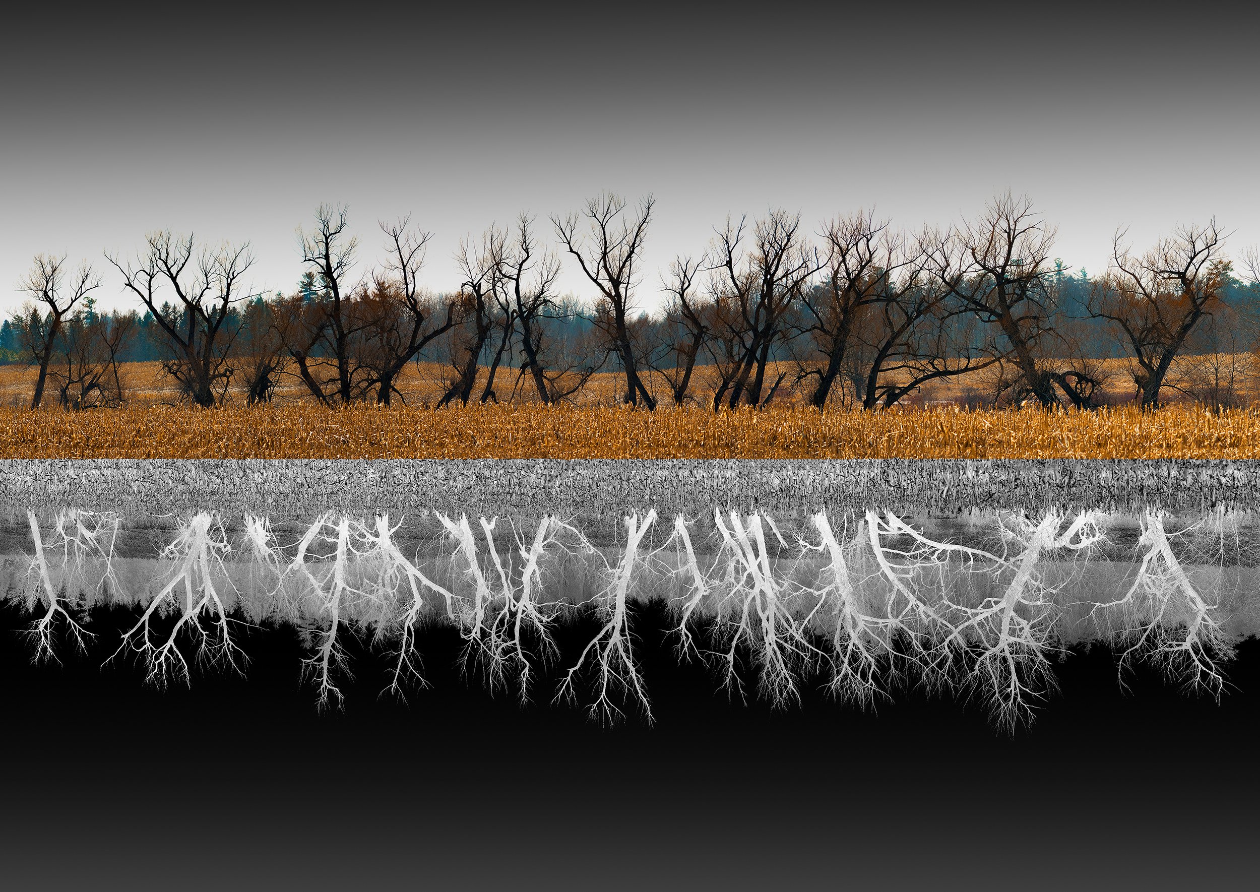
Behind the Lens with Optics
"OPTICS" features different variations of photographic lighting and techniques. Presented in landscape and cityscape artworks, our March exhibit will give you ethereal visions of places and locations in and out of the city.
"OPTICS" features different variations of photographic lighting and techniques. Presented in landscape and cityscape artworks, our March exhibit will give you ethereal visions of places and locations in and out of the city.
Taha Shanouha

Artist Statement
Being a newcomer here to Canada and Toronto specifically, everything looks interesting and everything is exciting. For the last 6 months, I've been capturing all the beauty of this gorgeous city, and
I'm excited to show how someone new sees the city around them. These images represent the daily life of the city of Toronto, from the CN tower, to the snowy days and nights full of people and streetcars and some unforgettable moments.
Artist Bio
A Lebanese photographer who recently made Toronto his new home. A graduate of computer science turned photographer, Taha’s journey started back in 2018 when he discovered photography as a way of therapy to battle depression. Living in a country where trouble seems to be attached by the hip, Taha’s goal was to take photos to showcase its beauty and wonder. From street and landscape photography to shooting Behind the scenes for some of the biggest Lebanese movies and theater performances, Taha’s hobby has gradually turned into a profession. And he is looking to prove those who doubted him wrong by showcasing his work in bigger countries and cities.

In relation to our theme “Optics,” how would you describe the play and use of light in your photographs?
I say when it comes to my night photography I look for specific sources of light that can help provide a certain mood to my photos, while in the day I'm either looking for the sun or trying to find interesting contrast in colors. This method makes your subject pop and leads the viewer's eye towards what you want him to see. In some cases it could be towards the cityscape itself, in others it could be a person crossing the street or the streetcars in Toronto. I always try to make my photos look like paintings or scenes from movies.
You said that photography helped you to battle depression, do you see it as another way to communicate your thoughts and intentions?
Photography is a way of therapy for me, it helps me express feelings, thoughts and emotions that I can't with words or with writing. I would say it is my outlet when it comes to battling tough times and hardships.
What’s more exciting and unique about taking photographs in Toronto compared to other cities you’ve been to?
I've been to several cities around the world, but Toronto's diversity is definitely where it shines. A city full of immigrants and locals living in harmony, and since I do street photography mostly, you can see the influence from areas like Chinatown, Little Portugal or even Greektown. Not to mention the sheer size of the city, making exploring every angle, nook and cranny such a great adventure. This is definitely the biggest city I have lived in, and wherever I look there is something that catches my eye. There is always something happening in this city, whether people are just walking around and going about their day or if it's a concert, basketball game, hockey game etc...

Henry Hawkins

Artist Bio
Henry Hawkins is photographer and visual artist based in Toronto, Canada, Henry’s work draws inspiration from nature, and the pursuit of connection between our inner and outer worlds.
Growing up in a big city, he always cherished the moments he was able to escape the fast pace and be amongst the simplicity of the outdoors; spending summers canoe tripping around Northern Ontario, planting trees in Alberta, exploring the shores of New Brunswick, or hiking in the mountains of British Columbia. Henry’s body of work is influenced by his deep love for the Canadian Landscape; celebrating the diversity and richness of nature from sweeping vistas to Earth’s natural patterns.
Particularly drawn to scenes that evoke tranquility and wonder, Henry aims to transport the viewer through romanticism and escapism, to find a deeper appreciation for the beauty and fragility of our Earth. Through his work, he ultimately hopes to inspire new connections with the natural world, and love for the simple wonders of our planet.

In relation to our theme “Optics,” how would you describe the play and use of light in your photographs?
Light is a crucial element in nature photography, as it can affect the mood and tone of a photograph. The type and quality of light can create different effects, from soft and gentle to dramatic and high-contrast. The direction and angle of the light source can add depth and dimension, and various techniques can be used to manipulate light for a desired effect. Ultimately, the use of light in nature photography can enhance the natural beauty of the subject and convey a particular emotion or atmosphere.
What inspires you to take nature landscapes?
I have always been deeply inspired by nature, even though I grew up in a big city. Nature was my escape from the concrete jungle, and I have been fortunate enough to have parents who recognized the importance of spending time outdoors. They took me on canoe trips when I was a kid, and I spent most of my adolescent years working at a summer camp in the Georgian Bay area of Ontario, Canada. These growing experiences in Northern Ontario truly fostered a love and appreciation for our planet at a young age.
As I got older, my obsession for the outdoors grew, and so did my love for photography and adventure. Whether I'm in a local park or exploring a remote wilderness area, I find myself surrounded by inspiration. Being in nature allows me to disconnect from the stresses of daily life and connect with the beauty of the natural world.
Through photography, I am able to capture the beauty and wonder of the natural world in a way that can be shared with others. My hope is that my photographs can inspire others to appreciate and protect the natural world, just as it has inspired me. In nature, I find a sense of peace, a connection to something greater than myself, and a deep appreciation for the beauty of the world around us.

How do you find inspiration when you are outdoors? Do you usually imagine an image in your mind or do you take time to compose?
I’d say usually a bit of both. Most of the time on a photography trip I’ll have images in my head of what I ant to capture, but a lot of the time there are moments that inspire me on the spot, and a lot of my favorite photographs are those ones that happen spontaneously. Nature always has a way of surprising me, and often it can’t be predicted.
Do you have a favorite element of nature or a theme in creating images? How does this influence your style?
It’s hard to choose a favorite, because I love it all. A style I’m definitely drawn to and you’ll see in a lot of my work, is long exposure nighttime photography. There’s a certain challenge and excitement involved in being out at night; the conditions are always different. Often times the most rewarding parts of photography for me is the unveiling of the long exposure photos I capture at night. The surprising beauty that’s lit up by my camera and unseen to the naked eye.
Patrick Kilburn

Artist Bio
Patrick Kilburn’s journey into photography began decades ago as a youngster, when his father introduced him to his own love for the art, having converted a spare bedroom into a wonderfully mysterious darkroom. In those pre-digital days, He fondly remembers them both excitedly watching the final steps – when a photograph ‘appeared’ before their very eyes under red light in the chemical trays before hanging it up to dry. To Patrick, that was just magic.
Years later, his passion for photography was rekindled with the advent of digital cameras, just after his eldest was born. Since then, Patrick has been helplessly captivated by the creative enjoyment and technical challenges that it brings! His passion lies in exploring nature, travel, and landscape photography; in finding precious opportunities to sling his gear over my shoulder and head out to capture something wonderful.
It has been Patrick’s great privilege to observe the world around him – encouraged by family and friends, as well as other creatives whose passion for photography inspires his own. Patrick’s aim is to build a photographic art collection which in turn motivates him to continue capturing, creating and evolving as an artist. Patrick’s work is, simply put, life inspired.
In relation to our theme “Optics,” how would you describe the play and use of light in your photographs?
For this exhibition, I chose photographic works of mine which present several ways in which natural - or ‘available’ - light can be used to give life to a composition. Natural light at different times of day – sunrises and sunsets in particular - can bring out incredible colour hues and gradients which are often spectacular! Several of my displayed images celebrate the beauty of natural light in this way. ‘Fire on Ice’ and ‘Ice Crystal & Evergreens’ exemplify this well. And when there’s a relative absence of sunlight, chances to capture darker, more dramatic and mood-evoking scenes are what I look for. ‘Pea Soup’ is a great example of this, as are ‘Reflecting at Peggy’s Cove’ and ‘Fallen But Not Forgotten’.
Our Canadian seasons also uniquely affect naturally available light, providing me with opportunities to capture distinctively different scenes throughout the year. I love each of them! I’m always looking forward to the next season while doing my best to capture the one we’re in to the fullest. As the amount of natural light changes in terms of its duration and its angles at different times of year, compositions change in interesting ways. As a photographer, I have become acutely aware of where and when to find natural light during different seasons, and I use that knowledge to plan for shots accordingly.
And finally, I feel lucky to be able to take advantage of dramatically changing weather phenomena. One of my works, ‘A Winter Blow’, is a great example of how intense wind and blowing snow can completely transform and otherwise ordinary looking Toronto cityscape view by incorporating a type of long exposure ‘light painting’ technique to create something really unique.
You mentioned the word ‘magic’ when telling the story of you and your father processing an image from a film. Do you still feel that kind of magic with digital cameras? Or is it a totally different experience?
This is a great question! The truth is I never really explored the technical aspects of capturing and developing images on film at the time when I was that young, mostly just watching my father. Later though, like anyone who took pictures before the digital days, I either had to take my point and shoot camera rolls of film into a shop to get them developed, or develop them myself as my father did. I didn’t really have the space nor the means to set up my own darkroom, so the first option was the one that I always went with.
The ‘magic’ returned to me when digital photography was introduced, I was pursuing a technical career with IBM Canada, and had become more technically minded. I was also considerably older by this time, had started a family, and I had become more motivated perhaps to capture moments and immerse myself into ‘developing’ photographs I had taken using a computer. I became quite fascinated by how the settings I was using in my digital camera would affect how they would appear on my computer screen. I think it was then when I started to seek out more in-depth knowledge about the physics of light and how cameras work in order to become a better photographer. It’s been exciting to me to explore the magic of this art ever since!
Having said all this, something I would like to do at some point is go back to exploring film photography. Essentially get back to the roots of this art, very much putting to the test the skills and understanding of proper compositions and exposure settings in a less digital, more organic way. I have photography friends who shoot both digitally and using film, and I see how their choice of subject composition and the magic of light positively impacts their work.
Do you have a dream location or a destination you haven’t been able to take photos of so far? Where and why do you feel the need to capture that place?
Like a lot of passionate photographers, I have a pretty long bucket list of destinations that I would love to not only shoot, but experience! I’ve been fortunate to see parts of Canada, enough to understand that there’s a lot to celebrate from a regional, topographical and climate perspective. Canada to me is an endless well of opportunity to explore, and I intend to see much more of this beautiful country in future.
In terms of destinations abroad, I’d really love to visit Iceland and Scandinavia. Iceland because of its unique if not harsh and dramatic natural landscapes which include black sand beaches with diamond ice shoreline formations, volcanoes, and with any luck, Aurora Borealis! I understand that photography there is very challenging because of the dynamic nature of the landscape, weather factors, and light. But I’m ready to embrace that challenge! Scandinavia appeals to me I think mostly because I was born in Sweden and spent a few memorable summers there as a youngster. It’s in my blood. I’m curious about learning more about its culture as well as its diverse landscapes. I would very much like to go back to see (and of course capture) the beauty of my country of origin with more experienced and mature eyes. And while in the area, providing there’s enough time, I can't imagine any photographer not wanting a chance to experience and shoot the fjords of Norway. Another big draw for me.
I’d also love to explore the many other countries of Europe. Having been lucky enough to cruise around the Mediterranean, I’ve been treated to incredibly beautiful sights of the coastal areas especially. Some of my portfolio celebrates this beauty, since I had by then already started to explore photography in a more dedicated way. While enjoying excursions off ship, I was able to get an ‘overview’ of the countries we visited, but often during the middle part of the day when light is harsher and arguably less than ideal.If I’m ever able to return, I’d love to put down roots in a few places for a week or two at a time, and really experience them as seen in the more subtle and beautiful light of morning and evening.
And then there’s the Far East. And Oceania. And so many other parts of the world… Time and resources permitting, I hope to see as much of this ‘big blue marble’ as I can. My bucket list is long!
What inspired you to take reflections or incorporate symmetry of images in your photographs? Does it relate to your own expressions?
I really appreciate that you noticed these elements in my work, as I’m very conscious of them. Visually, I’m very drawn in particular to trees and reflections which display natural symmetry. This is especially true when they present together for a potential photographic composition. When I see trees, I think about how their root structures give them strength enough to stand and grow. Drawing a parallel of this observation to myself, I think of what gives me strength enough to keep standing – core family and friends, life affirming experiences, and hopefully a good sense of groundedness, as it were.
Reflections stop me in my tracks whenever I notice them, not only for their interesting visual appeal, but also because they too remind me that in a way, we all have another ‘side’ to who we are. I’m of the opinion that we all have a true self and a projected self - a reflection, one might say – of who we are not only others but also to ourselves. For me, trying to synchronize them can sometimes be difficult to achieve as I try to navigate my day-to-day existence. As an artist, I need to keep this balance in mind as I evolve my photography. I want to show images that aren’t just visually appealing in some way, but also represent the way in which I see – or want to see - the world around me.
Perhaps the best example of what I’ve shared here is my signature piece titled ‘A Matter of Perspective’. It explores ‘reflection’ and ‘symmetry’ both visually and metaphorically. I created this abstract composition during the depths of the covid-19 pandemic during lockdown. It was my attempt to explore and convey my conflicting thoughts about the ‘duality’ of positive and negative elements in my life as well as the lives of those important to me. I noticed that my eye was naturally drawn towards the darker, negative reflection of the positive side of this composite image, and I noted that I needed to make a conscious effort to ‘focus’ upon the positive side itself. This work became my daily reminder to try to look for the positives in life everyday. It helps to keep me grounded.
I’m truly grateful for this opportunity to exhibit my work. It has been a tremendous and interesting learning experience preparing for this showcase, and I’m well aware that there is no way I could have done so without the tremendous support of my parents, my family and friends, and my photography community peers from whom I have learned so much. Big thanks to the great people at Print Partner for working with me to produce quality prints of my work, and of course to Twist Gallery for inviting me to participate in this group exhibition!
France Phonlakrit Lapjaturapit

Artist Statement
As an urban photographer, I am constantly drawn to the vibrant energy and diversity of the city. It was my move to Toronto that ignited my passion for capturing the unique beauty and complexity of urban spaces. Through my lens, I aim to uncover the hidden gems and unexpected moments that often go overlooked in our bustling metropolises.
Each click of the shutter is an opportunity to uncover a new perspective and a new story. But more than just a means of capturing the world around me, photography has become a deeply fulfilling pursuit. It is a way for me to connect with my surroundings, to find meaning and purpose in the most unlikely of places. And it is my hope that through my work, others will be inspired to see the world in a new light and to discover the beauty and wonder that lies within the city.
Artist Bio
France Lapjaturapit is a Toronto-based photographer and multimedia creator from Thailand. From a young age, France was passionate about the arts and creative expression, and he used to draw, paint, and write stories. Currently, he is studying Media Communications at Humber College. After moving to Toronto, France was inspired to pursue photography, and he quickly developed a style characterized by vivid colours and interesting perspectives. He is deeply inspired by modern style, and he loves to explore the city and document its diversity and beauty. France always looks for creative ways to express his vision, and his goal is to create something unique for the world.

In relation to our theme “Optics,” how would you describe the play and use of light in your photographs?
My use of lighting in photography varies depending on the location, time of day, and mood I'm trying to convey. I prefer to shoot on a clear day, especially during golden hours and sunset, when the light is warm and beautiful. However, some of my work was shot in a dark environment and with artificial lights, which can give off an interesting feeling when compared to daytime photography. It is heavily influenced by the story I want to tell.
What do you find unique or inspiring about photography versus other forms of art that you previously made?
Photography is the most realistic way to capture something we can see with our eyes before clicking the shutter button. Photography can be done anywhere, which gives us the opportunity to travel, explore new areas, and connect with our surroundings and environment. When I photograph, I use a variety of senses, such as observing and being aware of the conditions, lights, and fleeting moments. Capturing that one shot that stands out among the other shots I took on the same shoot requires a lot of steps. Drawings and paintings, on the other hand, are more abstract, capturing your ideas in a different format and may require more time to complete one good piece. I mostly have to sit and stay still for long periods of time, which prevents me from going out and experimenting with different elements.
In your series of photographs, your perspective on each work stands out. How would you describe this style and the element it brings to your cityscapes?
My photography style is characterized by vivid colours and different elements such as people, nature, buildings, etc. Using different focal lengths can help bring out different emotions. I intend to show a wide range of elements including the styles that I can do.

How does living in the city influence your work and how you express your style in the images you create?
Living in Toronto has been a great source of inspiration for me to explore and capture the unique characteristics of each neighborhood. Every corner of the city has a different style and atmosphere, which motivates me to go out and discover new perspectives. I particularly like to include the CN Tower in my shots, as it not only represents Toronto but also adds charm and dynamism to the image.
Although I can be quite shy when it comes to taking candid shots of people on the street, I have found other ways to express my style by capturing objects and scenes that catch my eye. The energy and bustling life of the city have been my ultimate inspiration, and I feel fortunate to live in such a vibrant and dynamic place.
Bryan Stewart

Artist Statement
Bryan Stewart is an emerging artist based in Oakville ON Canada whose practice is based on observation and transformation of the normal to the noteworthy. Using both digital and film photography, Stewart’s wide-ranging subjects are tied together by an overarching curiosity to notice, experiment and share.
He has previously exhibited work at Gallery 44, Capture Oakville, and Gallery 1313, as he has had photos published in three issues of Humana Obscura, a literary arts magazine. In his latest work, impressionistic and abstract photography is used as a means of interpretation and expression, to create images that give new perspectives to familiar objects and scenes.
In the 6 images presented in Optics at Twist Gallery, multiple images taken at varying angles around the subject are recomposed to yield a new viewpoint on three common trees and three well-known Toronto landmarks, to create unique one-of-a kind images.
In relation to our theme “Optics,” how would you describe the play and use of light in your photographs?
I'm very attracted to the shadows and almost all my favourite images include shadowy and dark elements in them. I find that most subjects have a depth that can only be best expressed by incorporating shadows into the images. This could be the physical depth of the scene but often times inclusion of shadows helps build the mystery and story created in the image.

You have a series of compelling abstract & impressionist images in your exhibit, what attracted you to this type of photography?
First, I love the approach because it allows me to capture unique images that really can't be replicated and the style allows me to take recognizable or ordinary subjects and present them in very interesting and different ways. Take the Gooderham Building photo for example. That is probably one of the most photographed buildings in Toronto, but I feel like my image is unlike any other I've ever seen. Second, the rich history of abstract and impressionist art gives me a lot of inspiration about how I approach photography, as a means to express my point of view, what to include or exclude from an image and how the large forms come together.
How do you select your subjects and is there an overall theme for your photographs?
There is no real method to selecting subjects, as my interests are always changing, but across all my work I'm definitely interested in exploring transforming normal to noteworthy. Trees, or flowers, or street scenes are regular things in our daily lives, and I like to imagine how I might transform those normal things to something extraordinary by changing perspective or looking from multiple points of view.

What captivates you the most about taking patterns of light and images?
I think when I focus on the light and patterns there is an interesting opportunity to put my personal point of view into the image. Whether I play with long exposures to smooth out time, or use camera movement to enhance dynamics, or I overlay multiple frames to show the many sides of a subject at once I am able to create something unique and different.
Joseph Salvoni

Artist Statement
I’ve been a hobbyist photographer for over 25 years, starting when my parents got me an SLR film camera for my 14th birthday. Most of my time in photography has been with film, but a few years ago I switched over to digital, venturing into a whole new world of shooting and editing. There is nothing better than being out on the street, alone with my camera, capturing a moment that materialized before me, as if by magic. Street photography is my primary focus and passion, but I’ve also taken many cityscapes and landscapes over the years, some of those presented here today.
I’d put these photographs under the umbrella of “Lone Perspectives”–most of them long perspective shots, the rest featuring unusual angles and framings that play with perspective while still conveying the overall theme of isolation and loneliness. The photographs are also a mix of digital and 35mm film scans that, when viewed together, accentuate the contrast between the modernity of cityscapes and the simplicity of landscapes (city meets country/digital meets analog). I’ve positioned these photographs close to each other in a repeating and symmetrical interlocking pattern to draw attention to the interconnectedness and slim separation of the urban and rural worlds.
In relation to our theme “Optics,” how would you describe the play and use of light in your photographs?
All photography is the capturing of light, what that light reveals as well as what’s hidden in its absence—I always keep this in mind when composing an image. The feeling that a photograph conveys can change significantly based on the time it’s taken, and the quality of the light at that moment, so I try to keep an open mind and shoot at many different hours of the day. Often, the images I end up keeping and returning to are the ones that combine striking light, story, and framing. Without the right lighting a good photograph can never be great, it’s a vital part of what I’m hunting for when I’m searching for a shot.
Do you always follow a theme when shooting and what do you usually look for in capturing a moment? How do you usually find locations and spots around the city?
I don’t look for a theme, I’m happy with what presents itself, whatever, whenever, or wherever that might be. Street photography is my main passion, and a large part of my love for it comes from its spontaneity. I plan very little. I’ll have a rough idea of the area I’m intending to shoot, but I’ll more than likely hop off the bus early instead because I see something interesting through the window, or I will trail behind a curious character at a random subway stop. I always feel like I’m waiting for a moment to reveal itself to me, and it can be thrilling to see all the elements of a good photograph come together before me just before taking the shot. Some days I’ll go out and get nothing, and then other days everywhere I look there are scenes worth capturing, it’s part of what keeps me doing it.
How would you describe your experience in switching from film cameras to digital photography?
I still have a lot of love for film photography, the amount of thought I have to put into each attempt, and the reward when a shot comes out well, but I’m able to do so much more with digital, in particular when it comes to editing, which I now love on the same level as shooting. With digital there are more attempts to get the shot, and then there is complete control later when editing. Film just can’t offer that, and often costs more. Going from a DSLR to mirrorless feels in many ways like when I went from film to DSLR; it’s amazing to me how much more I can do with a mirrorless camera, it’s like having a computer that takes photos instead of a film camera that’s been converted to digital. I’m very excited by the possibilities and have already seen many of the benefits.

What motivates you to take landscapes and cityscapes? How would you describe the experience versus when you’re doing street photography?
I like all kinds and styles of photography, but I wouldn’t say I’m particularly motivated to shoot landscapes and cityscapes. While they often lay at the periphery of street photography, when I see the opportunity to get a striking image of anything I’ll try to take it. It’s interesting that many of the photos I’ve presented were taken on the way to shoot something else. I think I ended up taking most of these because of a fascination with long perspective shots which are offered most readily by cityscapes and landscapes. I’ve been shooting for a while now, so I happened to have built up a collection of these kinds of shots that fit well within the overall theme of the exhibition.
John Jennings

Artist Bio
John Jennings is an Ottawa-based photographer, who has been taking photographs from a very young age. He was able to turn his passion into a career, working as a commercial photographer at a marketing agency throughout the day, with a focus on headshots and portraits, events and products. When he isn’t working commercially he takes to the streets to capture both street photography and cityscapes. He loves the ability to capture images of people going about their business, and the opportunity his camera gives him to capture iconic monuments and beautiful architecture. He is a firm believer that photography is a means of documentation, and a way to preserve moments that may only happen once. He strives to see beauty in everyday life and hopes that his photography will help others see the same.
Artist Statement
This display of photographs spans both Toronto and Montreal. There has always been a draw to these cities, and when I am given the chance to photograph them there is never any hesitation. Both cities provide me with such an incredible backdrop to capture the photography I love most, Street and Cityscape. As someone who grew up near Toronto I always have a nostalgic feeling when walking the city's streets, seeing the CN tower or walking along the harbor. With the opportunity to come back to Toronto and showcase my work, there was never any doubt I had to share two of my favorite photos I captured most recently in the city.
Montreal is a city that I started to visit in more recent years, but regardless the artistic influence of the city grabbed hold of me and didn't let go. Some of my most cherished photos come from trips to Montreal. I love this city for its blend of old and new architecture, as well as its heavy European influence. Walking the cobblestone streets of old port, or exploring side streets in the Plateau, the vibrancy of Montreal keeps me coming back and always finding something new to photograph.
In relation to our theme “Optics,” how would you describe the play and use of light in your photographs?
As a photographer, light is super important and it's something I notice whether I have a camera in my hand or not. Street photography is fun because you can only control yourself in relation to the light, you can't control the actual light/sun. So I try to observe how the sun's light interacts with my surroundings and I photograph whatever catches my eye. I think my best examples of this in my installation are in “Shadow Break” with the sliver of light cast along the building's facade, and creating those 2 pillar-like shadows. In “Smoke Fire Escape'' where I used the sun as a backlight to really accentuate the smoke from the windows, something I would have not been able to do if the sun was in front. Finally in “Vanhorn St.” using the shadow in front of me to virtually frame out the building, and hide the street which isn't the focal point of the image.

For you, photography is a form of documentation and a way to preserve moments. Do you also see this as a medium to express yourself and your views? and why?
I think it's for sure a way I express myself, maybe not in an angsty artist way, but in a way where every photo I share is an unaltered representation of something I witnessed, when you see my photos you are seeing what I saw. My street and cityscape photography is never photoshopped, the most I will ever do is make it black and white. I live by the photojournalist rule of nothing removed or nothing added. I think my views are represented to an extent, but regardless I try to stay neutral and again take on this documentarian mindset where I don't let what I believe or feel affect a moment, photographing the most natural elements of the streets is always my goal.
You’ve turned your passion into a career, what keeps you passionate about photography in and out of the work scene?
Photography is my passion, and I think one thing that has really helped me stay passionate about photography is not forcing it, forcing creativity really just leads to frustration and self doubt, so being able to step away for a couple days and reset I find it really helps. That isn't to say I am any less passionate about it, I just know that forcing myself isn't going to produce the results I want. On the contrary to this though, I think consistent execution of creative ideas, whether they work or not has also helped keep my passion alive. I also don't view photography as work, I love to do it on a daily basis, so as they say do what you love and you won't work a day in your life. Finally on that note, over the years in both the personal and professional sphere, I have not become complacent, I am always striving to learn new things and techniques and I use that new found knowledge to advance all my work. With only being 25, if I knew everything about photography by now, the next 50 plus years would be pretty boring.
How do you usually connect with your subjects? How would you differentiate your experience inside the studio when you're on the street?
Connecting with subjects in my studio work is pretty straight forward. The great thing about running a business is there's lots of meetings! So anyone who comes to the studio for headshots, portraits or lifestyle photos has already met me, we have probably talked about more than just photos, and the day of the shoot isn’t the first time we have met. This makes it a lot easier for both parties to interact and get some great photos. When I am out shooting on the street I take the fly on the wall approach, people see me as a random guy with a camera, I snap my photo and I move on. I don't usually talk to people, they kind of just end up in my photos. Unless someone really catches my eye, in that case I will stop chat and ask to take their photo. Both types of photography I do on a regular basis, personal and professional, require me to take different approaches when interacting with subjects to get the result I want.

Wesley Bethel

Artist Bio
Wesley Bethel has worked for the city of Toronto in the Emergency Services Sector for the past 15 years. This dynamic work environment has allowed him to see and experience many different situations in life that have influenced his own unique perspective of the world around him.
Learning about the art of photography has provided an expressive outlet where he brings this same unique perspective to the camera lens, capturing moments in time and infusing them with his own aesthetic style. Wesley really enjoys the extra creativity that can be applied when shooting double and multiple exposure photography, as truly unique, one-of-a-kind images can be created. He firmly believes the possibilities are limitless when one is willing to take on the challenge of interpreting life through a lens.
Artist Statement
I wanted to thank Nadia Kakridonis and her staff for providing me with the opportunity to participate in my first Art Exhibit. Having my photography images displayed in the Twist Gallery “OPTICS” Exhibit is a real privilege.
For this series of images, I wanted to present them mainly in Black and White with a darker, raw vibe. The stark contrast across the neutral colour palette is used to further accentuate this point. The addition of small amounts of colour can be viewed as “light in the dark”. If we choose to view light as hope, we can be reminded that light can be found even in the darkest of moments.


Optics is running until March 25th! Make sure to visit Twist to see all the amazing work in person!

The Artists Behind, "Form"
Form is an Exhibition that displays the inhibitions of some of the city’s finest abstract artists. Keep reading to discover what inspires their work, what drew them to art and how they stay motivated in this day and age. Explore their journeys and learn more about their histories.
Form is an Exhibition that displays the inhibitions of some of the city’s finest abstract artists. Keep reading to discover what inspires their work, what drew them to art and how they stay motivated in this day and age. Explore their journeys and learn more about their histories.
Kathryn Doner
Artist Statement
Kathryn’s process inherits insatiable curiosity and boundless energy resulting in an experimental and vigorous approach to art - tempered with her keen eye for balance and detail. Her career as a graphic designer has influenced her desire to seek balance and harmony between loose organic strokes and controlled shape. Abstraction is her personal journey to seek the full experience of creating a problem and solving for it through balance, layers, blocking, transparencies, color and form.
Artist Bio
Kathryn is an artist of Métis descent who is based in Toronto, with over fifteen years of experience in the graphic design and tech industries. She channeled her experience into focusing on what she loves most: Visual Art, Illustration, Animation, Murals, and solving any design problem that comes her way. Kathryn’s work is all about creating beautiful experiences and thoughtful stories through approachable design solutions.

What does form mean to you? How does this inspire you?
Form represents the configuration of the abstract world into the physical world and I am inspired to find form and balance in each piece I create. My process is my personal journey to create something out of nothing through problem solving.
What inspired this new series? What would you want your viewers to feel when perceiving these pieces?
This new series was inspired by texture, form and depth through transparency and colour combinations. I want my pieces to bring a sense of calm to my viewers. I want them to see the depth of each piece and the story that comes to life through their unique layers.
You said that your approach to art is experimental, how do you find your creative style evolving with each exploration?
The explorative component to my work is in the initial stages of my painting process where I am totally free to be self-expressive. This phase and style has evolved even further as I experiment with new techniques, texture applications, colour combinations and layers.
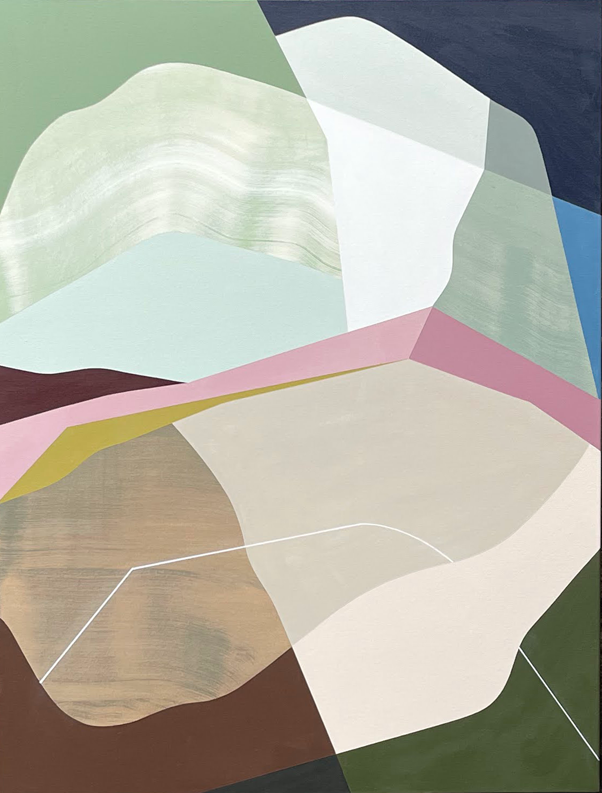
Do you find that your knowledge of graphic design strengthens your work?
Absolutely. My experience with graphic design has trained my eye to seek perfect balance and composition. My eye has been trained to be very detail oriented which is what gives my work a "graphic" feel to it. There is a digital component to my process that feels so natural to how I work. It just made sense to have my computer come along with me in my art journey.
When creating pieces that showcase the harmony between loose organic strokes and controlled shape in your work, do you find that nature is an inspiration to you?
Yes! Nature always seems to shine through in my pieces. This is very much a subconscious outcome that seems to manifest in my work - and I love it
Natalia Ackers

Artist statement
With each painting, I strive to create a piece that evokes positive emotions, ranging from calm tranquility to vibrant energy, through the use of shapes, patterns, colours and textures. I approach each canvas with a general concept and palette in mind and then let the composition take form as it evolves and takes on a life of its own with each drag of paint across the canvas. The shapes and patterns, along with the interplay of colours and textures, bring about a different emotional reaction in each viewer based on their personal history, allowing each work to take on a different meaning and produce an individualized reaction based on the eye of the beholder.
Biography
Natalia is a late-blooming, emerging Toronto-based abstract painter. As a teenager, her bedroom walls were covered with posters of her favourite bands and with various drawings and paintings she created for school assignments or for fun. Natalia took as many visual art classes as possible throughout high school and yet, despite enjoying and excelling in the arts, she felt the pressure of being the first Canadian child in an Eastern European family and her post-secondary journey ended with an honours bachelor of science followed by a law degree. After years of dedicating herself to her legal career, she was feeling burnt out and frustrated, started re-evaluating what she wanted to do going forward and felt drawn back to the arts. Fast forward to the fall of 2016 when a friendly painting challenge led to Natalia picking up a paint brush for the first time since high school and she hasn’t stopped painting since! She continues to work as an in-house lawyer as her day job, but her primary focus is now on painting and creative expression.

What does form mean to you? How does this inspire you?
When it comes to my abstract paintings, I consider the element of form to be the combination and interaction of gestural marks, textures and free flowing shapes and lines. This approach inspires me to create works that elicit positive emotional reactions from what, at first glance, may appear to be a random composition.
What kind of external factors do you take the most inspiration from?
I love being outdoors, especially by the water. Several collectors have pointed out the presence of nautical undercurrents to many of my pieces. Being in nature both calms and revitalizes me, and long walks through our City help me to reset and focus on my next project.
How do you balance being both a lawyer and an artist?
This is a constant challenge, but all I can say is that it is probably not much different than any artist who needs to balance a day job with their creative pursuits. I aim to set aside large blocks of time on weekends or evenings to paint, or even squeeze in short sessions when I need a mental break and reset.
Does you work as a lawyer influence your art? How so?
Painting provides an outlet for creativity that is not always present in my day-to-day work. While I am sure that there may be some impact that being a lawyer has on my art, I actually find that abstract painting is quite liberating whereas my work is a lawyer can be adversarial and regimented, and it is important for me to leave work at work. In other words, painting is my escape from the legal world.
You said that at one point in your career, you were feeling burnt out and chose to pursue your passion in art; How did this big shift in your life inspire your art?
Like anyone dealing with burn out, your brain can keep you stuck inside some dark and negative headspace. I found that in addition to long walks by the lake with my dogs, painting really helped me get through those periods. Being focused on colours, textures, and just getting lost in the studio for hours, gave me joy and introduced me to some very cool people with similar interests. The joy that I get from being in the studio is what inspires me to keep creating!
What do you wish viewers would take away from your work?
I hope that my paintings elicit positive emotions. Be it the colours, patterns, or just the overall feeling that the piece generates in viewers, I want them to feel calm, energized or -- just happy. My collectors generally gravitate to pieces that bring a positive vibeS to their spaces.
Rina Kazavchinski

Artist Statement
I create art because it takes me away from my everyday life. It lets me focus on the task at hand and brings me into a meditative state. When I'm creating art, time stops, and all my worries and anxieties disappear. Creating brings me joy and I find relief in this practice mentally and spiritually. I am also very fascinated by the ability to create something that has never been created before.
I love using bright and vibrant colours. I mostly use acrylic and some mixed media to create a lot of heavy texture to create art that pops right off the canvas. All my paintings start and end with the palette knife as no brushes are used in my work. My ultimate goal is to brighten up my viewer's life with bright textured pops of colour to bring joy to the viewer’s life through colour.
Biography
Rina Kazavchinski has honed her artistic skills as a successful Canadian abstract artist and digital illustrator specializing in vibrant abstract pieces and digital illustrations. She creates textured abstract paintings that brighten up any space. Her paintings are unique and can be recognized anywhere. Using bold texture and special palette knife techniques. She is mostly inspired by nature and mental health. She also specializes in body-positive illustrations highlighting the human form.
Rina has exhibited her work at several in-person and online art shows. Most recently she exhibited at her largest show yet, the winter One of a Kind Show in Toronto in December. Rina has sold over two hundred original paintings and hundreds of digital illustrations. Recently her work was featured on Season 2 of Sort Of, a hit show airing on CBC Gem and HBO Max.
What does form mean to you? How does this inspire you?
To me, Form means flow and creativity. Abstract art is important to me because it's imaginative and not what is obviously seen. It is imagination and the creation of a fantasy world where anything and everything can exist. This inspires me because there are absolutely no rules to follow and everything goes. I feel free and am able to flow naturally from the heart.
You said that creating art brings you into a meditative state, do you think the same can be said for when viewers are seeing your art as well?
I'm not sure if they feel the same all the time. It really depends on the painting and the colours that I used. Sometimes they can feel excited, inspired or calm.
I'm not sure if they feel the same all the time. It really depends on the painting and the colours that I used. Sometimes they can feel excited, inspired or calm.
Are there colours that you gravitate towards? And for what reason?
I've been gravitating towards warm and vibrant colours such as purples, teals, pinks, blues and whites. These colours make me feel at peace and calm. I try to portray a similar feeling to my viewers when I use these colours.

Your paintings are created entirely with a palette knife, what makes this style unique in both the process and outcome?
This makes it unique because it's unconventional and different. This is unique in the process because it makes me feel closer to the painting. I'm able to layer on thick coats of paint which adds a lot of texture. I'm also able to change the strength of my palette strokes to create different kinds of effects. The outcome of using palette knives and other special tools, adds luscious texture and art that pops out of the canvas. I love when paint pops out of the canvas because it becomes very tactile when touched.
Which external influences do you take the most inspiration from?
I am often inspired by the beauty of the colours of nature. Whether it's a vibrant sunrise or the golden glow of golden hour right before the sun sets, I often use these colours from nature to recreate the calm feeling I feel during those times through my art. The colours that make me feel the calmest are colours such as; various shades of blues, lilacs, teals, purples, and whites.
I am often inspired by the beauty of the colours of nature. Whether it's a vibrant sunrise or the golden glow of golden hour right before the sun sets, I often use these colours from nature to recreate the calm feeling I feel during those times through my art. The colours that make me feel the calmest are colours such as; various shades of blues, lilacs, teals, purples, and whites.
Kirk Sutherland

Artist Statement
I feel my creative process bridges, and somewhat amalgamates both intuitive, and conscience realities. My paintings do not imitate life, but perhaps harness the energy and the essence of life. In life we are conscience of present realities, yet travel forward with no actual conception of what to expect. My art making process seems to find itself in the same unpredictable reality. For I surrender a degree of control, yet I feel profoundly that my work does not fall into what could be defined as random or chance.
I feel the process is equally as important as the finished piece. It is a spiritual experience. I find myself channeling to a higher energy or light, in which the medium, the action, and the paintbrush in a sense are an umbilical between the soul, the essence and that of the material world.
Artist Bio
Kirk Sutherland is a Toronto-based Canadian artist. He has exhibited his work under the representation of many art galleries internationally over the last 30 years. Many of his pieces are included in both private and corporate collections globally. Sutherland graduated with high honours from the Ontario College of Art and Design University (OCADU) in 1991, majoring in Contemporary Art and Drawing and Painting from the Faculty of Experiential Arts. Kirk Sutherland is a renowned colourist who was born with synesthesia. This blending of senses very much enhances his perception of colour and his overall creative Process. Kirk Sutherland is also known for working with the Hollywood Film Industry, creating and designing public art in urban environments and working with the music industry creating album cover designs.

What does form mean to you? How does this inspire you?
Form is elemental and a physical reality in the material world. When I think of formal constructs, I envision substance monolithically. I suppose I'm inspired mostly by the visible shape and configuration of what we define as form, as well as the spatial realities, both negative and positive.
How has your synesthesia influenced your artwork and creative process?
I was born with synesthesia. I know no other way to be, so I wouldn't say it influences me, it's just a part of who I am. As a synesthete I have an acute sensibility to colour and I cross senses, which results in an ability to witness and experience multiple realms at the same time.
Where do you find the most inspiration for your work?
Most of my inspiration comes from within. I'm inspired by the unseen metaphysical realm. I'm influenced by nature and by lived experiences as well as the world I perceive. You could say my work finds its origins in a stream of consciousness so to speak. Of course, I’m influenced by other artists, including many contemporary masters.

What does from mean to you? How does this inspire you?
Over the last 30 years I have used a myriad of media and materials. In the last 10 years I've gone back to using acrylic based paints and resins. I tend to paint on traditional surfaces these days which would include either primed or raw linen canvas or wood panels. I tend to use many unorthodox techniques, which in a sense I have invented while experimenting and exploring the medium within my creative process.
What do you hope that the viewer feels when seeing your work?
I believe in the Universal Law of Freewill. Everyone perceives the world uniquely and subjectively. The content within the body of my work is void of any obvious narrative, so I believe my art functions as an undeliberate mechanism for provoking emotion, energetically or otherwise. I would hope that my paintings resonate at a level that promotes healing and positivity.
Cobie Cruz
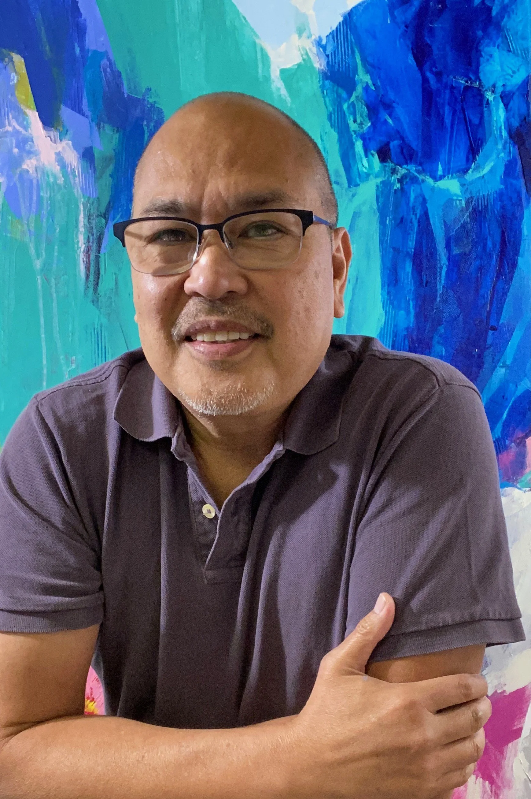
Artist Statement
I begin on a blank canvas without a preconception of the final outcome. I allow things to develop according to my thoughts, feelings and moods and how these shift and change as my painting begins to unfold.
I don't start with a colour order, but find the colours as I go. The whole business of spotting the small areas of color in the canvas, how the edges meet, how accidents are controlled----all these things fascinate me.
The colours in my paintings are juxtaposed to support and contrast. They are chosen to evoke thoughts and emotions.
I don’t fear change throughout the process. Images are often altered, destroyed, erased and even returned as I feel my way to the best way to bring a painting to life. I call this stage in my process – “push and pull”. My challenge is to constantly push myself and test the limits of my imagination in the hope of creating impressions that are distinctly mine.
What does the word form mean to you? How does this inspire you?
The word form means shape or configuration. It can also mean appearance in
terms of style or design.
My art style relies heavily on compositions using forms and shapes but these
forms are not premeditated. They appear as I work, applying colour and texture,
layer after layer. My process is like a discovery, even to me, with each stroke,
colour and texture creating a new form and inspiring the next move.
What made you make the change from being an art and TV director to a professional painter?
I loved my two previous careers and they taught me a lot about discipline and
creativity. But painting affords me a freedom that I did not have in my two past
lives. Painting lets me express myself with each stroke of my brush. I am not
answerable to a client – only to myself. As a painter my only restrictions and
boundaries are my own imagination.

You said that when you’re painting you make decisions as you're feeling, do you find the ideas for the painting evolving as you do so?
Yes, absolutely! My eyes and mind are not fixed to one possibility. I explore as I
progress or sometimes regress. There are times when I’m not happy with the
result so I stop and look for other sources of inspiration and allow the inspiration
to redirect the trajectory of my work. I like to be playful throughout the creative
process.
Can you elaborate on your “push and pull” process and the way you use it to create?
This “push and pull” process can also be called editing. I usually apply this in the
final stages of my painting. This is where it gets exciting for me because I am
challenging myself to improve the piece I am working on. There are times when I
am not fully satisfied with a form and I try to see whether I should add something
(push) or take something away (pull) to enhance the overall composition.

Are there colours that you gravitate towards? And for what reason?
I’ve never met a colour I didn’t like! My paintings are a testament to that; they are
full of bold colours. But I will work with certain colour combinations or themes for
a specific series of paintings, mostly driven by inspiration from something I saw
or a mood I am in.
Rhonda Hewitson

What does form mean to you? How does this inspire you?
Form to me is abstract and loose and can be interpreted by colours and texture. It's more than just an object or shape; it's movement and energy and feelings. Form can be anything you imagine, and isn't limited to what you see. It inspires me to create art that speaks to the viewer and invokes a connection to my work. Through form, I add depth, flow and movement to my pieces in an effort to take the viewer on an emotional journey; inviting them to look at my work through all these aspects, and see the form I have created with an open mind.

There is movement in your pieces, how does this style help you convey your intention?
Movement to me is very important in my work. My intention is to make the viewer to feel as though they are being swept away from the everyday life, into a world of imagination and creativity. I want them to forget their troubles and hardships, but rather feel passionate and energized every time they look at my work. I want the flow of the paint on the canvas to reach out and grab the viewer's attention and give them a positive experience that will resonate with them. I use loose strokes, sweeping lines and blended colours to provide the movement and hope that succeeds in giving the viewer a story they will enjoy.
Being a self-taught artist, how did you find the process of trial and exploration to develop your style?
As a self-taught artist, there is a lot of exploration and experimentation in my work. There's a lot of trying new techniques and materials to see what not only suits my creativity, but what is also an enjoyable experience for me. My style has evolved over the years from linear patterns to broad strokes, and light and airy to moody and dark. But over the years, I have experiemented mixed media elements to add depth and texture to my work. I enjoy playing with bursts of colour and mediums to add interest to the pieces I create. But it's through these trials that I learned what works for my style, what my audience appreciates and what speaks to them.

You said that your art is a form of catharsis, how did channeling your emotions affect your pieces?
My work is very emotionally charged. When I pick up the paint brush or the palette knife, I channel all of my emotions into those tools and put them on the canvas. If I feel moody, the colours are darker and richer. If I feel happy, the colours are brighter and bolder. Texture adds peaks and valleys to those moments and nuances, reinforcing those moods and emotions. I paint to get my feelings out of my system, to release energy, and to feel contentment. The result is a piece of art that defines how I felt in the moment. And I hope, ultimately, the viewer will understand that, connect with it, and engage in conversation about it.
Do you find that your knowledge of photography and graphic design strengthen your work?
Having experience with photography and graphic design definitely lends a hand to my artwork. Photography has given me an eye for details, which I try to incorporate into my work. It has also taught me how to draw the viewer's attention and capture their focus. Graphic design has provided me with experience with colours and shapes, which I consistently utilize in my work. It enables me to think outside of the box and push boundaries within my work. Both photography and graphic design are very creative tools that I definitely pull from in all of my pieces.
Andrea Higgins

Artist Statement
Form represents the building blocks of artistic expression - the lines, shapes, and structures that come together to create a composition. It is the foundation upon which I can explore color, texture, and other elements of art to create a visual language that is expressive and dynamic.
For me, form is about more than just the physical structure of an artwork - it is also about the emotions and ideas that it conveys. By exploring form in my work, I aim to create pieces that are both visually striking and emotionally resonant.
Form and free expression are closely connected. By working with form in an abstract and open-ended way, I am able to create compositions that allow for a wide range of interpretation and invite the viewer to bring their own experiences and emotions to the piece.
Artist Bio
Andrea Higgins is an abstract expressionist painter who creates vibrant and gestural paintings bursting with spontaneous energy. With a background in music, film and dance, Andrea brings a sense of rhythm and movement to her work, creating compositions that are dynamic and expressive.
Andrea's paintings are inspired by her own emotions and experiences, and she uses color, line, and texture to create compositions that are raw and powerful. Her process is intuitive and spontaneous, as she allows the paint to flow and move across the canvas in bursts of energy. Through her work, Andrea aims to capture the essence of the human experience, and to create art that is raw, authentic, and emotionally resonant.
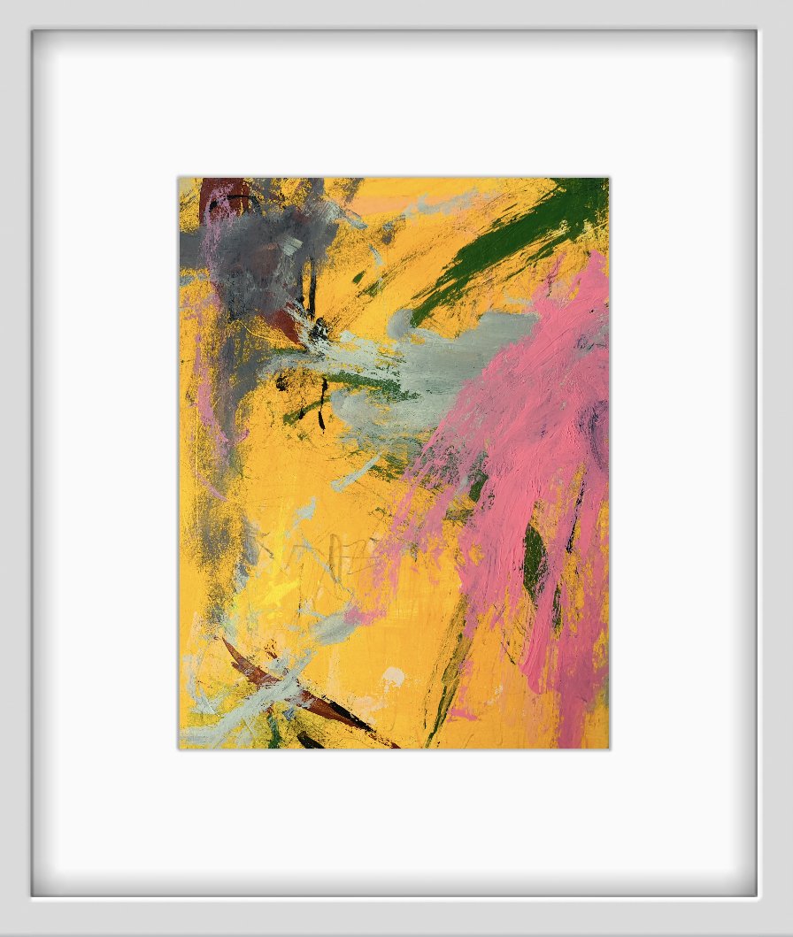
What does form mean to you? How does this inspire you?
For me, form is about more than just the physical structure of an artwork - it is also about the emotions and ideas that it conveys. By exploring form in my work, I aim to create pieces that are both visually striking and emotionally resonant.
You said that both form and free expression are closely connected, since these two seem contradictory, where do you find this balance?
It’s through free expression that I find form. working with form in an abstract and open-ended way, I am able to create compositions that allow for a wide range of interpretation and invite the viewer to bring their own experiences and emotions to the pieces
What about the human experience inspires your artwork?
Emotion. Connection. Expression. Communication. Colour. Energy. Soul. Movement. People. Magic.

With a wide background in the arts, including music, film and dance, do you find yourself connecting them together when you are feeling creative and inspired?
It’s all connected. when I’m creating I just let what ever wants to be expressed come through. Rhythm, sound, music and movement is just part of my dna. It all goes into a piece whether I’m consciously aware of it or not.
Where, or when, do you feel most compelled to create?
I’ve always felt the urge to create no matter where I am. I live in my head. I daydream a lot. I can’t seem to shut it off! I often have big feelings that need to be expressed and enjoy finding new ways to do it. I carry a notebook everywhere and go on lots of walks. Walking usually triggers ideas. I try to create something everyday because it just feels good.
Iman Sheraz

Artist Statement
Born in Peru, my Pakistani family immigrated to Canada when I was very young. Since then,growing up just outside of Toronto has meant blending my cultures to find my balance, and spending my early twenties honing my craft. My grandfather, Askari Mian Irani, was a distinguished Painter and a Professor at the National College of Arts in Lahore, Pakistan. His work specialized in Calligraphy and Islamic Architecture,and for me, it has been essential to carry this legacy through my work. My work centers around communication and its parallels. I began my artistic journey by writing poetry to story tell, while engaged with photography as a method to capture moments around me. Over time, I was drawn to painting to capture abstract emotions. Since I have connected storytelling techniques seen in poetry, and layers, levels, and vibrancy in photography as a foundation for my paintings. In my latest series “Time Flies” each painting represents a distinct stage of emotions when entering a new phase of life.
Biography:
Iman is an abstract painter intrigued by the parallels of communication. Through vibrant color palettes and layers, she captures emotions found within situations of interpersonal and intrapersonal communication. From a line of artists, she uses her diverse cultural backgrounds and degree in communications to story-tell and bridge worlds together.
What does form mean to you? How does this inspire you?
When creating abstract work, visually the idea of a piece isn’t seen concretely, and this is where form comes in. I enjoy the process of creating distinct shapes along with layering to create levels that strike a balance in my paintings. Form allows me to differentiate and draw similarities from my works over time and provides a sense of direction visually.
You stated your grandfather was a distinguished painter, how did this influence you as a person and artist?
My grandfather’s work played a massive role in me finding my passion for painting while growing up. Seeing his work from a young age definitely was and continues to be inspiring but has also instilled a sense of ambition early on. His work has always provided direction for me and I feel as though with every painting I further myself in it. I love when looking at his paintings I always get the opportunity to learn something new and connect with him.

How have you used storytelling techniques in your work?
When creating a series I gravitate to having a narrative structure and each piece following a set order within it. I’ve recently done this in my new series titled “Time Flies” which follows the stages we go through emotionally during new phases of life. The series structure goes from initial excitement to feeling overwhelmed but eventually gaining a sense of control. I enjoy having cohesive themes that flow throughout and connect a body of work together.
How has blending your culture’s inspired your work?
Culture, more so conceptually than visually definitely impacts how I approach the process of painting. Growing up I’ve been exposed to South Asian, South American, and North American cultures, and I’ve really gotten to see the differences in interactions among people. Emotions that stem from interpersonal communication are key to my paintings as strokes at times represent interactions I’ve experienced with others.
What was your reasoning behind using both warm and cool tones in your series Time Flies?
Every painting in “Time Flies” has a distinct set of emotions. With the series based on perspective created from personal experience, I wanted to explore color palettes that visually told a story immediately. “Copacetic” is the second painting in the series and is a warm piece that shows the excitement new experiences bring. The piece needed to pop for its placement in the series, and I thought the shades chosen would deliver vibrancy for that idea.
For “The Newfound Navigator” which is the last piece within the series, I wanted it to blend feelings of happiness and sadness that ultimately lead to a sense of contentment—bringing the excitement from the shades of pink, paired with the deep blues to bring sadness created the balance I wanted for the piece. The name of the piece solidifies finally gaining confidence, so mixing warm and cool tones was integral to ending the series with a sense of control.

Useful Links: Event Space Toronto, wedding venue Toronto, Wedding Reception Toronto
Setting The Tone For 2023
What these 2023 colours of the year tell us
Announced by Pantone, Benjamin Moore, Behr, Sherwin Williams and Glidden they each have their own meaning and reasoning, yet when put side by side, they bring a bigger picture. With the perfect mix of subtle and bold, the colours for this year form a message of empowerment, new beginnings and connection.
This year will be about our creative expression and the way we use it to bring happiness all around. Let’s take a closer look at each colour and the message behind it.
Behr: Blank Canvas
Starting with Behr’s colour of the year: Blank Canvas. This colour is exactly the vibe it sets out to be: a fresh start. This colour gives anyone who wants it, the chance to start again. Both refreshing and inspiring, allowing the opportunity to choose the way you want to express yourself, in your home and everyday life.
Pantone: Viva Magenta

Pantone’s Viva Magenta is the colour of the year that is fearless in its pursuit to write a new narrative. This colour was chosen to inspire people to take the leap into brighter and bolder, in order to “experience the transformational power of color”. A colour that is unapologetic, encouraging others to be the same in their self-expression. It inspires experimentation and feelings of joy, a way to go about life that is full of optimism and beauty.
Glidden: Vining Ivy

Glidden went with a “bluish-greenish-something-in-betweenish” vibe, choosing Vining Ivy as their colour of the year. It’s refreshing and a subtle shift from the moss and ivy greens we saw last year This versatile shade can elevate any setting. It’s a conversation starter, encouraging people to see things with a new perspective. Glidden’s overarching theme for this year was reflection, hoping to inspire people to reflect in on varying perspectives.
Benjamin Moore: Raspberry Blush

Benjamin Moore’s Raspberry Blush is for those looking to take a step out of their comfort zone and toward more colour. With the same intention as Pantone, this colour is an unapologetic shade that dares to be bold, with a charismatic twist. Whether it's an accent or the main attraction, this shade brings joy to its environment.
Sherwin Williams: Redend Point
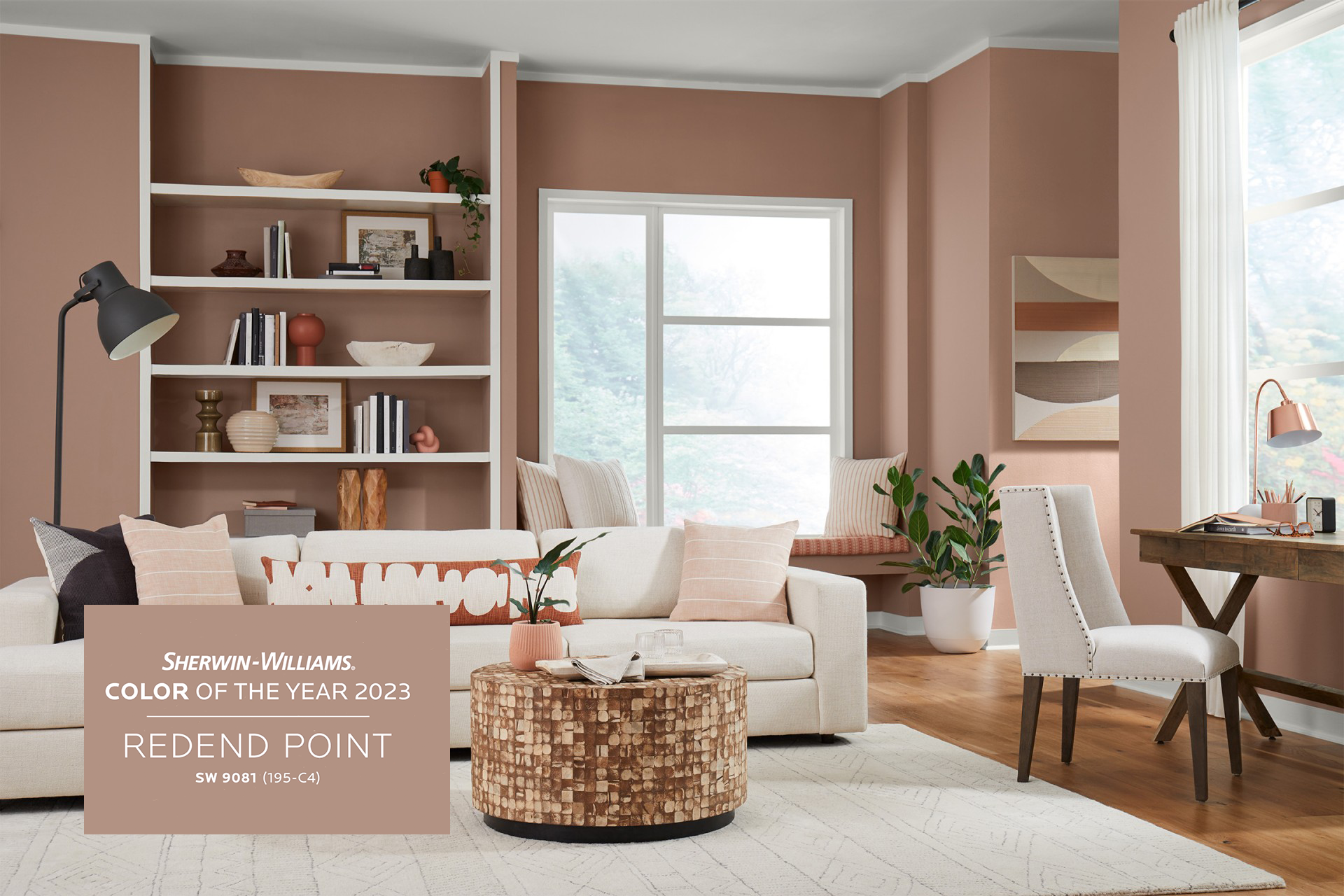
Last but not least, comes Sherwin-Williams Redend Point. This neutral is a choice for those looking for natural, with a hint of warmth. Its welcoming colour that inspires connection. it’s the perfect shade for a living room or family room, being described as a “joyful neutral. This shade was chosen to invite compassion into any space, and reminds us to use that compassion with ourselves and others.
It’s no coincidence that these shades go well together in colour and meaning. This pallet sets the tone for a year ahead filled with inspiration and connection. We are ready to set the tone to be our brightest, boldest, most compassionate selves!
Also Read: Event Space Toronto, wedding venue Toronto, Wedding Reception Toronto
Introducing Horizons
Twist Gallery is hosting a very unique photography exhibit this month, Horizons. This exhibit features eight talented photographers who have a mix of cityscapes and naturescapes pieces. We asked our photographers some questions about their work to find out more about the inspiration behind their work. To know the talent behind the lens, read more below!
Twist Gallery is hosting a very unique photography exhibit this month, Horizons. This exhibit features eight talented photographers who have a mix of cityscapes and naturescapes pieces. We asked our photographers some questions about their work to find out more about the inspiration behind their work. To know the talent behind the lens, read more below!
Angel Fonseca
Angel Fonseca is a local Toronto film-based photographer who has been shooting photos since 2014. Angel started photography on his iPhone as his brother recommended building an eye before diving into the craft and equipment. Angel has always been interested in photography due to the skateboarding fisheye 2000s videos he would watch growing up.
What is the most beautiful “Horizon” you’ve captured so far?
One of the most beautiful horizons I've been able to capture is my Porsche photograph in Malibu. The location, lighting and scene for the cars made it the perfect dream image that I was able to capture during this day.

MALIBU 1
Most of your photographs are centred around mainly vintage cars. What about older cars inspires your work?
The funny thing about these vintage cars is that skateboarding and movies have been a huge inspiration when creating my work. I tend to imagine or create scenarios that create a storytelling aspect with my image as my goal is always to have the viewer experience something when viewing my work. I tend to make work that others can connect to and with through my experience in my life.
What do you hope the viewer draws from engaging with your work?
I hope the viewer is able to relive experiences through my work and appreciate the aspect that they feel something through my work yet not understanding why they do.
What drives you to create? How does it impact your personal growth?
Creating is my way of self-expression. I've grown up with a learning disability and this has made it difficult to express my emotions and feelings through words or writing. Art allows me to fully immerse myself into creating something that I'm able to express to the world without having the fear of being judged since I enjoy creating narratives to fit the emotions I may be going through.

STARLIGHT DRIVE
Do you take inspiration from other mediums of art?
I absolutely take inspiration from other forms of art as this is the base of my foundation of creating unique work. I'm not afraid to use any type of art or medium for a form of inspiration.
Rick Bogacz
Rick Bogacz, born and raised in Toronto, began his artistic journey after being influenced by his father. After discovering his love of photography, he continues to explore the use of negative space in his compositions, particularly architectural abstracts and long exposure landscapes.
How do you tie philosophy to your images?
I am not sure whether there is a particular philosophy tied to how I produce images but I tend to follow a minimalist approach. I am not a fan of clutter in any aspect of my life and I suspect part of that can be attributed to upbringing. It then evolved professionally in my journalistic career where clear, concise development of content was an all-encompassing requirement. I was fascinated by the relationship between the subject matter of my images and the role that negative space played in creating composition and mood. Similar to the Japanese philosophy of Ma, emptiness becomes a palpable entity.
WINDSWEPT PINE
Do you find that being a journalist has strengthened your creative process?
It definitely has had an impact because part of being a journalist is finding a way to provide information to the general public in a clear and concise way. So in photography my goal is to break through the noise, so to speak, and return to the essentialist esthetic.
Your work is all photographed in black and white, is this a conceptual choice or stylistic?
It depends on the subject matter. When I photograph landscapes, for example, I tend to look at the subject matter in terms of black and white, influenced by the works of Michael Kenna, Mary Ellen Mark and other masters such as Edward Weston, Andre Kertesz and of course, Ansel Adams. I just find, as a personal preference, that the tones associated with black and white elicit a certain quality that fits my goal as a photographer. Having said that, with my abstract work, I do tend to veer towards shooting in colour to enhance the richness and contrast of the subject matter.

THE DARK FOREST
How have painters Christopher Pratt and Edward Hopper influenced your photographic work?
When you first look at the work of Christopher Pratt or Edward Hopper there is, on the surface at least, a certain simplicity. But when one looks closer there is a sense of foreboding and isolation which they depict that I find rather interesting. Although I rarely have human figures in my work, I perhaps subconsciously, look to portray a certain sense of aloneness and solitude in the environments as well.
What is the most beautiful “Horizon” you’ve captured so far?
It hasn't happened yet and I don't mean that to sound as if I am ignoring the question. There is certainly work that I am 'happy' with and enjoy displaying to an audience but I believe one of the common characteristics of artists and other creative individuals is that they are constantly trying to perfect their craft. The learning process, and curiosity that comes with it, never really stops and it's what drives us to keep moving forward to the next horizon with the camera.
Colin Shillingford

PURPLE HAZE
Colin Shillingford documents moods and moments in his city and attempts to capture the city from various angles that showcase its beautiful views. He strives to create cityscapes that appear to have occurred in a surreal, dreamlike state. His work evokes a cinematic and futuristic feel using a variety of elements including lighting, tonality, depth, contrast, color, shapes and lines.

FROSTBITE
GJ Verellen
GJ Verellen is an American Canadian-Belgian photographer based in Toronto who has been taking photos since 2017. Photography allows him to express his love for beauty in everyday life as he documents exciting colors, shapes, and light.
All of the images in your series are taken on 35mm film. Why did you decide to use analog film compared to digital? Do you find that analog film adds to or strengthens your creative narrative?
The reason why I shot all my images on 35mm film is that it slows me down, it makes me think about my composition, subject, and lighting. I enjoy shooting on film a lot more since it is a whole process compared to shooting digital. When I develop my images and scan them, it is always a surprise to see what I got. I also prefer the look of organic grain and the dynamic range of the gelatin silver over a digital image. The feeling I get from film makes it easier to convey a sense of timelessness and serenity. Being able to work on the image from start to finish and having control over the whole process is a therapeutic and relaxing process that makes it easier to edit the image to the final photo I imagined when I pressed the shutter.
Your series A Portrait of Paris is a tribute to a city you love. Did you take any inspiration from Parisian art while you were visiting that aided in the creation of your series?
One of my biggest influences in street photography has been Eugene Atget, a Parisian street photographer who documented the industrialization of Paris at the turn of the 20th Century. His images have an emphasis on the architectural landscape that is so characteristic to Paris and its inhabitants and still stands out in the 21st Century. When I was photographing the city, I focused on the architecture while balancing the human element to the photos as.

PARISIAN BRIDGE
What is the most beautiful “Horizon” you’ve captured so far?
Some of my favorite "Horizons" were taken on my trip to Paris when I shot this project.
My first favorite horizon is a medium format color image of the Sacre Coeur on Mont Martre. The photo focuses less so on the church than on the cultural hotspot that the church represents. The steep hill provides a great sectioning of a foreground, middle ground, and background where in every layer you can see something interesting and tell of the place. I took a similar photo a few years prior but was unhappy with how it turned out, so when I visited again in 2022, I was ready to take the proper image.
The Second favorite horizon I took is the 13x19 image on display at the gallery. I saw a photo at the exact location that was purely from the side clock at Museé D'Orsay and thought I could improve upon it. When I went to the clock near the painting of the impressionist period, everyone was occupied by taking a photo with the interworking of the clock rather than of the structure itself. I was able to capture four images in the span of only a few seconds; this is one of the images from that moment. I think the composition is quite successful where you have this long double curve created by the clock that draws attention to the building in the background framed by the spokes of the clock.
How does Paris’s neoclassical and renaissance designs influence you in creating future work?
I think It's something to further investigate and research for sure. I hope to go back sometime soon to spend more time there and create a larger body of work where I can display more images. I wouldn't say that those designs inspire me by themselves, but rather the integration of those architectural styles together in a modern world.
MUSÉE D’ORSAY
Cristian Arango
Cristian Arango, formerly a Chemical engineer and Food Scientist, started in the photography world in 2018 when he came to Canada. Equipped with his phone, he commenced creating memories through photographs. His mission is to show people's lives through his work, understanding diversity, feelings, and personal spaces.
You spend a lot of time commuting to your locations. What continues to drive you as an artist, and, pun intended, to these far out locations?
When I was going to college and working part time I spent around 4/5 hours per day on the TTC system. It was either sleep or use that time to create. So I started to photograph in subway stations, trains, and buses. knowing that I did not want to lose any second drove me as an artist.
What is the most beautiful “Horizon” you’ve captured so far?
I had the opportunity to shoot the last eclipse in November of last year. I captured the Toronto cityscape blended with the eclipse in its totality. It was a cold morning, I stayed 3 hours outside creating an eclipse series.

EPHEMERAL
Do you have any advice for someone beginning their photography journey or career?
Sometimes they are going to feel that their photographs are not good enough, I have been there. This feeling is absolutely normal. My advice, keep shooting, everyday. Someone once said: "the first 10000 photos of a photographer are the worst". If you go through your pictures over time, you will find a pattern of improvement. One more thing, photograph even the silliest thing, you might get the best pic of your life.

EUPHORIA
Do you have a favourite location where you draw your inspiration from?
To be honest, the whole city inspires me. Old town, St. Lawrence market, and Financial District would be my favourite locations. I always return with my camera full of bangers from those locations.
Devin Yuwono
Devin Yuwono is a self-taught photographer based in Toronto, who always has the drive to create visually compelling images. Devin specializes in uniquely displaying the natural landscape and photographing harder-to-reach locations, capturing the spirit of adventure.
What inspires you to create?
I would say that seeing something that somewhat just triggered my emotions inspires me. Basically, I love creating which in my case would be taking photographs that evoke an urge of emotion to get out of my comfort zone and see the world from a new perspective. Being able to prove myself that my art reflects who I am as a person, the emotions I'm feeling while taking those photographs inspire me to keep creating.
What is the most beautiful “Horizon” you’ve captured so far?
I would say the most beautiful "Horizon" I've captured so far would be either Mount Bromo or Hazdistazí, 'spiral rock arches'

HAZDISTAZI “spiral rock arches”
Your work is very vibrant and saturated. How do you find colour is an asset in your images?
I try to categorize my style of shooting depending on landscapes or portraits, with landscapes I've always loved how the actual colours I see during the moment would be reflected as close as possible after I photograph them. Colour definitely inspires me in seeing how it's something we get to see every day and basically have some sort of control in photography and making something beautiful with just that.
How do you find these “hard to reach locations”?
These so-called "hard to reach locations" is a term I would usually use for places where I had to travel to, hike, and going through somewhat not an easy route to take on, for example like the "Mount Bromo" I had to scout there from sunrise which before that I needed to hike to a certain spot to be able to reach that same level of composition to what I got in my shot, "Denali National Park and Preserve" was taken in a small aircraft flying through the rugged peaks of the Alaska Range, and "Head in the clouds" with making sure the right timing and composition yet reaching to a non-public area.

CAPE SPLIT
Do you experience creative blocks? If so, how do you overcome it?
I do experience creative blocks for my own photography artworks, since working in the wedding industry at the same time, it definitely takes away the creativity juice when wanting to create my own work out of the industry, and I personally find going outside, taking a stroll, and having the mindset that it doesn't matter how well everyone else is doing because you are being you and you are doing your best, knowing that things will happen, when it's supposed to.
Ryan Bolton
Ryan Bolton is an award-winning, Toronto-based photographer who aims to make his mom proud. Forever chasing a good story, Bolton's work has taken him around the world working with renowned clients like Apple, Red Bull, Spotify, Gucci, Lexus, Universal Music, Chevrolet, Columbia Sportswear, and as a photographer for the JUNO Awards.
Out of all the continents, countries, and cities you have visited, what has been your favourite to capture?
I'd have to say Morocco. There's nowhere else like it. It feels like it's stuck in time with the sights, sounds, and smells of days long past. Walking through the souks markets in Marrakech is unlike anything else. But the best part was I travelled with a nomadic Berber family on their ancient migration paths through the Atlas Mountains of Morocco. It was just a small group of travellers, the Berber family, and all their sheep, goats, and four camels. We slept in caves that have been there for hundreds of years and didn't see another soul for a week. We got some of the clearest nights with the sky lit up with infinite stars. I can't wait to get back.
You said your goal is to make your mom proud. Has your mom been an inspiration in creating your work?
Awww. My mom definitely set me up for success from a young age. From first learning how to hold a camera with her Canon AE-1, which I still have, to watching my mom run her own business as a Veterinarian in a small town in a mainly male-dominated industry. My mom also offered me the opportunity to take risks, to try new things, and always encouraged independent thinking and pursuits. That was invaluable. As a parent myself now, I'm trying to do the same. To guide my children gently, let them explore the world, and find what truly interests them.

DOWNTOWN STREETCAR IN RAINSTORM
How has working with renowned clients such as Gucci, Lexus and Redbull influenced your work?
Honestly, I love working with big, well-known brands, but it's not why I do it. It still has to be the right "fit." I like brands that are clearly defined, but still like to take risks, try new things, you know, get creative with their brand and who they work with to represent their brand. Red Bull, for instance, is all about that. Constantly trying new, unprecedented feats, and constantly chasing new dreams and frontiers, all while having fun and pumping out jaw-dropping content. That's what it's all about. I get energized by brands like this.

FILMORE’S IN THE RAIN
What is the most beautiful “Horizon” you’ve captured so far?
Probably the Great Pyramids of Giza in the early morning. Or down on the southern coast of Sri Lanka at sunset. The world is truly beautiful.
What does your artistic process look like? Do you scout your locations before shooting or is it a spontaneous moment?
Definitely half and half. A big part of photography is in preparation. What are the conditions? What lenses and gear will I need? What's the light going to be? And then once prepared, the fun stuff happens. On the other side of the coin, photography is also about experimentation for me. Once prepared, then you can start to experiment, try out new angles, and unique camera tricks, play with the lighting, try out different focal lengths, etc. It's somewhere in the middle of the preparation and the experimentation that the magic happens.
Sundus Siddique
Sundus is originally from Houston TX and is a self-taught photographer with over 15 years of experience. Moving to Ontario in 2017, inspired her to pick a camera and start her photography journey again.
What is the most beautiful “Horizon” you’ve captured so far?
I feel like the most favourite captures of mine would have to be my Autumn pieces. But if I must narrow it down to one specific Horizon, it would be “A Floral Moment’’. It reminds me of the freshness of those alluring, fleeting moments of falling in love.. the intoxicant essence of magnolias symbolizing true, passionate love.. charming lamp post reminds me of hope wrapped in the midst of floral ethereal dreams. There is just something magical about the framing in this piece, the focus being the lamppost wrapped in poetic chaos and desires, watching as its aspiration shines through.

A FLORAL MOMENT
How does poetry influence your photographic work?
Poetry is one of the most beautiful forms of expression there can be. I feel like poetry is best how I describe the vibes and emotions of a picture or video since they are both abstractions of reality. Poetry is highly connected to my initial aesthetic and visual storytelling. My captures are like poems to me, each very dear to my heart and soul each moment has so much meaning and richness behind it which I translate into poetry. I love to incorporate poetry throughout all of my work, it gives me the ability to manifest my true self. Including, my feelings and how others can connect and relate to my work as well. I feel like it’s a privilege, a gift to put our art out there in our vulnerable world and for someone to appreciate and connect to it is honestly the best feeling ever.
How has your photography evolved over the years?
My photography journey has evolved several times over the past years, there is still so much I wish to learn, and I know I will get to all of it at the proper time. I started off taking pictures for my high school yearbook and journalism after that, I went into event and portraiture photography in Houston. Being an extreme workaholic for several years put a toll on my life and my creativity, it all became highly difficult to balance. I even put my camera away for a decent amount of time. While I was settling into my new life here in Ontario, Canada back in 2017, I committed never to put my camera back down. My passion for photography and videography has grown so much, particularly over the last few years. Life can be challenging at times, and we also grow and change as an individual. I take those life lessons and express them through my art, I feel like it adds more depth, meaning and love to my work. I would like to thank the Toronto photography community for really inspiring me to never stop creating. I have organized 5 successful photo walks in this amazing city, and I can honestly say we have learned so much from each other. They have helped me evolve my work and challenge myself to become better. Furthermore, I believe that true authenticity and consistency are key, the rest of the possibilities are endless.
What about autumn inspires you the most?
The most exquisite season, the vibrant energy, the magnificent colours there is magic in the air every day of Autumn. My soul patiently waits every year for Autumn to arrive for us to fall in love again. Autumn is truly healing it spreads so much beauty and positivity in the world. Especially moving from Texas, has opened my eyes to embracing all four seasons in Canada. It is honestly one of the most beautiful experiences of living, to witness the trees change colours, and watch the sunlight dancing on the colourful leaves moving with the wind. Beautifully, each leaf delicately transforms into a flower petal. My favourite time to take pictures in Fall is in the rain, oh I completely get absorbed and lost in the moment, the immaculate, pristine shades of nature. The raindrops falling on the leaves slowed down time for a moment or two. I love to visit a small forest near my place, I call it My Enchanted Forest, I discovered it about 4 years ago. I spend a lot of my time in Fall over there, I absorb every moment and meditate over there. My forest has taught me the majestic beauty of change, reminds me of how short life really is, and how important the presence of time is, between the past and tomorrow. What we have is ‘now’, I can deeply relate to change and growth from the season itself. I wish to leave something meaningful behind in this world, as gracefully as Autumn has taught me. I feel like Autumn brings out the best of us, and unity with nature felt especially vividly, awakens our inner voice. My favourite poet John Keats was very much in love with Autumn. He is one of my oldest inspirations for the season, he has written some of the most extraordinary poems about Autumn. His deep words of expression have also influenced me to seize the fulfilling beauty of Autumn.
MAJESTIC MAGNOLIAS
Why do you recognize yourself as a Vibe Creator?
The meaning behind being a vibe creator is like an emotional-atmospheric sense. When I create a vision in my artistic mind of how I would like to compose a picture or capture a moment. I start with the feeling of that moment, how the energy would feel, and what the weather and nature elements would be like. I imagine the vivid colours, embracing that moment with every detail. It is so amazing to actually feel, how much colours around us influence us and affect us in our everyday life. The energy of emotions, moods and colours that articulate together is my euphoria. I want my artwork to be therapeutic and radiate positive energy. There is a whole universe inside of us, your imagination is your kingdom it all starts with a thought, and our thoughts shape our reality.
Eight photographers with a great visionary talent for our Horizons exhibit which is being featured at Twist until January 27th. See all the great work before it ends only at Twist!
Also Read: Event Space Toronto, wedding venue Toronto, Wedding Reception Toronto

In Depth with The Evergreen Artists
We had the opportunity to chat with the nine artists featured in the Evergreen Exhibition this fall! They opened up to us and allowed us to understand their artistic process and what inspired them to paint. Keep reading to learn more about these amazing artists and gain insights into what drives them to keep creating.
We had the opportunity to chat with the nine artists featured in the Evergreen Exhibition this fall! They opened up to us and allowed us to understand their artistic process and what inspired them to paint. Keep reading to learn more about these amazing artists and gain insights into what drives them to keep creating.

The Evergreen artists at Opening Reception!
Ewa Stryjnik
Ewa Stryjnik is a familiar face here at Twist Gallery, Evergreen is the third exhibition she has participated in. Many of Ewa’s paintings are influenced by the vast and uninhabited regions of Northern Canada. Ewa feels it is a privilege to live in one of the most beautiful countries of the world where one can still experience the pristine, natural territories. With her landscape paintings, Ewa invites the viewer to walk through the lands she’s visited and experience the topography; the natural and physical features of the area, as well as, the moods of the weather.

Labrador 3 (Battle Harbour) | 54" x 48" | $3500 | by Ewa Stryjnik
Over the years, Ewa has adapted her creative practice. For years, she loved to apply multiple layers on the canvas. Allowing for the colours and shapes to peak through, in order to create the complexity of the surface. Lately, she simplifies the layers, opening up bigger fields to bring calmness and clarity to her paintings. Ewa’s paintings project happy and positive energy, which she achieves with bright, saturated colours.
Theo McLaren
Theo McLaren has been drawing and painting for over 40 years. Recently, Theo has adopted monoprinting; she enjoys this technique because it is a more spontaneous and intuitive method of mark-making.
Her favourite piece from the Evergreen is “River Flow.” It is a piece inspired by watching the tide in New Brunswick. She was fascinated by the patterns the water was leaving behind in the sand.

River Flow | 20" x 14" | $400 | by Theo McLaren
Theo’s current artwork is about a memory of a place, traveling through the Canadian landscape. When you are alone in the forest or in the vast hills you think about where you have been or where you are going next. Or sometimes you pass by without really looking - but that image stays in your mind and resurfaces later.
Monique Parlevliet
Monique Parlevliet started working primarily with oil paint in 2021, after painting with acrylic for years prior. She finds the motivation to create in the hopes that those around her will enjoy it. When she finishes a painting, Monique always makes sure to share it with her family because she knows it will put a smile on their faces.
When creating, Monique tries to not spend a load of time on one painting. It is easy for her to get caught up in “small details”, which you can tell from her beautifully detailed work. She likes to keep her paintings on the impressionist side, which she can easily end up overthinking and overworking if she spends too long on it.

Beaver Valley | 16"x 20" | $1100 | by Monique Parlevliet
Monique finds inspiration from seemingly plain but scenic views of trails, fields and lakes in places she travels to. Growing up in a small farm town, she is influenced by her love of fields, which is something that some people might see every day but never fully appreciate. Monique used to think that landscapes had to be beautiful and one of a kind to be worth painting, like giant mountains or a crystal clear lake. She has since come to appreciate the beauty in more common scenes
Nerso
For Nerso, Evergreen is his first group exhibit and that makes it very dear to his heart. It is a new experience, meeting other artists, and gaining new perspectives. Overall, Nerso is very excited to take part in the exhibit.
As an introvert, Nerso is accustomed to painting in the nook of his basement. He still manages to create even when natural lighting is scarce. Out of Nerso’s whole Evergreen collection “Pink Parasol '' is his favourite painting.
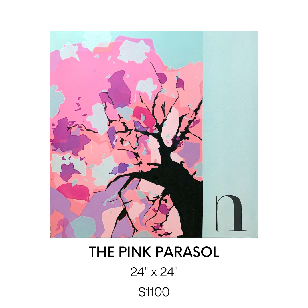
The Pink Parasol | 24" x 24" | $1100 | by Nerso
Family is very important to him. The branches symbolize the protecting arms of a family and the pink parasol itself represents the bonds within a family, characterized by deep affection, respect, loyalty, and unconditional love. What viewers can take away from his art is a state of being calm, peaceful, and untroubled.
Michael Brennan
Michael Brennan’s motivation to paint fulfills the need to practice creativity and freedom. After years of making art for other people commercially, it feels good to have the freedom to make his own choices and make something for himself. Michael is endlessly experimenting with materials, paints, brushes, and surfaces. Constantly trying out new things or painting at new locations to keep him stimulated every day. As an artist, Michael finds he is learning something new about art, so he can't get enough.
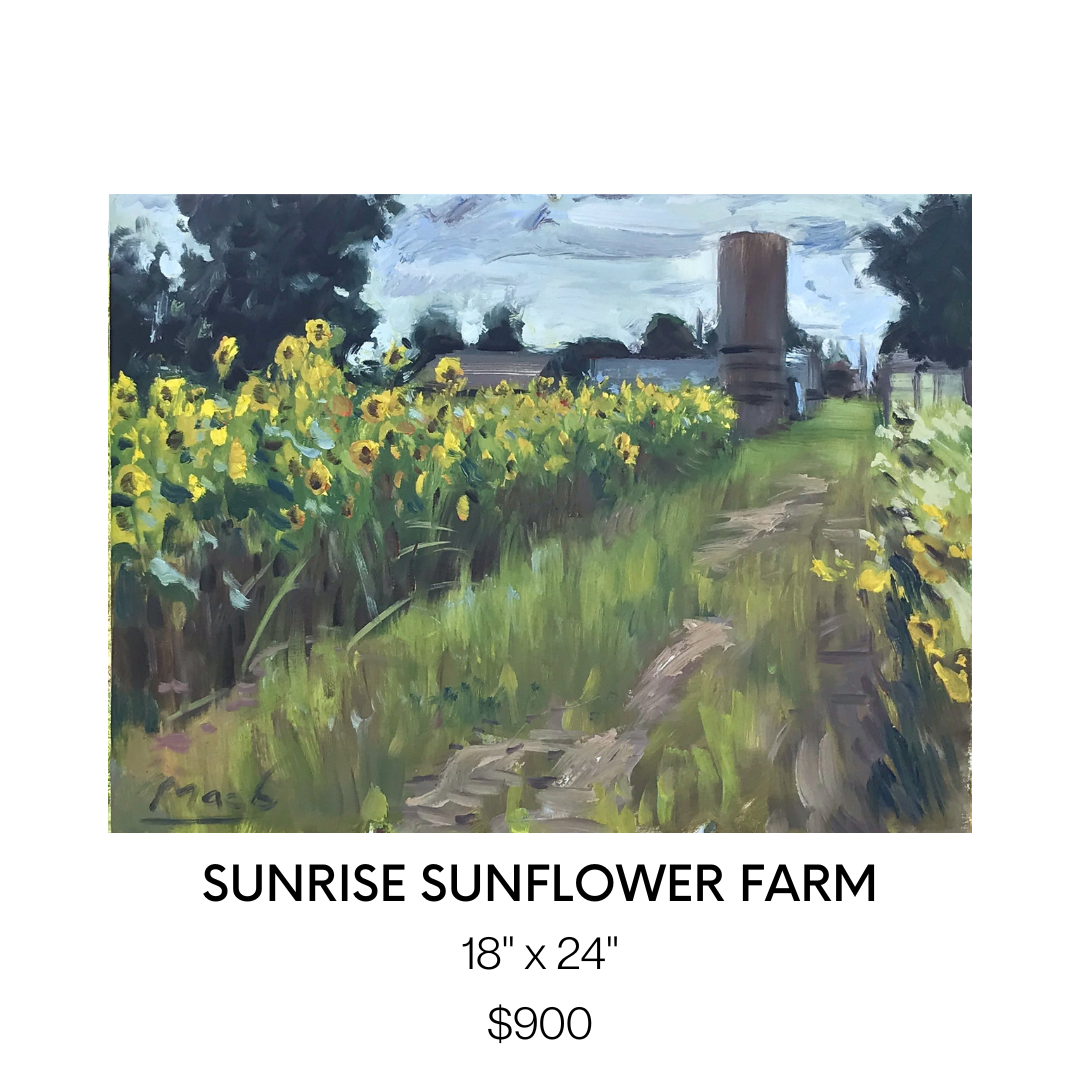
Sunrise Sunflower Farm | 18" x 24" | $900 | by Michael Brennan
The hardest part of creating a painting for Micheal is making it look fresh and spontaneous. He finds it easier to get the look he’s after when working from life, but there are times it just doesn't work out and it is better to just start over instead of reworking. That is one of the reasons why he enjoys painting with oil. He can wipe and start over.
For Evergreen, Michael shares his space in the gallery with his aunt Maria Grazia. They come from a creative family, so he finds it nice to have a collaboration where they can showcase work together. We couldn’t agree more!
Maria Grazia
For Maria Grazia, painting is equivalent to a type of meditation. Her focal point is what inspires and moves her the most in life and that’s why most of her subjects include the natural world, whether it's the sky, water, trees, or flowers.
Maria has learned over the years that ALL paintings go through an “ugly” or not-so-desirable stage. Back when she was first learning to paint she threw away a lot of paper and painted over a lot of canvases because she would not like something she painted and just give up. Now Maria knows that it's only a natural part of the process and if she keeps at it, the piece transforms right in front of her eyes.

Quiet Is The Night | 11” x 14” | $240 | by Maria Grazia
The paintings Maria features in Evergreen specifically highlight the sky. Maria loves the sky and that’s why she paints it. She lives on the 20th floor of a condo and it faces the West, so almost every night of the week she is treated to a beautiful light show of various stunning colours during sunset. Nature is a master artist and it inspires her!
Janet Horne Cozens
Janet Horne Cozens is drawn to painting Canadian landscapes because they were part of her childhood, growing up in Northern Ontario. Even after decades of living in Southern Ontario, she still feels that sense of "home" when traveling north and experiencing the rocks, the trees, the water, and the skies of that area.
Painting landscapes is a very personal expression of Janet’s life journey. Janet sees herself as an ambassador of the Northern Experience, not only the physical world but also of the culture and spirituality that exists in Northern Ontario. It's hard for her to explain in words but there is a different feeling that you experience when you are outdoors there - a sense of awe at the natural world, a connection to the land that is fostered by the natives, a sense of vastness and separation from others, and a serenity that one cannot find in the hustle and bustle of the big city or urban sprawl. She tries to convey those impressions and experiences to the viewer in my work.

Reflections (BLACK RIVER) | 30" x 40" | $2000 | by Janet Horne Cozens
Janet’s style of painting is influenced by Canadian artist, Tom Thomas. When Janet studied at Ontario College of Art (now OCAD), she used to spend hours pouring over his small plywood oil sketches that were kept in drawers in the gallery, taking in each brush stroke. Janet’s favourite work of his is Morning, now in the Tom Thomson Gallery in Owen Sound, because of the colours that he uses in it: purples and pinks and mauves.
Janet loves indigenous art of all styles because at first glance it seems so simple, but as you look at it you become aware of the artist's personality, culture, and personal experiences coming through in the art.
Heather Munsie
Throughout Heather Munsie’s artistic career, she’s had lots of support and inspiration. Heather and her husband travel to find references for her paintings and her husband’s enthusiasm and support keep her going.
When she first started painting, living in Calgary, Heather had a mentor who pushed her to deeply analyze a scene and gave her the confidence to pursue painting as a career. Heather is inspired by master painters and her current favorite is William Blaire Bruce (b. 1859) from Hamilton, Ontario.

Rapids Amphitheater | 22”x 30” | $1000 | by Heather Munsie
Prior to being a painter, Heather was a geologist. Both geology and painting involves looking at the bigger picture and working down to the details. Heather has an appreciation for the complexity of how the terrain was formed and strives to paint accurately to best depict the geology of the landscape.
When she’s outdoors it’s easy to feel the energy of the scene because it engages all senses. “The trick is to hold onto the energy of the location and bring that into the studio.” Heather will ask herself these questions; “How do I make this scene feel stormy? How do I make this ice feel glassy? What texture is needed to make the water feel frothy?” By paying attention to how something feels, she can vary the texture of the paint and brush strokes to best suit the scene.
As an artist Heather wants viewers to notice the little things – the glowing ochre tinge on a tree or the vibrant rust color of water when the light hits it. There’s so much variety outdoors and she strives to bring those details onto the canvas so that the viewer can experience what caught her attention.
Danilo Ursini
Danilo Ursini’s inspiration is dictated to represent the intersection of an imaginary line between reality and fantasy. For Danilo painting represents a way of learning himself, representing a subject, with the background with the lights (strengths) and shadows (defects). Danilo likes painting without judgment, he tries to be as objective as possible, like a photo, which stops in a special instant.
His painting style is inspired by his love of the Group of Seven. Many of his paintings feature trees, they represent an extraordinary being that moves in time and space, like following and changing every season, every year. Danilo’s painting Fall n3 was inspired by reality. It was autumn, Sunday afternoon, and he was sitting on the coast of Lake Algonquin Provincial Park.

FALL n 3 | 15” x 60” | $1250 | by Danilo Ursini
Closing Thoughts…
Each individual artist represents the meaning of Evergreen with their own unique style and creative process behind their paintings. Taking inspiration from the natural world, their artwork is a great reminder of the brilliant landscape across Canada.
We would like to thank all of these fantastic artists for their dedication to creating beautiful and meaningful art. Of which, our Evergreen exhibition would not have come to life in the way it has. We hope that Evergreen motivates you to explore the Canadian outdoors and to embrace and preserve the beauty of nature for future generations to come.
Useful Links: Event Space Toronto, wedding venue Toronto, Wedding Reception Toronto

How I Take Care of Myself During Wedding Season
he wedding season is stressful for everyone, but how do you stay in tip-top shape? This article will outline some practical ways to take care of yourself during the wedding season. Do these things, and you'll be on the road to wedding perfection!
The wedding season is stressful for everyone, but how do you stay in tip-top shape? This article will outline some practical ways to take care of yourself during the wedding season. Do these things, and you'll be on the road to wedding perfection!
Working Out with a Personal Trainer
Working out with a personal trainer during the wedding season is an excellent idea if you are a future bride. Getting fit can be difficult when you are busy with your wedding preparations. However, it is not impossible, as personal trainers can help you shed unwanted pounds and get in shape quickly. In fact, many trainers offer special packages for newlyweds. You can choose a package that incorporates phone calls and in-person sessions, keeping your costs within your budget.
Avoiding Processed Foods
Improving digestion is a major health benefit of avoiding processed foods during the wedding season. Processed foods are packed with sugars and additives that can upset your digestive system and adversely affect your skin's complexion—something you absolutely want to avoid when it comes to wedding photos and videos.
Sugar is a commonly-used ingredient in most processed foods, and it can cause bloating and gas. Instead, choose a more natural sweetener, such as honey, that contains only natural sugars. You can find these sweeteners in natural or organic foods and get a sugar fix from eating natural fruits.
Taking a Nap
While some brides wake up at 4 am to start their hair and makeup, others don't have the luxury of sleeping in until the afternoon. A lack of sleep can drastically affect your physical and emotional state, making it imperative to schedule a nap before the wedding. Taking a nap is the perfect way to rest and rejuvenate after a long day of wedding preparation. Make sure that no one disturbs you while you nap, and delegate the rest of your tasks to trusted assistants or wedding planners.
Avoiding Tanning Booths
There are a few ways to avoid getting too dark at tanning booths, especially during the wedding season. First, book your last appointment at least two days before your wedding. This will allow you time to correct mistakes before the big day and protect your wedding dress from stains.
Fresh spray tans tend to rub off more easily on fabric, so ensure you avoid moisture for eight hours after your appointment. Then, moisturize your body with hydrating lotion.
Taking a Vacation
If you're considering taking a vacation during the wedding season, consider the pros and cons of this season. As the wedding season approaches, prices on airfare and accommodations tend to go up. You'll also want to plan your vacation well in advance to coordinate your plans with friends and family. Luckily, several ways to get the best deal include shopping during holiday sales and signing up for resort newsletters.
One of the Most Unique Toronto Wedding Venues
Twist Gallery is a well-known art gallery but also serves as an event space Toronto relies on for custom celebrations, including birthday parties, weddings and receptions, and corporate events. Get in touch today at (416) 588-2222 or nadia@twistgallery.ca for more information!

Interviewing Our 8 Vibrance Artists
Twist Gallery is very excited to showcase our new exhibit Vibrance, and give you a chance to get to know the 8 talented artists on a deeper level to better understand their artistic process. Vibrance is centred around life’s moments, both in the mundane and the exciting, encouraging our intertwined connectivity of the human experience. We asked our artists some questions about the ‘vibrancy’ of their work. To find out more, keep reading!
Twist Gallery is very excited to showcase our new exhibit Vibrance, and give you a chance to get to know the 8 talented artists on a deeper level to better understand their artistic process. Vibrance is centred around life’s moments, both in the mundane and the exciting, encouraging our intertwined connectivity of the human experience. We asked our artists some questions about the ‘vibrancy’ of their work. To find out more, keep reading!
Amanda Pistillo
Amanda is a self-taught artist whose work is centred around the feeling of joy, the tranquility of being happy, and extending that to others. She hopes to entice a feeling of inspiration and motivation in others to create their own unique art work.
How does the title ‘Vibrance’ connect to you and your art?
"Vibrance" to me and in terms of my art is about the light that radiates within your heart and soul. It is that powerful energy that brings forth happiness and love! Each piece that I create is a one-of-a-kind creation always made with lots of love and with the hope that they bring happiness to others!

All of your paintings are centred around John Lennon. What aspects of his life inspired your work?
John Lennon's empowering mission for a world with peace and love coupled with his never-ending call for inner courage and strength are very inspirational to me. I wanted to try and capture the light and radiance of his heart and soul within my artwork.
How have you cultivated such a unique style of painting?
I love to create art, it helps to centre me and brings me so much peace. Over time I have learned to exercise a sense of courage when creating my art, just being totally free. I enjoy using a rainbow of colours within my work, along with an edgy/sweet kind of look. I never have an exact plan of how the piece will turn out, I just go with the flow and try to be fearless. I've found that the best process for me when I'm creating my art is to just listen to my heart and let go of any control.

Do you have any advice for beginner artists who are nervous to explore new mediums and areas of art?
I think it's really important to be yourself and to have a sense of fearlessness when creating your art. There are going to be people who will have opinions about what you have created and want to change your style of art, but always remember how unique you are and to never conform to other people's expectations. Always believe in your art and in who you are. Your art is a reflection of you, and all of your divine creativity and your beautiful soul! Always remember to keep persevering, try new techniques, and always always stay true to yourself!
Daniella Williams
Daniella is keen on expression, keen on capturing the moments that truly make us human. Whether it be alone, with a partner, in a public setting with strangers… she makes sure to grasp deep emotion in a way that makes the viewer feel comfortable and understanding. Daniella focuses on all of the little details that are incredibly important in the final composition of her piece, and will make sure to capture every angle and shadow.
How does the title ‘Vibrance’ connect to you and your art?
I wanted to be a part of Vibrance because I felt that the concept and title of the show was one that reflected the overall essence of my work. My paintings emphasize colour and dynamic imagery of people in mundane scenes. Therefore, when I begin a painting my end vision is a scene where I have pushed the colours and skin tones of the subjects in unexpected ways. I want my paintings to be vibrant and energetic as well as probe the viewer to ask questions about the narratives I develop.

Why have you explored the themes of intimacy, self-reflection and voyeurism with your Domesticity collection?
My work touches on themes of intimacy, self-reflection and voyeurism because I’ve always been concerned with the idea of being perceived. I want to explore the tension and discomfort that exists in this as an individual but then paint it in a way that feels intimate to the viewer. As curious humans we love to get a look into the psyche and inner experiences of people around us; hence our fixation on social media and consuming images. Similarly, I have struggled with my own body image, and self-perception as a young bi-racial woman in an age of internet and image consumption, so it's always felt important to create paintings about these ideas.
What is the narrative behind the Domesticity paintings?
The Domesticity series paintings are meant to follow the domestic lives of four young adults who share a home. Their relationship to one another is ambiguous and highlighted by their inherent separateness in each scene. The setting of each painting is clearly a home yet none of the inhabitants ever meet the others gaze or interact. Domesticity was meant to be a look inside a troubled home life, one that looks bright and beautiful at first glance but harbours tension and restlessness at a second glance.

How do you choose your muse for your paintings? (Are they friends of yours? Models? Strangers?)
The subjects of my paintings really depend on where I am and what I’m feeling inspired by at the time. A lot of my most recent pieces were of friends who I had sit and act out different scenarios and narratives for me. Whereas many of my other paintings are of strangers I capture in passing. For instance, my newest painting “In A Sea Full of Women’ was a collage of several people I observed on different beaches in Italy and Greece. Mainly what I look for in my subject is a sense of mundanity, I want them to look like everyday people and to tell some kind of story in their expressions or body language.
Sandra Lambert
Sandra has a spirit that can be seen directly through her paintings. She focuses on the things that make her happy and takes inspiration from the little parts of life that may be overlooked otherwise. High saturation and crisp lines in her art convey an intense wave of emotion and expression.
How does the title ‘Vibrance’ connect to you and your art?
My first love in painting is colour. I’ve always been attracted to fresh, bright colours - colours that remind me of summer gardens or brightly coloured insects and birds. Loving the colours in nature, I’ve wanted to capture that feeling of freshness and aliveness without limiting myself to representation. So, it’s more of a desire to express the essence of an experience of nature - fields, sunset, fruit, flowers, insects, birds - the vitality that, at our core, we share with the natural world.

What attracted you to painting utilizing such rich saturated hues?
When I discovered acrylic gouaches- especially the Japanese colours- I fell in love with them. I rarely mix them, instead using them straight from the tube. They convey the intensity of my emotions and my experience of being saturated with the beauty of the world around me - an intensity that is difficult to convey in words, other than poetry, but seems to come more easily in the language of paint.
What would you say your biggest inspiration has been during your art journey?
I am like a sponge, soaking up visual stimuli- natural and urban landscapes and the work of other artists. I think it was John Berger who talked about the importance of receptivity in the act of painting. That resonates for me- what you take in then moves through you and into the paintings. It’s not that you don’t need to learn techniques and practice a hell of a lot, but I think it’s good to stay open and receptive to the world around you and the impulses of your own soul.
What drives you to create? How does it impact your personal growth?
I don’t really know what drives me to paint, other than I’m not happy if I’m not making something. And there’s nothing like the feeling of being completely absorbed in making a piece of art; it’s that loss of self-consciousness, that sense of rightness, of doing what I’m supposed to be doing. Also I never get bored- there’s always a new idea and something new to learn and try, and you can never get complacent because you can never really capture what you set out to capture so it’s always in front of you like a breathtaking view that is never reached because it’s always just around the next bend in the road.

How do you know when to stop, when do you really know when a piece is finished?
I used to overpaint more than I do now. I didn’t trust what I was doing and was trying too hard and worrying about the end product. I do that less now and trust more in the process. It helps to work on 2 or 3 pieces at a time so you don’t get hung up on getting one perfect. Maybe that is something I’m learning from painting- perfection is not where it’s at in art or in life- instead it’s trying, experimenting, failing sometimes and succeeding sometimes, but keeping on working with an open mind and a playful spirit. Also there are happy accidents - ‘mistakes’ that turn out to be wonderful surprises. I’m trying to keep that attitude in regards to other parts of my life - what we hope and expect often do not occur but sometimes what seems ‘wrong’ can turn out to be a gift.
Allen Ford
Allen, a man well versed in our society’s natural fast pace and how our minds can interpret the advertising all around us, excels in collage style art that encourages the viewer to expand their horizons across many places. He uses second-hand bright and colourful advertising materials to create a whole new piece of art, enticing a sense of unusual inspiration from many different things at once.
How does the title ‘Vibrance’ connect to you and your art?
Excellent question! I feel vibrancy in my art is found in creating new meaning with the posters. Originally all these posters have a clear meaning and intent. Take the huge panel with the Andy Warhol poster from the AGO exhibit. Originally that poster had a very clear purpose. But rip it, tear it, and mash it up with other posters, and something new and unexpected is created with its own energy and meaning. To me that is vibrant.

Your collages reinterpreted old advertising posters from across the city. How do you see advertisements subconsciously affecting our decisions making as consumers?
Advertisements affect our decisions just as all other forms of inspiration do. We are first triggered not by the entirety of something but by one single element of it. It's like being at a club...or an opening night of an art show! You see somebody across the way, you don't know them but the way they wear their hair, or stand, or hold their glass connects with you. Advertising is no different. We see or hear a word, see an image or a colour, and it sticks. And you then want to know more.
What does your artist process look like?
It looks like a mess! When I am in full creating mode, my apartment...err...studio is literally strewn with posters and panels. I then proceed to mimic a squirrel in a park digging for nuts. I know a specific poster is buried somewhere, I just need to find it! There is usually one core poster fragment I build around. It might feature a word or sentence, or perhaps an image or colour. With that foundation, I simply look to then build around it as I add, shuffle, rotate, and rip other poster fragments in. I rarely have a defined image I am looking to create though. It is very much a process that is about finding the finished image. And when do I know something is finished? When I get a tingle on my arms, a smile on my face, and start nodding. Then I know I have created something!

What do you hope the viewer draws from engaging with your work?
I like to imagine viewers of my work as a kind of urban archaeologist. This art requires viewers to reconstruct what they see, but also imagine and parse what they can't. I feel viewing my art also asks people to be creative themselves. These posters, once all ripped and torn, all fragmented words and images, ask every viewer to create their own meaning, find their own inspiration.
Eleanor Lowden
Eleanor’s art will take the viewer to a universal happy place - a beautiful garden, which holds the power to be exactly what we need as humans. She makes sure to share her beautiful imaginations in a way that is inviting while also exciting.
How does the title ‘Vibrance’ connect to you and your art?
It’s such a pleasure to be part of the Vibrance Show at Twist Gallery. I think my work often reflects a certain vibrance, the colours and the mood and the settings that inspire me. I’m thrilled to be showcasing my work with this group of artists whose work I admire.

What inspired you to create your Joyful Garden Series during the pandemic?
I began my Joyful Garden series during the pandemic in the summer of 2020. I was living in a condo with no garden of my own. During lockdown we were all limited and my outings were mostly to walk my dog. I started noticing gardens and outdoor spaces and gained a new appreciation for them. I began creating my garden series around this time, I felt like I finally had a garden of my own. It was my own form of abstract art that also felt very liberating and fun.
Do you have a favourite place to create?
I create in my home studio, I love the early morning hours the most. I’m up at 5:30 am and I paint until 7:30 am. when I walk my dog. I then come back and grab a coffee and paint for another few hours. But the early morning hours are still the best.

Do you ever hit a creative block? How do you overcome it as an artist?
I rarely have a creative block. I am always looking for more time to paint. If I have a day I don’t feel like painting, I always have administrative work to do. My website or my books or my Instagram…..All things that need to be done!
Phero
Phero’s lust for life and appreciation for all shines through his digital and painted art pieces. His idols, exuberant and talented, bring a sense of inspiration to the viewer for this kind of vibrancy in their own life. He combines mediums to fully grasp expression and emotion in his subjects.
How does the title ‘Vibrance’ connect to you and your art?
Vibrance, to me, means full of life and energy, vibrating at the highest possible power or potential. I feel like my pieces are exactly that they are full of energy, they show movement in their stillness because they are vibrant.

What inspired you to paint these POC pop culture icons?
I draw my inspiration or choose my “subjects” based on things I believe in or I enjoy. I love hip hop culture which is why a lot of my pieces are so deeply linked to hip hop and the surrounding elements.
What does your artist process look like?
I usually start it with a mood board or a reference board where I gather pictures of the subject and try to figure out how I can capture them. Then, I start to pencil things in lightly (or outline things digitally), and then I start to drop colour in places and see how the composition comes together, making alterations where I need to.
What attracted you to painting with and utilizing such rich, saturated hues?
Early on my artist journey when I was trying to develop my unique style, I wanted something where people would be able to easily identify my work immediately. I found the easiest way to do that was to use vibrant colours. It is easy to unify an exhibit when the colours are the same across all pieces.

Rahul Ohja
Rahul’s abstract mind encourages the viewer to step out of their comfort zone and feel the emotions of life that may be previously unexplored. He uses colours and shapes in a way that has an other-worldly effect, a way that will inspire creativity in a vibrant and fun manner. Read for further tips for beginners that Rahul was nice enough to share with us.
How does the title ‘Vibrance’ connect to you and your art?
I believe vibrance is a state of being full of energy and life. My thoughts and variant emotions represent my belief in colours being a central part of all living beings and non-living objects.
I love working with bright sparkling colours & textures in creating bold, vibrant, and colourful abstract art. I try to reinvent myself through my artwork and observe the world with extreme detail — from colour to line, and light to shadow. I do this because it fulfills me, helps liberate me, enriches me.
How have the events in your life influenced your creative process?
As beings, I believe we are all creators – some masterful with their words, others captivating through their actions and outliers, like myself, through our ability to enthrall with colours on canvas. I have trotted the globe, living and serving in three continents and hence, it is safe to say that my creations transcend cultural and geographic contexts to offer any beholder a sight worth more than what meets the eye. Predominantly through abstract work, I use colours, brushes and strokes as media to explore parts of my own subconscious that have been shaped, ostensibly, by experiences I do not vividly remember.
What attracted you to painting in the style you have come to adopt?
I do abstract art! I believe every colour has a meaning, it speaks of something, when many colours blend it has a language, a language that has nothing to do with realism or perfectionism... it’s just so powerful… and that is where abstract is born. I direct these colourful, bold, and boundless abstract language onto canvas and try to connect to people with an aim to sooth, to heal, to energize and help them search for inner peace and tranquility and give life a real meaning!

Do you have any advice for beginner artists who are nervous to explore new mediums and areas of art?
Abstract art can be a challenge. Beginners may believe that it is very easy, and anyone can do it. For those who have created abstract artworks or have taken a course, know that things can get a little complex. Creating an abstract piece requires certain skill sets. Don’t let the challenge turn you away. If you are a beginner , there are some tips you can keep in mind to start your journey as an abstract artist. You have to keep the following three main components of abstract artwork in mind:
1. Composition: While composition plays an important role in all types of artworks, it is especially essential in abstract art. Since abstract art is generally vague, it is important to have a focal point in your painting to capture the viewers’ attention. The shape, size, and placement of the objects on the canvas help create a good composition.
2. Colour: Since there aren’t any objective rules when it comes to abstract art, it can be easy to get carried away with the colour. However, it is advised to not throw all the colours on your palette onto the canvas before calling it a day. In fact, think about your colour palette before you even pick up the brush. Ideally, choose a limited number of colours and try to get creative with them. Mix these colours on the canvas to create an endless stream of changing shades and colours instead of picking a different tube every two minutes.
3. Texture: While using the right colors and composition, to ensure that you create an attractive piece of artwork, the texture makes the abstract painting really stand out. You can use various techniques and materials to add texture to your painting. In fact, you can just apply the paint more thickly in places. However, make sure that the texture is consistent throughout the artwork. Even if you have multiple different ideas on how to add texture, leave the rest for your next projects and only use one or two techniques per painting.
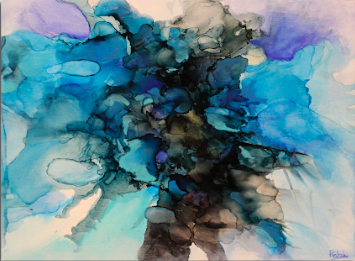
Nicole Dimt
Nicole guides you to the future through vivid colours and unique shapes with impeccable attention to detail and design. Her art is limitless, combining a magical imagination with real-world vibrancy that will leave the viewer craving more.
How does the title ‘Vibrance’ connect to you and your art?
Vibrance is the perfect word to describe my art. Every piece I make incorporates multitudes of every colour, which is the main goal of everything I create. In my work, I use the most saturated version of every colour I can, as I want my art to be eye-catching, as well as remind myself, and viewers, of the fascination and the joy that being a child once brought. I use vibrant colours so that my art feels lighthearted, fun, and just a little chaotic.

The subject in your artwork varies from nature and cityscapes to self-portraits. How do you decide on what subject to focus on?
My undergrad and the assignments it gave me are what opened me up to exploring many different subject matters within my art. I like to keep a very open-ended and diverse portfolio, and like to play with as many styles as I can. Anything can inspire me. Whenever I see a picture, or another artwork that I like, I get inspired to make something just like it, no matter what it is.
Do you prefer an abstract or realism style? Why?
It's hard to choose between the two - I often refer to my art as "abstracted reality," because that's exactly what it is. I always start my artworks with a reference of something from real life, such as nature, architecture, or fabric, and edit it digitally to create new wonderlands and worlds, which I then replicate. I would say this is my natural style. Granted, I do love to play with pure realism, and have a few pieces that showcase that in this exhibition. I like to create realism pieces when I find a reference that catches my eye, and I want to test my skill and
What would you say your biggest inspiration has been during your art journey?
My biggest inspiration throughout my art journey has definitely been all the amazing artists, and friends I met during university. My professors, peers, and mentors are who pushed me to be the artist I am now, and showed me new worlds and possibilities within painting. Many of these people helped me come up with themes and motifs, and really helped me connect with my art and understand it for what it is - something that did not come easily to me. It has been amazing to be around such creative people in my life, and this has continued post-grad into my workplace where I work as a concept artist, surrounded by brilliant minds who are fluent in the digital arts.
We hope you enjoyed getting to know a little more about the talented artists behind Vibrance! Don’t forget to come check out the exhibit, on from October 4th - 29th.
Also Read: Event Space Toronto, wedding venue Toronto, Wedding Reception Toronto
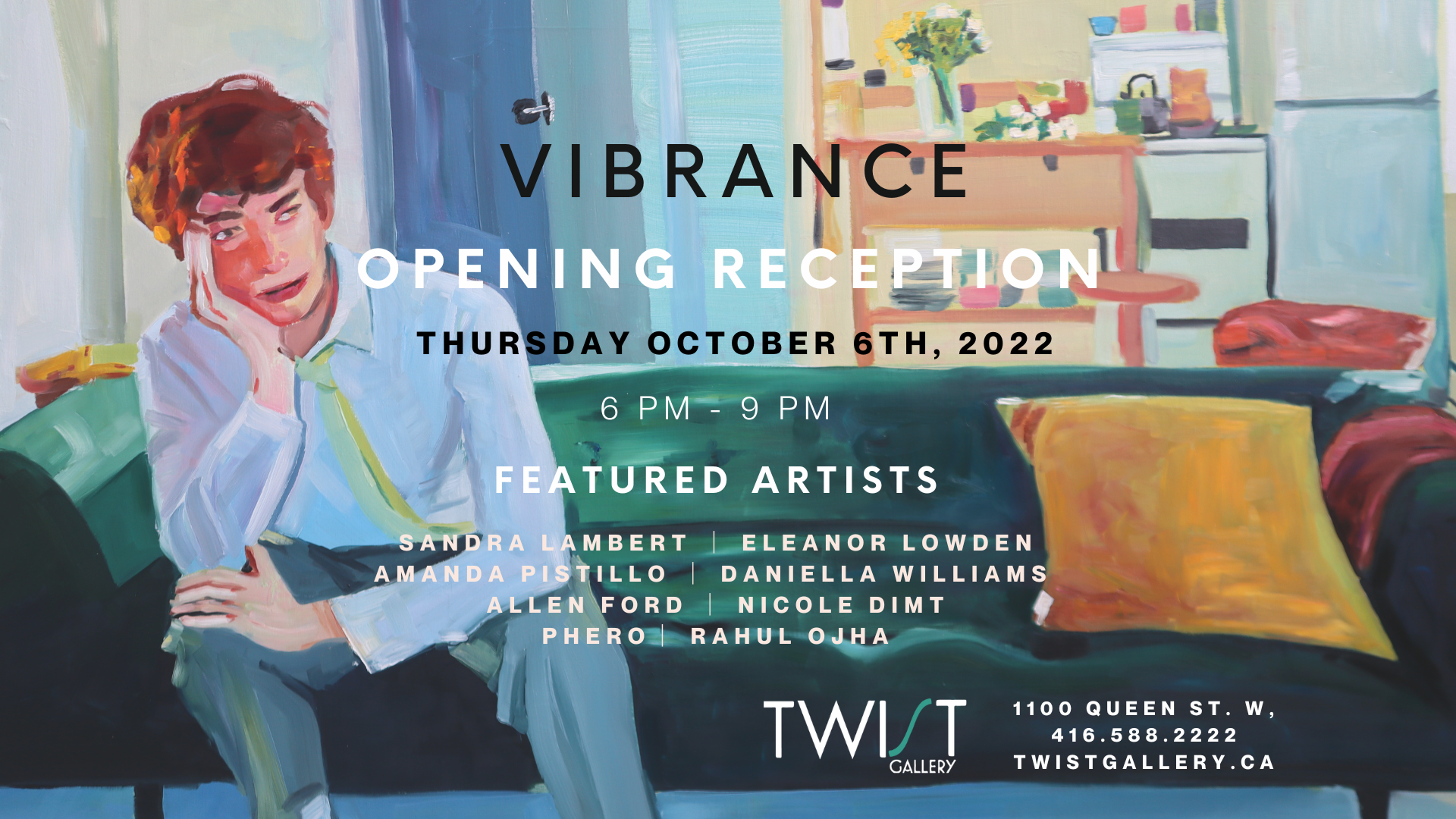
Introducing our #Vibrance Artists
Twist Gallery’s October 2022 exhibit #Vibrance, on from October 4th to 30th, is a dynamic, joyful, and effervescent interpretation of what it means to live, to feel, and to dream. Spotlighting eight exceptional artists from Toronto, this exhibit garners the unrestrained power of light, hue, and texture, inviting the viewer on a journey into colour itself. Through a fearless employment of colour and bold brush strokes, these artists open the door of creativity for the public. Don’t miss #Vibrance’s Opening Reception, taking place on October 6th from 6-9pm. Click here to RSVP.
Twist Gallery’s October 2022 exhibit #Vibrance, on from October 4th to 30th, is a dynamic, joyful, and effervescent interpretation of what it means to live, to feel, and to dream. Spotlighting eight exceptional artists from Toronto, this exhibit garners the unrestrained power of light, hue, and texture, inviting the viewer on a journey into colour itself. Through a fearless employment of colour and bold brush strokes, these artists open the door of creativity for the public. Don’t miss #Vibrance’s Opening Reception, taking place on October 6th from 6-9pm. Click here to RSVP.

Daniella Williams

Daniella is a local Toronto painter that is centralised around community and relationships, everywhere from friends and the neighbourhood beyond. She prioritizes creating narratives that are expressive in their use of colour, paint handling and subject matter. Daniella strives to push the colour palette of the atmosphere and skin tone of her subjects towards one that comes off as vibrant and imaginative; giving the figures life and vitality. Her paintings are marked by themes of intimacy, self-reflection and voyeurism, but they are most importantly defined by the juxtaposition of the bright vibrant manner which they are painted in. Expressive brush strokes and an imaginative colour palette provides the lens for her work and aligns her paintings with the #Vibrance of life as a human being in this world.


Allen Ford

Allen has chosen collage as a medium because it so beautifully reflects how we experience and remember the things we see, and how advertisements have become such a large part of what we take in. created these collages from advertising posters ripped down, torn from, and peeled off of hoardings and walls in Toronto, Montreal and Ottawa. In their original form, each poster was the result of an intentional creative process directed by marketing and design teams. Decisions were dictated by business goals, creative briefs, target audiences, and budgets. Every element was considered and directed towards a specific outcome. Once these advertisements have been pasted and posted on the streets of cities, their makers have ceded absolute control of their work. Instead, he transforms the specific images, taking them in new directions based on his own experiences and perspectives, inviting the viewer to do the same.


Eleanor Lowden

Toronto native Eleanor has been painting professionally for about 35 years. Her work is an interpretation of life from a happy point of view. Her style plays with patterns and repetition of forms, it is both illustrative and impressionistic too. She is inspired by many things: country roads, umbrellas, trees, polka dots, mass cultural objects, people, dogs, and most recently, spring flowers. Through these differing subjects, She is continually exploring unique compositions while creating bright, luminous paintings with her own unique colour palette.


Nicole Dimt

Nicole, a 23-year-old painter from Toronto, got very inspired by futurist architecture and landscape while roaming Downtown Toronto at the start of her third year of university, and integrated these themes into her artwork very quickly. In her art, Nicole reflects on her childhood, projecting feelings of joy, innocence, and wonder. Nicole’s art relies heavily on the use of highly saturated and vibrant colour, as well as line, and shape. Nicole’s artwork, with themes of architecture, nature, and technology, depicts futurist, dystopian, and psychedelic wonderlands full of overwhelming detail, pattern, and fascination. Nicole’s art can be described as “organized chaos.” Nicole’s art also works hand-in-hand with the digital world, collaborating with heavy photo manipulation, colour inversion, and total distortion, adding an unnatural or synthetic quality to her paintings. This added quality to her works speaks upon the narrative of the grasp that the digital world has had on us, and how it has warped our perception of reality.


Amanda Pistillo
Amanda is a self-taught artist with a passion for designing mixed media artwork, exploring the freedom and wonder of art. Her artwork is always created with the sincere hope that they provide happiness to others, as one of the goals in designing her artwork is to encourage others to create in their own unique artistic style. Amanda's heart is at the centre of her design process, always guiding her to create with love. She presents her John Lennon Collection, as she was inspired by his passion to bring love and peace into the world.


Rahul Ojha

Rahul, as a creative by nature, his mind wanders the depths of his innermost self and the ideas and experiences that make up his core. With time, his art has evolved with his personality. While up for interpretation, his work is, in a way, a depiction of his journey through the rollercoaster of life. You can consider Rahul’s work as his life as told on canvas through acrylics and mixed media. Viewers and patrons can find meaning and the rawness of human emotion that stirs the soul. Each piece exudes sensitivity and connection, creating a visual and emotional experience that goes beyond what is in sight.


Phero

Ahmed, artistically Phero from Cairo, Egypt, is a classic 3rd generation kid; exploring a unique balance of the arts, culture & lifestyle of his ancestral origins and his surroundings. Drawing was (and still is) his form of creative expression, it is what grounds him and what helps him move through life. Phero loves all mediums of art and his own style evolved many times throughout the years. He takes great inspiration from superheroes, music, and sports - which is very evident in his works. He combines digital and traditional media in ways that are exuberant and vibrant, inviting the viewer to feel as strongly as he does when he sees his passions come to life.


Sandra Lambert

For Sandra, painting is both a playful and intense experience. Her paintings are containers of emotion. Within their boundaries she feels free to play; to lose (or find!) herself in the pleasure of sensory exploration. She enjoys exploring the use of various techniques and media to express the essence of experience. Her #Vibrance paintings represent three different approaches; three small panels on the left shock the senses with pure, intense colours in flat organic shapes. The two small panels on the right are more spontaneous, loose and lyrical. The two larger panels are dense, layered and lightly textured through the technique of scratching back. All the paintings are pulsing with colour and a sense of power, though contained exuberance.


#Vibrance ties together the excitement and exhilaration of life and its passions and love. The combination of expression and vibrancy in this exhibit will ensure viewers have a new appreciation for livelihood and the possibilities of exploring your mind. Remember, don’t miss out on #Vibrance’s Opening Reception on Thursday, October 6th, from 6-9pm!
Useful Links: Unique Wedding Venues Toronto, Wedding Venue Downtown Toronto
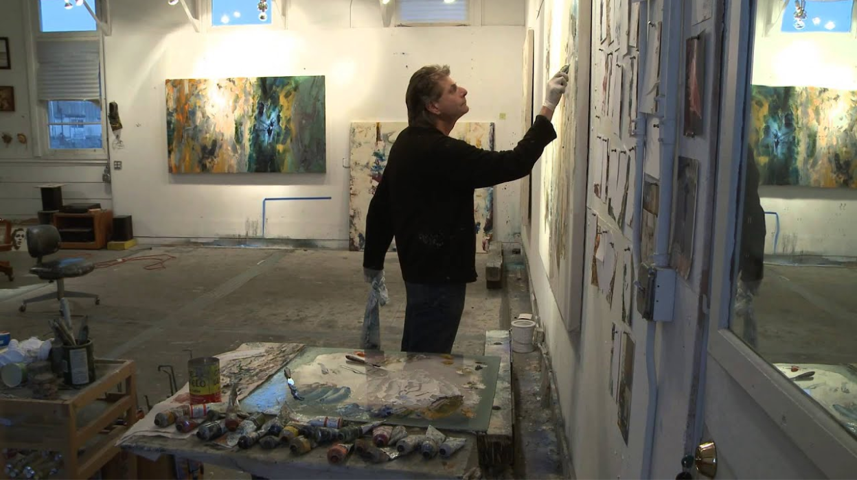
A ‘WiP (Work In Progress)’ FOR SEPTEMBER
The field of art is one with a heavy burden of expectation; perfectionism can often be the death of great creativity. Fears of failure and rejection are ultimately at the centre of this weight, and it is this very crux we wish to subvert through this exhibit WiP {Work in Progress.}
The field of art is one with a heavy burden of expectation; perfectionism can often be the death of great creativity. Fears of failure and rejection are ultimately at the centre of this weight, and it is this very crux we wish to subvert through this exhibit WiP {Work in Progress.}

Retrieved from: https://clyffordstillmuseum.org/blog/clyfford-still-as-a-teacher/
The act of painting is an ongoing exploration of light, texture, materiality, patience and skill abounding in trials, errors and happy accidents. Studies lead to different compositions of shapes, colours and techniques without fear.
“Within those moments of uninhibited freedom, magic happens.” (Project Art Toronto, 2022)
WiP (Work in Progress) shares the work of 5 artists from Project Art Toronto’s studio. A glimpse into their painting process and the artists' dialogue between subject matter and media.
Each artist brings their approach to the creative process and unique artistic style and identity. Through the works of these artists, we will be able to experience the joy of exploration and self-discovery.
In the spirit of free-flowing creativity, here are 5 strategies to help capture inspiration:
1. Let go of your fear
It’s important to approach all our endeavors equipped with a sense of self-assurance and confidence! Embark on every new project with a sense of wonder and discovery, and the knowledge that your creative process is part of your art. Fear should be parted with to achieve creative flow. It was Claude Monet when asked to give advice on painting who said to not be afraid of making mistakes. This is crucial for creativity, to let go of the things holding us back so we may let our creative spirit flow. A Harvard Business Review article by Tom Kelley and David Kelley, explains that there are four common hangups that block our creativity. They include fear of the first step, fear of being judged, fear of the messy unknown, and fear of losing control.
These fears can be the kryptonite to our creativity, but with courage and confidence, we can overcome them.
2. Practice, Practice, Practice
It’s said that to become a master of any skill, one must be prepared to dedicate over 1,000 hours. Practicing the techniques that we have learned can make inspiration more readily available. In a similar way to how one must learn to run before they can play basketball, or to play the violin before being able to play in a symphony, mastering the physical techniques and mediums we wish to work with will make it much easier to use them in our creations.
3. Iteration is the mother of creation
It is easy to fall into the trap of wanting our first attempt to be the best and only one, but more often than not having multiple attempts and versions is what is most likely to lead to dissatisfaction. The progress made with each iteration is where the magic of creativity lives.

Retrieved From: https://www.pinterest.ca/pin/113153009366238711/
4. Reboot your brain
Often the best way to rekindle our focus and inspiration is to step back from our project altogether. Psychologist Robert Epstein, PhD, a Harvard graduate, says stress and time constraints can squash your creative process.
Here are a few ways to give your mind a reset:
Snack break: Sometimes we focus best when we satisfy our stomachs. Find a snack to munch on while you think!
Shake it out: If you are having trouble focusing or finding your inspiration, physical movement can be a great energizer. Get up, stretch, take a walk, or do a little dance, give your limbs and joints a shake, just move!
Shift gears: Diverting your focus to another project or subject can help get the creative juices flowing when the well is running dry. Consider switching to an old project, watching a video about a different type of art, or even reading a book to give your brain a different influx of ideas.
Siesta time: Sometimes the best way to reset our mind is to shut it off completely for a moment and rest. Set a timer for 15 minutes and find a cool and comfortable spot to catch a few Z’s, it can be just what your creative brain needs.
Space out: There can be times when we can benefit the most from just disengaging our minds. Why not lie on some grass and watch the clouds pass by?
5. Take a second look
Take a moment to pause your mind, and look around you at all of the things you usually encounter, but this time, try to look beyond what you normally see. Find in its countenance the beauty or interest you might have missed. How would you describe this object, colour, or texture to someone who could not see it?
Find the grace in the curves of a vase or cup on your table, and take in the rhythm and movement of the branches and leaves of a tree you are familiar with. Be sure to take notes of your observations and thoughts, these are just for you, so don’t worry about editing, write any thoughts that arise, or take a picture to refer back to at a later time.
When we take a second look we can be surprised by the inspiration we find. Approaching our day-to-day surroundings with curiosity and wonder can bring about great ideas.
6. Relish where you are at

Every masterpiece has been a Work in Progress until the creator decides it is completed. Unfinished projects possess a special quality of possibility and transition, which is beautiful in and of itself. Take a moment to appreciate your progress and the stage your project is in, without judgment or criticism, and let yourself love every aspect and minute that is a part of its journey.
Twist Gallery is thrilled to announce that we will be hosting WiP (Work in Progress) for September with Project Art Toronto. An anticipated exhibit to be featured at our space. Stay tuned for more on WiP and how the process came to life with an amazing group of artists from Project Art Toronto.
Retrieved from:
*Harvard Business Review, Reclaim Your Creative Confidence in August 2022
**American Psychological Association, The Science of Creativity in August 2022
***Greater Good Magazine, How Mind-Wandering May Be Good For You in August 2022
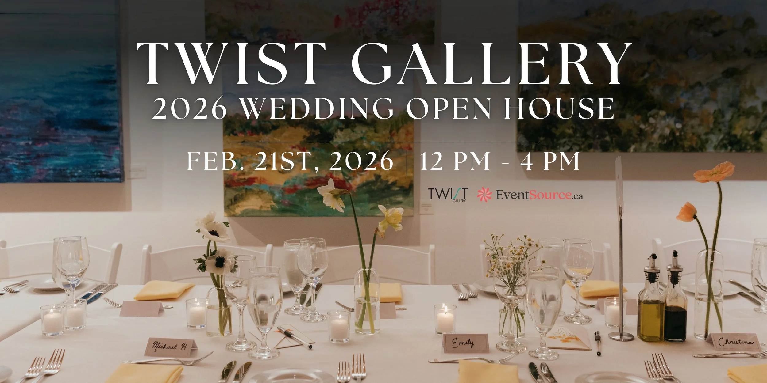
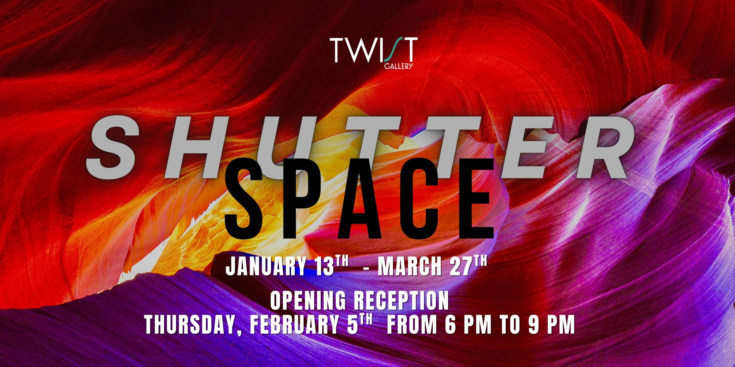


As the winter season wraps the city in twinkling lights and festive cheer, there’s no shortage of activities to make your holidays magical. From holiday markets to pop-up bars, ice skating rinks, and dazzling light displays, the city is ready to enchant visitors of all ages. So here’s a small guide to the most famous and iconic spots around the city, so you don’t miss all the fun!